Main Nav

Showing posts with label Tutorials. Show all posts

Jul 18, 2012

Create Custom Brushes for illustrator and Photoshop


Creating custom brushes for Illustrator and Photoshop

Using Photoshop and Illustrator for graphic designing is extremely common now, but the professional experience differ highly. The work done in Photoshop and illustrator by a professional and amateur can easily be differentiated. Why? Because an amateur uses advance tools and options that an Amateur may not even know about. Professional graphic designer use custom tools that both Photoshop and Illustrator support. Of course building these tools is fairly easy but a lot of people find it difficult to do so. Those people are not real professionals, Nevertheless even professionals seek help from time to time, especially with newer versions of the software.

One of the best work you can do in Photoshop is when you use customer brushes. Custom brushes allow you to enhance the editing in your picture that can really make difference. For starters you can give touches on the picture that make it look authentic and unedited. Some experts use it to watermark their images so that even if stolen, no one can deny that it is truly not their own.

Starting with custom brushes


To create a custom brush you first need a texture image. You can get these texture images easily by searching them on Google. It is highly advised not to use images that already belong to someone else. For the sake of a fellow designer, I advise you to use images that are out there for sample purposes or is distributed free of cost. Open the image on Photoshop and DE-saturate the image. In Photoshop7 you can do this by (SHIFT+CTRL+U). What you get will be present in a background layer. Copy this layer and paste it so that it become layer1 and now delete the Background Layer. We do this because it is easier to edit Layer1 and Background layers are not always editable. Now edit this layer to your liking. Use the brightness settings, changing the levels, playing with the contrast and saturation etc.

The easy Part

You’ve created the brush but Photoshop sees it as an image. So now you have to create the image as a brush. To do this go to “edit” and then click “Define Brush”. A window will appear asking you to name and save the brush. Name it and click “Done”. That’s it you have created your new brush. You will need to save it in order to use it. You can use the same brush on other similar applications like illustrator. Once you’ve made many different brushes you need to do one more thing. In the “Edit” option find Preset Manager. The window will show you all the brushes available on your computer. Click on the ones you want and then click on save option.

If you want to load a brush from your back files simply go to “window” select Pallets and then show brushes. Find the brush on your back up drive and load it. You will get the brush now displayed on your application.

Author Bio- The author is an expert in online marketing financial solutions. He has experience in giving advice on increasing productivity and money saving schemes for online businesses. He also has experience in providing online "You can do this by using the following basic HTML code in the article:
credit card solutions solutions for ecommerce businesses


Read More →

Jun 2, 2012

Creating the Windows 7 Wallpaper for your Desktop

Probably not in this world no ITshnika who has not heard of the release of Windows 7, many have even managed to set it as your home Windows. I myself am in the process of installation - recently bought a new hard drive, 2 cooler for the body and found I needed the distribution of Windows 7. What is missing is time to take off everything and work, but to concentrate once and get away with cumbersome and dreaded Vista. So for those who are still in, as I propose to put in thought a motivational wallpaper in the style of Windows 7, but instead to look for them, we will try to draw them yourself in a photo editor Photoshop (English version).

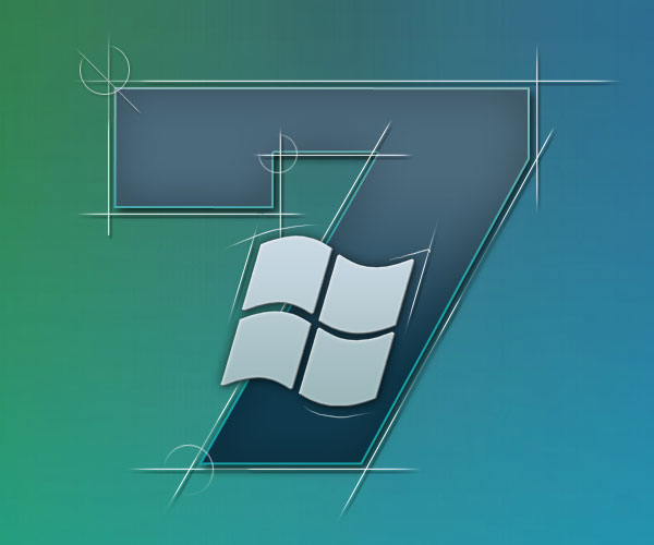
So in this tutorial I'll show you how to make a beautiful wallpaper of Windows 7 . Here we go. To begin with, by the way, I propose to evaluate the final result of our work:

Wallpaper windows 7

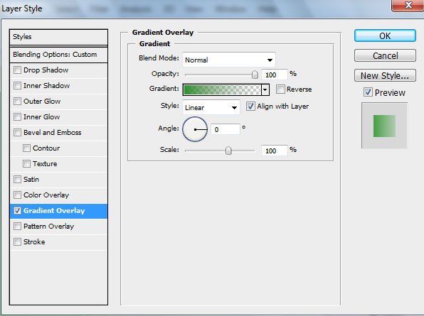
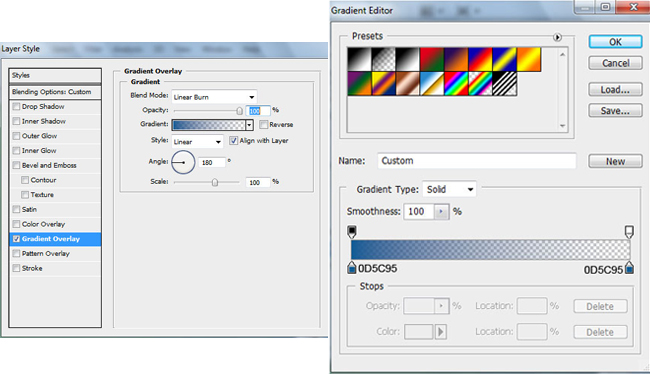
Create a new file (File> New) size of 1920px to 1200px, in the "Background Contents" select White. Then knock out the tool Rectangle Tool (U) and draw a rectangle. Fill the parameter is set to 0% and go into the settings of the layer (Layer Style), then proceed Styles> Gradient Overlay.

Photoshop gradient

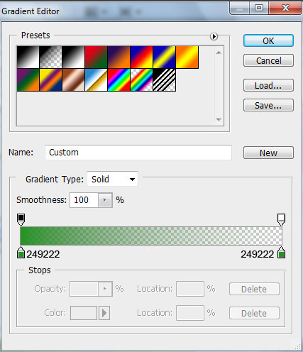
Select the Gradient Editor by clicking on the gradient, pay attention to the colors used codes:

Photoshop gradient

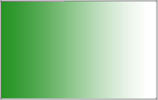
The result will be something like:

photoshop gradient

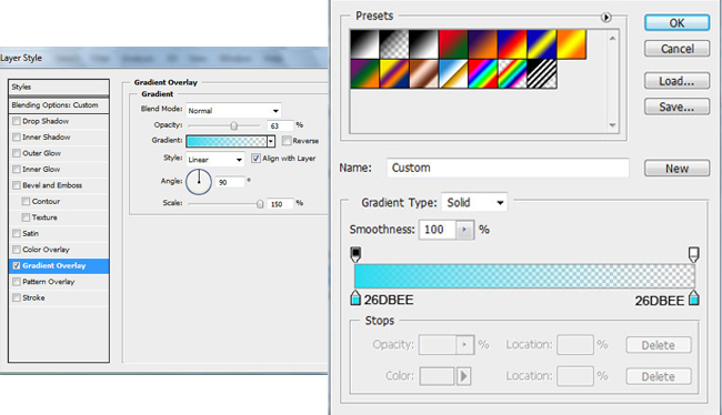
Use this same technique to create another layer of background. Again, draw a rectangle on the screen. For him, just expose the Fill to 0% and go into the settings of the layer (Layer Style), to the point of Gradient Overlay and choose a different color.

photoshop gradient

Should have:

photoshop gradient fills

Then again, select the tool Rectangle Tool (U), select a rectangle slightly smaller, and fill our new gradient background. The newly set to Fill the layer to 0%, go to the settings of the layer and go to Gradient Overlay.

photoshop gradient

Total we have the background wallpaper in the style of Windows 7

photoshop gradient

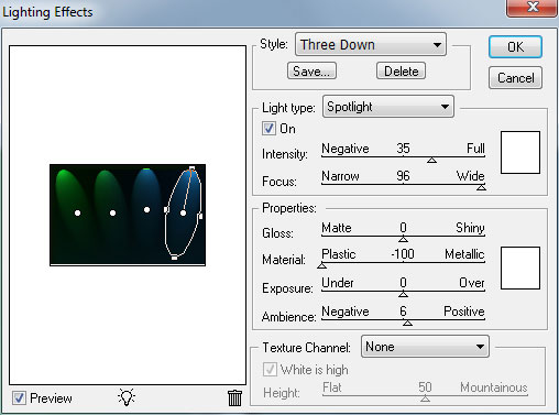
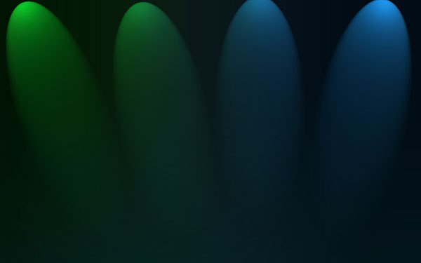
Now we make from all walks of one image, it will be the background. Select them all (hold down the Ctrl key and click on each layer) and press Ctrl + E, or click the right mouse button and click on "Merge Layers". We had a merged layer. Next, make a copy and go to Filter> Render> Lighting Effects.

photoshop lights effects

photoshop lights effects

We set up the layer Blend Mode to Mode Screen.

photoshop Blend Mode

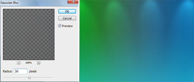
As well as set up in the box Blur Filter> Blur> Gaussian blur.

Gaussian blur

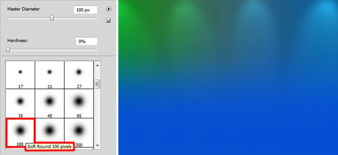
Create a new layer and using a brush paint the bottom of the layer. Brush Color: R: 5, G: 80, B: 210.

photoshop paint layer

Add a Layer Mask by clicking on the button Add Layer Mask, which is located at the bottom of the Layers palette.Then use a brush of black color with a value of Opacity - 30%. She paints a vivid blue background on the relevant parts so that it does not stand out. The result should look like this:

Set the Blend Mode is set to Luminocity.

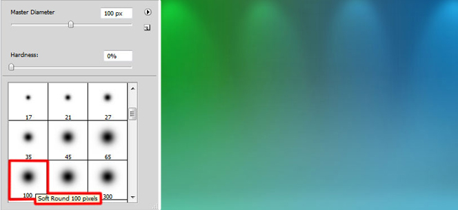
Create a new layer. Choosing the same brush, but white with the Opacity to 10%, which would be "light" bottom layer.

Set the Blend Mode to the value of Overlay.

Now the first part of a lesson on how to create the Windows 7 wallpaper for your desktop can be considered complete - will continue to add the logo of the system.

Read More →

How to Create Favicon (ico file)

Site without favicon (favicon), as a ship without a flag. Favicon - an integral part of the brand site, its image and identity. By the way, look for the issuance of any search engine (such as Yandex). You will definitely find a number of titles found pages and documents favicon. That is, favicon, it is also a factor which increases click through your site in search results. Therefore, no favicon anywhere!

How to make a favicon? The process can be divided into two stages:

  1. Making favicon or the presence of already finished;
  2. Install it on site.

The first task, as has been indicated, there may be several approaches. If you for some reason you do not want to make favicon yourself, you are too lazy, do not have time or do not know how, and to try and experiment there is no desire, you can find it at one of the sites, libraries, finished favicon. The main disadvantage of this option - hardly your icon will be original. Rather, it is already used in dozens, if not hundreds or thousands of sites.Therefore, in this case, the relevant question: "Do I need a favicon at all?". To me, this element must be unique, even if it is as simple as "3 penny". Therefore, from this version is better favicon refused and made his own hands.Let's stop this process in detail.

Start making favicon can be in a photo editor or by using special service. In the first case does not necessarily seek the help of desktop applications (eg, Photoshop), you can use the free online raster graphics editor . All you need - to create a 16x16 paper and anything on this "canvas" to portray. Fill the background, try to draw something "pencil" or to put any symbol or letter. In the screenshot example of a "masterpiece" that I began to paint using the service  Pixlr :

Pixlr create favion

The result can be saved in the format ". Gif" or ". Png".

For me as a tool to use graphics editor - the organic option, but it is not only because there are special services that can help you draw a favicon. An example would be the site Favicon.cc, which allows you to create an icon in pixels:

Service favicon.cc

This is just one example, in fact there are so many sites - services to create favicon online - free of charge, with the same functionality and for every taste.

Whichever option you would choose, create favicon is not very complex and interesting. Install the same problem does not deliver. Once you've finished, save the icon on your computer, it can be converted into a format ". Ico", or use the files ". Gif" or ". Png". The principal difference will not be just about any option, if desired in the future it will be possible to animate. It remains the last - pour favicon in the "root" of the site (named favicon) and add the code in the head section:

<link rel="shortcut icon" href="put_k_ikonke/favicon.ico" />

(If you have a favicon format other than ". Ico", you must specify the desired type of file)

In this process of creating and installing favicon, can be considered complete. If you need any additional information on the icon, it is possible to look out my article 2 a year ago in another blog - all about favicon.ico icons - most of the data they are still relevant.

Read More →

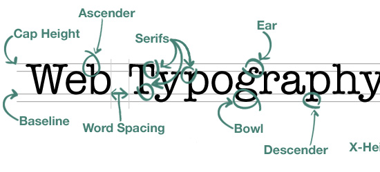
9 Tips on Typography Site

Typography for the Web site - quite an important design element, which is expressed in runet somehow not very much. This question is often raised in the English-speaking foreign design blogs, we have virtually no attention is paid to him. No, of course when you create the layout, most designers think of the site typography - fonts, design, but it is very modest and small. Because, probably, in runet can count on one hand the number of projects with a bright and creative custom typography, more than the standard dull "gray" design: (Maybe that's why Dmitry Naumov decided to share an interesting guest post about typography. Dima in combination, by the way, is author of a very useful project Converlab - "Design. Usability. Conversion." So, 9 boards typography Web site:

A. The choice of font

The choice of font depends a great deal. Type design determines the mood passes 'character', and indeed has a strong influence on perception. Choose the font that matches the style and concept of your site. For example, a "traditional" design goes a traditional serif font like Times Roman, for the "modern" design can go sans serif font - Arial or Helvetica;

Two. Font Size

Particularly important is the font size of the main body of the text. Title (subtitles) can be grotesquely large and clunky, but the main text should be comfortable, which is possible only if the optimal size. This is usually 12-16 px;

Typography

Three. The set of styles

The font should not be monotonous, gray mass is not nice to read. Develop a system of styles for headings and subheadings (H1, H2, H3, etc.), quotes the main text and the like. Use a different font sizes, options for the mark, perhaps to contrast these to use another font (especially for headlines or quotes);

4. Emphasis

Important places in the text must be allocated - bold or italic. The main thing is not to overdo it. Focus on that and he later emphasized that the dosage should be used;

Typography site

Five. Column Width

In traditional typography great attention is paid to the width of the column, for this reason that the text is divided into columns in newspapers and magazines. If the string is too long to read it is not convenient. Because you have to look too far to translate from the end of one line to the next. Short Line is also not good. The optimal length of the string is in the range 70-140 marks;

6. Leading (Leading)

Leading (Leading) - the distance between rows. If it is small, it affects the readability. Too big, too, Leading promises nothing good. In general cases, you will probably be the best spacing for 2-4 points more than the size of the font;

7. The general structure of the page

Ideally the page should be used a single grid. Thus it is possible to achieve a harmonious form of the whole site.Try to use common rules and styles (which you have come up with) on the whole site;

Eight. Color and contrast

The text should be readable, so he must be a contrast. It is better to use the classic black and white decision, it has the best possible combination of contrast, so the most convenient for reading. The remaining combinations to be tried with caution otherwise you risk to make one of the common mistakes of web design .

9. White space

White space - it is not void, but an important design element. It should not be too closely to mold elements, always leave a little "air". Thus it is possible to achieve a clean, light, nice design.

-

First of all, thanks for the post of Dime. All told briefly and in substance, in fact, develop the theme can be infinite for each item. I think part of the answers can be found on its website Converlab . Also, on my own I wanted to add that if you really decided to do something, "such things" in terms of typography site, you would be advised to view the work of the various collections on the Internet with the original decisions. This is very inspiring, but also contributes to the emergence of creative ideas.

Read More →

Six Basic Steps of Site Development

I was here recently in the comments said that some positions do not correspond to the format of the blog, which is positioned just a useful resource for web designers. If you want a competent and professional approach to the process of developing store websites, it is necessary to need good ecommerce hosting for best performance of site. On the one hand, it is really a lot of attention paid to the graphical editor, for example, photoshop, but on the other - this is also part of the work, and no small. However, today decided to publish a post that would be willing to partially satisfy the read something about creating websites. In this case a web design, I decided not to limit, and consider more broadly.

If you want a competent and professional approach to the process of developing websites, it is necessary to take into account all the details and carefully consider all stages of the project . In this case, nothing can be overlooked, even though developers are often guilty of this. As for the "stages of creation," then perhaps they can each have their own, that depends on who and how used to work. Nevertheless, there is a list of common (recommended) items that it would be desirable to perform. In any case it is useful to define for itself a clear structured plan to ensure that no detail is not overlooked.

Typically, a workflow on a project is as follows:

  • The study of the issue;
  • Design, concept development;
  • Design;
  • Create a site;
  • Launching the site;
  • Support for the site;

As a source of inspiration was used by this article . Let's look at each step in detail.

Study

"Why learn something?" - You ask - "we are enough experienced people." In fact, this is one of the most important steps. You may be an experienced developer but nothing has been understood in a "women's shoes," which will be dedicated to the site. Therefore, before proceeding to phase development of the site you must have an understanding of the subject and the subject site which will be dedicated. Not that the need to delve into all the details of this niche, explore a variety of models of women's shoes, simply estimate the basic features and nuances of the subject area.

When you're designing a site for a client, take as much time as the initial communication with the client. Need to know about the goals and objectives, timelines, target audience, the proposed budget and other matters. Get as much information. At the end of this stage you should have a clear understanding of what is required of you. This difficult task can help you such a thing as a "brief." This is something like a list of standard questions on the future of the project, where you can learn the preferences and wishes of the customer. Of course, "Brief for the development of the site" will not replace personal contact with the client, but can be used in the initial stages of cooperation - straighten it by mail, or to make a survey over the phone. In the "brief" can include various issues - from the audience of the project, the proposed budget to personal preference in design and functionality of the site.

The overall design, layout

Once you have decided on the goals and objectives, you can begin to develop a basic layout . This phase can start by visiting competitors' sites. Surely someone has done something similar to you. Therefore, the first task - to study the best examples of sites on the same (or similar subject) and note for themselves the advantages and disadvantages of each. Given the experience of competitors, you can proceed to breynshtormu in which you need to determine the overall design concept, the basic elements, colors, fonts and so on. Do not forget at the same time, of course, and the wishes of the customer.

The last stage of the design - a sketch of the framework. It can be done on paper, by using special programs and services. If you're working with a client, be sure to confirm the layout of your base before you move on. In principle, in my practice, I saw that "the basic outline of the layout" is not always approved. An exception may be considered a design of logos, where it is important to understand just which direction to go. But as for the design of sites, not all customers can understand something from scratch is usually determined by the basic site structure, layout and color blocks. Although to some extent, it can be considered a "sketch" :)

Site Design

design development siteIt's time to "build on our frame of meat." Many designers and developers are just beginning to this stage, ignoring the "study questions" and "layout". In my opinion this is not entirely wrong, rather, that the preparatory steps you will work much easier and more efficient - all the basic questions and decide for yourself the details before, but now concentrating on building design. Thus, studying the subject and having passed through the stage of creating a simplified layout, you have pre-determine the content and then do not miss anything of the kind. Design - this stage of the determination of the shape in which you clothe your content, it details the layout.

Typically, such a design is created in Photoshop or another image editing program. The finished design should virtually match the final product (the elements, colors, images, fonts), except that the text can be inserted until the staging. It should be remembered that the design development includes not only the main page, you must also develop a sub, and maybe "alternate versions" for mobile devices, or any other special purposes.

Always confirm the finished design with the customer before continuing to the next step. Then go back and redo it will be harder (more time consuming). Be sure to pay attention to this nuance of the customer - imagine yourself that you have completed all work on the coding or installing the cms, but here the client suddenly changed his mind about the design. This, of course, it happens, but it should be to minimize risk.

Created by

At this stage we need a "picture" (detailed design) to make a living site. This stage is different from the webmaster varies considerably. It all depends on how, on what basis and for what CMS (if any) you write the code.Experienced artists are usually already have a pre-made "blanks» HTML / CSS, so after "cutting" the necessary elements in Photoshop, the process may take a markup is not too much time. Do not forget in this beautiful andcorrect HTML layout .

After writing, debugging, testing in different browsers, validation and error correction, you can proceed to the next step. Incidentally, after this stage I personally also give the result of the customer for approval, if the site is developed on the cms typo3 where you want to connect (to adapt) the generated HTML in the admin. If we talk about wordpress , then there is probably better to create a template without the "pre-layout".

Launch Site

If your site is perfect, "tweaked", and all works perfectly like it, you can finally publish it. Do not forget to check out all the good (good to have on this case prestart checklist), after the upload to the hosting site via ftp, once carefully all potestiruyte. In principle, you can do immediately to create the site hosting - in this case, first, do not have to "relocation site" from the local machine, and secondly, all tested in the real in the real world (and host settings), in- Third, the customer can monitor the process performance.

Site Support

It is not in the literal sense of the word stage of development, but to resolve the issue of support and further development costs in advance - will you address this issue, or the customer will be able to do everything himself.In addition, after the date of the site, developed by a management system (CMS) should provide the client with documentation on working with her, or a little training.

Read More →

How to make a website easy. Usability by Steve Krug

Looking the other night in my mail and found it an interesting letter from the publishing house "Peter." If someone had told me something similar institute in distant years, when does the reading of some books on computer topics, would never have believed it. Now, given my profession blogging and authorship of the project design Mania, they offered me a little bit, and collaborate together to tell blog readers about an interesting book. The practice, in principle, quite typical in the blogosphere, so of course I gladly accepted. For the theme of the project is best suited Steve Krug book " How to make a website easy. Usability by Steve Krug on a method . " And if the web design for me is more a hobby than work, the creation of the site and the question of its effectiveness - the theme is much more intimate.

Steve KrugTo begin with a few words about the author. Steve Krug (Steve Krug) - usability specialist, bestselling author in the same yuzabilti "Do not make me think." He works in his own consulting company, has a great many years of experience in the design of interfaces and overgrown with usability testing.Boasts some of the most renowned for its customers such as Apple, AOL, the IMF, Bloomber.com, etc. Most of the time Steve Krug is engaged in conducting seminars, well, just consulting.

Honestly, before the book came in the mail "by the method of Usability by Steve Krug" only known to me was the usability experts , Jakob Nielsen .Now, we can say, I expanded my (and yours, I hope) because the horizons of what Steve has to tell the public. After the first book, "Do not Make Me Think" Krug has become a very popular specialist, began to actively organize seminars, advise, and then at one point, he says, in a weak moment signed a new contract with a publisher.

For example, the question of whether this world need another book on usability testing? You can read the following.

I did not invent the wheel. Usability testing has come into our world long ago, and many famous people, the most influential of them - Jakob Nielsen, more than twenty years of preaching the idea of ​​"affordable usability testing."

There are several wonderful books, which explains in detail how to test usability. I strongly recommend that you read at least one of them, when you happen to do testing. His favorite book on this theme, I have listed in Chapter 15.

However, this book differs from existing in at least two aspects.

It is not comprehensive. I guess you did not become usability and will not be a matter of life and that this word is not even in your job description. If so, you will not necessarily know all the nuances and spend a lot of time on their comprehension. This book, like the previous ("Do not Make Me Think"), I tried to make a sufficiently thin (200 pages), so that it can be read, for example, in the plane.

This book is written not to make you an expert on severe or usability testing. It is necessary for you to know which end to approach the testing itself. Some of you, of course, this theme will entice enough to need to know about it as much as possible. For these and I wrote a chapter 15. But in general, to be tested and get this huge impact, not to know anything more written on these pages.

This book is not only about how to find usability problems . Unlike many other publications, this also explains how to fix identified problems.

I can confirm all these words are 100%, though I am very involved (or rather did not do) usability, but from the first page was simply a human interest. And given how quickly read the book to find out all the details of this process somewhere along the road to transport or a rainy autumn evening - simple. In addition, such a reading also draws from the other side, that all this is really an invaluable experience, "knowledgeable" person.

And it is interesting that the question, " And your tips are only suitable for web-sites "you can find the answer.

In writing this book, I focused on testing sites, because these days most need this, and because it is possible to make the book a thin and simple. But exactly the same methods and principles can and should be used in testing and improving the whole, than are men. Network and local applications - is the most obvious sites for testing, but no one bothers with the same methods to estimate the ballots, cell phones, presentation, laid out in PowerPoint, Digital fotikom instructions and forms that you fill out when it comes to the doctor. I would suggest to you, wherever I have written "your website" to believe that it says "your product".

Actually it would be logical to continue to publish the contents of the book "Usability of the method by Steve Krug."

The discovery of usability problems

  • Chapter 1. Elephants, it can not see 20. What is an independent usability testing, why it always works and why it is so rarely performed.
  • Chapter 2. And now I saw cut my [excellent] assistant in half. In what looks like an independent testing
  • Chapter 3. One morning in the month - we do not ask for more. The plan, which you can easily follow the
  • Chapter 4. When and what to test. Why are the most difficult has to do first
  • Chapter 5. Do not hammer nails with a microscope. Who to test and how to find these people
  • Chapter 6. Take them to task. The choice of targets for testing and scripting
  • Chapter 7. A few boring checklists. Why they should be used, even if you (like me) hate them
  • Chapter 8. Telepathy without tension. Testing
  • Chapter 9. This is somewhat similar to the sport. How to captivate all the match and what to bring to their attention

Resolving problems with usability

  • Chapter 10. "Debriefing". Compare experience and decide what to eliminate the shortcomings
  • Chapter 11. Less is better. Why fix problems should carry as little as possible actions
  • Chapter 12. The Usual Suspects. Some of the problems that you will surely find, and thinking about their elimination
  • Chapter 13. Life has become better, life has become happier? The Art of pleasant manners

Just go!

  • Chapter 14. Teleportation without tension. Remote testing: fast, cheap and slightly uncontrolled
  • Chapter 15. Only for advanced users. A list of recommended literature
  • Chapter 16. Good luck, friends. A few parting words. An example of the script and the agreement on record

In general, usability testing can be very simple and informal employment. You just need to find time for it and read the book :) Steve Krug said as he held seminars that they say, first of all the assorted audience of a site for an example, and then decided to introduce an original method. He allowed himself participants usability testing - how it was raboaet :) That is the site is taken as an example and volunteer to perform some common tasks for which this is the site and set up.

Test results are almost always the same:

Talk a good time testing and eventually breaks a storm of applause for his bravery.

"Owners" of the site, all 15 minutes furiously writes, what problems must be solved, and asks whether it is possible to obtain a record of what was happening to show your team and your boss.

Others come to mind, "Heh-heh. Is that all? So I could. "

Upon completion of testing, I ask: "How do you think is worthwhile way to spend 15 minutes? - And all under the nod.

So if you somehow are building high-quality and user-friendly site, you can safely buy and read the book " How to make a website easy. Usability by Steve Krug by the method of "online publisher Peter. In the same way, find a small piece, but rather one chapter from the book.

Read More →

Power on the Redesign of the Examples

Sooner or later even the most successful design to date. Sometimes you can get a slight redesign, and sometimes require radical renewal, referred to as rebranding. Very often these processes began to appear with the acquisition of the popularity of so-called design style Web 2.0 , which simply did provoke a serious company for updates and follow current trends.

From the standpoint of the integrity of the brand's radically new design is not always acceptable, in at least a step risky, because that way you can lose face. But even those who are at risk was up to "moderate" is not a revolutionary redesign. Let's look at examples of how to solve this problem (and solved) the designers of famous sites. As inspiration, has been used , this English-language paper , reflections are copyrighted. First published on the old design, then a new one.

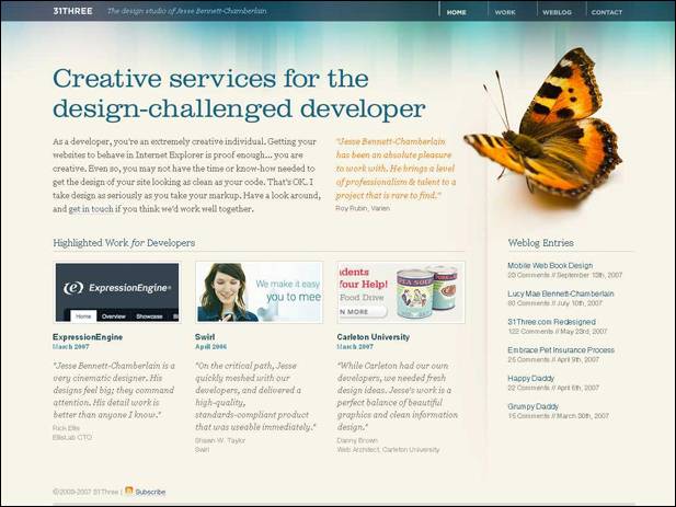
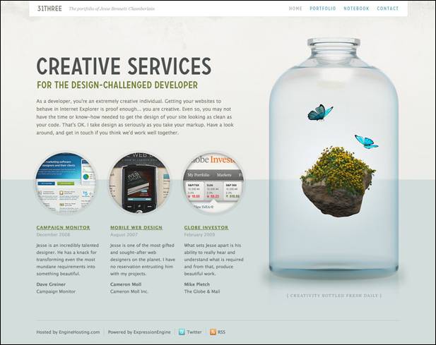
31Three

old design 31Three

new design 31Three

During the redesign was otherwise decided 31Three space (it was more) and changed a few colors, why design has become more "pure" and "air." Perceive the information has become much easier once it is clear that the page has the greatest value. Definitely a successful redesign, or should I say effective - catches.

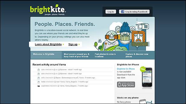
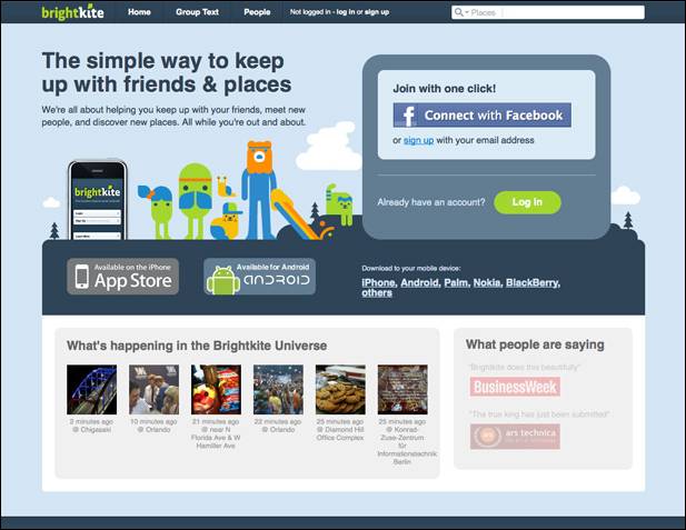
Brightkite

old design Brightkite

new design Brightkite

Brightkite has undergone major changes. The new design got rid of the heavy dark-blue substrate to replace the cap had come a lightweight upper panel. Visually zaokruglennye angles acute and successfully replaced by "splitting" last version, the big headlines emphasize the key parts of the project. In general, the new design creates the impression of a comfortable and well made. The previous version looked less than professional and integrity. The redesign was a success.

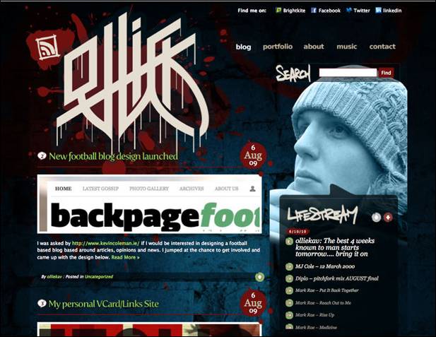
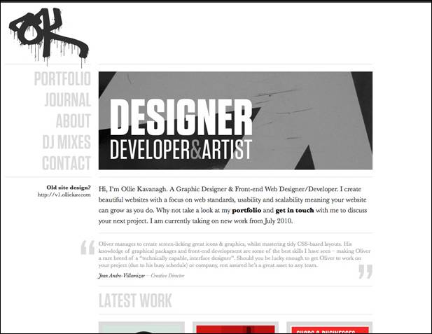
Ollie

old design Ollie

new design Ollie

In my opinion, the site is only won by Ollie redesign. The old one was too dark, dirty and a bit chaotic (this applies to both elements, as well as flowers and other things). The new design is in sharp contrast to the fact that it was, it is close to minimalistchnomu - a little strict, but neat. The only "a quote from the past" - a logo, which, however, fit quite harmoniously. Although my impression of a matter of taste, some people may notice that the old design could be more creative and stylish - it is quite possible, and sometimes because of the redesign is the author's desire to change something, sometimes dramatically. I think this is the case.

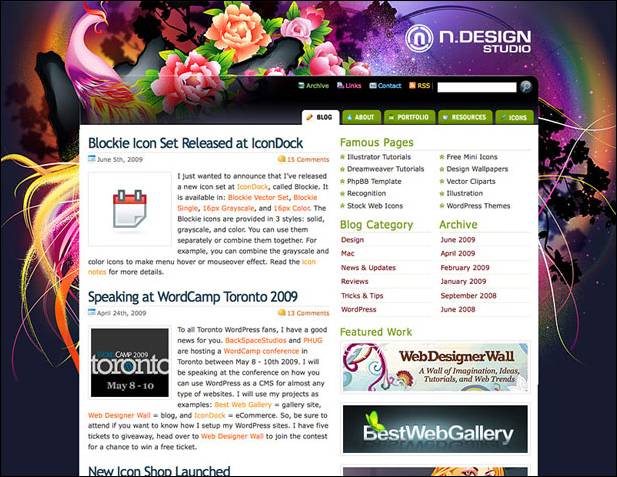
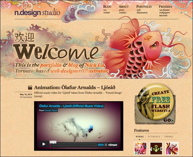
N.Design Studio

old design N.Design Studio

new design N.Design Studio

The project site N.Design Studio was always very bright, expressive and powerful in terms of design (which they say "showmanship"). Despite all the advantages of the old design become boring.

The new version of the design is small enough in common with the previous one. However, done very cleverly, keeping the continuity of the least of it. The new design may be surprised (those who are accustomed to the old), but leaves the impression of an extremely favorable.

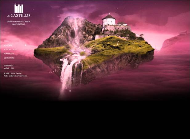
DelCastillo

old design DelCastillo

new design DelCastillo

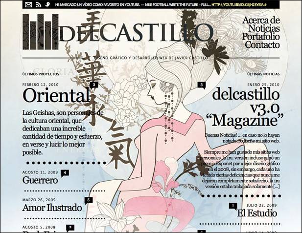
Designers working on DelCastillo decided on a bold step. The original version of the site showed a quiet traditional design and layout, the new version - a bold, "the log" layout, typography and vivid emotion. Such a redesign may be called for something extreme, but nevertheless, most successful rather than vice versa. In recent typography in web design is more and more weight, probably, the authors decided to comply with the new fashion trends.

Design Cubicle

old design Design Cubicle

new design Design Cubicle

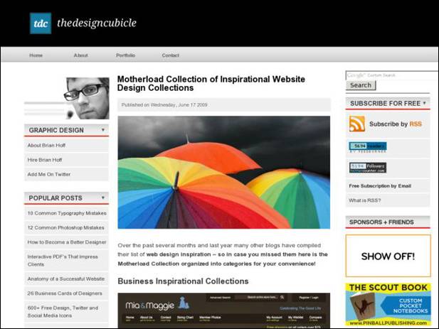
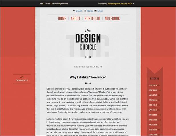
The first thing that catches your eye in the new design Design Cubicle - considerably fewer elements. The second - the design is almost centered. The new design "easier", more convenient, while brighter (even if you do not confuse the bright umbrellas in the screenshot with the old design - it is an illustration of the post, not a design element). The desire for minimalism and concentrating attention solely on the contents - is also very popular for modern web design.

Carbonmade

old design Carbonmade

new design Carbonmade

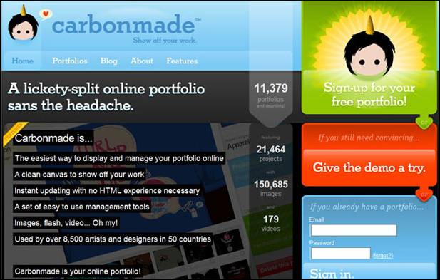
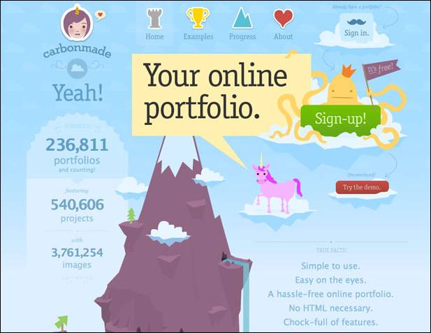
The new version of the design Carbonmade also very different from the previous one. The old version was obviously too heavy (which was the fault of mourning, a vast gray area under the cap). The new design is based on the idea of graphic (in the center of the mountain, rich in illustration), it is more clear, positive and creative. Visually looking at the page of the site, personally I remember such a thing as infographics , which is often used in the design for the presentation of information.

I often want to do for his redesign of the blog, sometimes almost dramatically change everything. Unfortunately, this is not a quick and easy process, so until that time is not enough, perhaps in the future, I still come to that.

Read More →

Create a portfolio with the help of online service Portfolios

Online-Services , a designer , an overview of services , useful websites , portfolios .

For working on the "free bread" designer, animator, photographer, or any way that does not define a good chance to get an order (or job) as having an attractive portfolio. Previously, portfolios were largely on paper or shown with the help of his computer, the trend of today (especially if you are looking for a job on the internet) - on-line portfolio.You'll notice that almost every site contains a freelance exchanges the ability to upload and showcase their work, but what if you want to create their personal online portfolio, which is independent of any internet projects.

Create your own online portfolio in several ways. The most difficult and time-consuming way - buy a domain and create his own website on it. The easiest - use the service to create a portfolio Portfolios ! In the first case, of course, you will have almost limitless options for customizing the functionality and appearance, but, unfortunately, without any special knowledge of development of sites here will not do (or the cash outlay). Option number 2 - a very interesting solution, which propose to examine in more detail.

Online Portfolio

So, Portfolios - an online service through which a person's creative specialties (painter, designer, makeup artist, illustrator, flasher, etc.) can easily create a free and fully customizable portfolio site.

In the Portfolios you can (just a few possibilities):

  • Choose a variety of design layouts and customize them;
  • Upload images and high resolution without compression (you can load multiple images at once);
  • Post videos and Flash (for use with the popular video service YouTube and Vimeo Video Hosting just point the downloaded video link);
  • Connect your own domain;
  • Use your own logo;
  • To study the statistics of attendance;
  • Maintain your own blog on the Portfolios;
  • Communicate with other members of Portfolios;
  • Add a comment, discuss and evaluate the other portfolios.

In fact Portfolios combines the two mediums. The first - a personal portfolio management mechanism online, where you can perform all configuration, installation, download pictures and files. The second - the site itself portfolio, which saw customers. To better understand what are the portfolio in Portfolios, worth looking at some examples:

online portfolio

And, of course, the same video with a demonstration of all the features of the service Portfolios.


Portfolios not only provides an opportunity for everyone to create their own professional looking portfolio (of course, the content on your conscience.) This is one of its kind social networking site for professionals and even a blog-hosting service. The most important thing - the service, of course, can bring huge benefits to freelancers. So the people of creative professions are obliged, to get to the Portfolios Portfolio!

Read More →

May 31, 2012

Fullscreen Background Image Slideshow with CSS3

CSS3 technology is becoming increasingly popular, and things that are realized with its help, all the more impressive and exciting. Today a post about one of these methods. I was there very much impressed with the output image to full screen browser. In a sample of "epic" and large-scale high-quality HD images created a very cool effect. So recently came across a small network of CSS3 tutorial that allows you to place in the background of a slideshow of pictures on the screen, and with some animation.

CSS3 background slideshow tutorial

In addition, the page displays the title picture, and also with CSS. It looks very cool! Although the need to clarify that it will work only in browsers that support CSS animation. So there you go:

Page Layout

For our slideshow will use an unordered list, where each image tag adding Span, and the DIV will be available heading.

<ul class="cb-slideshow">      <li>          <span> Image 01 </ span>          <div>              <h3> re · lax · a · tion </ h3>          </ Div>      </ Li>      <li> <! - ... -> </ li>      <li> <! - ... -> </ li>  </ Ul>

For each element of Span will be a certain fixed background image (background image) for the slideshow.

CSS styles

First you need to set the styles for the list itself - it will be a fixed position, but stretched to the whole scope. Also used: after pseudo order to locate a picture (with effect) over the image:

.cb-slideshow,  .cb-slideshow:after {      position: fixed;      width: 100%;      height: 100%;      top: 0px;      left: 0px;      z-index: 0;  }  .cb-slideshow:after {      content: '';      background: transparent url(../images/pattern.png) repeat top left;  }

The code used by the repetition of style. Cb-slideshow with image effects for images, though you might as well try to place a gradient.

Span, containing the background image will be positioned absolutely and have a height and width of 100%. Since it is within the specific text, make transparent color as we do not want it to display. Background-size property with a value of cover will make sure that the background image cover the entire area of ​​the element, which in turn stretches the full width of the visible screen. Transparency is set to 0, this will be changed even when the animation.

. CB-Slideshow li Infinite linear 36s 0s ; }                                                                                                                  

The animation for each Span will last at least 36 seconds and run an infinite number of times. But first consider how to resolve the issue with the display headline:

. CB-Slideshow li Infinite linear 36s 0s ; } . CB-Slideshow li div H3 { font-family : 'BebasNeueRegular' , 'Arial Narrow' , Arial , sans-serif ; font-size : 240px ; padding : 0 ; line-height : 200px ; }                                                                                                                                                 

The animation for the header block will last 36 seconds.

Further, the CSS styles should be defined background images for each Span and delayed animation (animation delay) so that each of the following picture and caption appeared in 6 seconds after the previous one.

.cb-slideshow li:nth-child(1) span {      background-image: url(../images/1.jpg)  }  .cb-slideshow li:nth-child(2) span {      background-image: url(../images/2.jpg);      animation-delay: 6s;  }  .cb-slideshow li:nth-child(3) span {      background-image: url(../images/3.jpg);      animation-delay: 12s;  }  .cb-slideshow li:nth-child(4) span {      background-image: url(../images/4.jpg);      animation-delay: 18s;  }  .cb-slideshow li:nth-child(5) span {      background-image: url(../images/5.jpg);      animation-delay: 24s;  }  .cb-slideshow li:nth-child(6) span {      background-image: url(../images/6.jpg);      animation-delay: 30s;  }     .cb-slideshow li:nth-child(2) div {      animation-delay: 6s;  }  .cb-slideshow li:nth-child(3) div {      animation-delay: 12s;  }  .cb-slideshow li:nth-child(4) div {      animation-delay: 18s;  }  .cb-slideshow li:nth-child(5) div {      animation-delay: 24s;  }  .cb-slideshow li:nth-child(6) div {      animation-delay: 30s;  }

Now consider the animation process in more detail. Span elements set the animation 36 seconds. During this time, the transparency will vary from 0 to 1 when the animation reaches 8%. More transparency is preserved until we reach 17%. After 25% it should again be equal to zero and remain so until the end.

Where did these numbers? - Let's deal. We want to see each image was 6 seconds, besides, after passing through the whole cycle again, should be shown the first picture. Since the commonly used 6 images, for a total take 36 seconds. Now we need to set the appropriate values ​​of time for transparency. Given the fact that the second frame (picture) animation will start in 6 seconds, we need to know what percentile of the animation should be shown for the first picture. Divide 6 by 36 and get 0.166 ... that would be 16% for our step parameter keyframe.Now, since we do not want to order our image just disappear all the time, we define an intermediate step, which is equal to half of the previous value, that is 8%. The bottom line is that the picture seemed to completely disappear gradually after 17%, respectively, and completely disappeared by 25%. (Ed. - here, of course, have a little pomozgovat and deal with all the subtleties of animation and mathematical operations. If you want to use to use the code "as is" - just place it in style or make similar calculations).

@ Keyframes imageAnimation                                                                               

Similar calculations apply to animate the title, the only thing that make the Cape a little faster so that he disappeared, so the transparency of 0 to 19%.

@ Keyframes titleAnimation {       0%  { Opacity :  0  }       8%  { Opacity :  1  }       17%  { Opacity :  1  }       19%  { Opacity :  0  }       100%  { Opacity :  0  }   }

For all web browsers that do not support animation, we only show the last image slideshow by setting the transparency of the Span to 1.

. No-cssanimations  . CB-Slideshow li span {       Opacity :  1 ;   }

Finally you can take care of the font size when viewing area smaller. We will use the media queries in order to set the font smaller for certain values ​​of the width.

@ Media screen and (max-width: 1140px) {       . CB-Slideshow li div H3 {  font-size :  140px  }   }   @ Media screen and (max-width: 600px) {       . CB-Slideshow li div H3 {  font-size :  80px  }   }

Perhaps that's it for the simplest version of a slideshow with background images on the screen. While you can add something in the process of transition between pictures.

Alternative Animation

The following sample code, along with a change in image scale also adds a little twist:

@ Keyframes imageAnimation                                                                                                                        

The title should be "go" to the right (you need to change text-align blocks in the value of right), then get out of moving to the left with the effect of extinction:

@ Keyframes titleAnimation                                                                                                                                   

That is, in principle, and all. On this page you can find the demo (examples) of CSS3 effects. Experiment with different effects and animation for the titles and pictures. It should also be noted that at present the most beautiful and gently slide it will work in browsers with support for Webkit such as Chrome and especially Safari. On the other, alas, can be significantly slowdown, but overall impressions of this picture I think everyone will be good.

Read More →

Learning HTML5 Library specialist

It was a story about how you can make the site more convenient and simple for users. The book was called by the method of Usability by Steve Krug , and was kindly provided by the publishing house "Peter." But this is not the end of our cooperation, in "Peter" seriously interested in improving my technical skills by offering to read something else. I immediately liked the book for HTML5.Technology, we can say revolutionary to some extent, and which is relevant in our time, and I, to my shame, not very familiar with it. And let not a coder, but the work of constantly having to edit someone else's templates, whether the introduction of personal ideas or fix the mistakes of others.

Thus, the book - Learn HTML5. Library Specialist - 272 page paperback about the new Web standard markup documents HTML5. The publication is a translation of the English-language books (successful abroad) by Lawson, B., Sharpe, R., professional programmers that use HTML5 for a long time and know all its intricacies. Fortunately, here you will find detailed specifications and dry language to hundreds of pages, most of the books take very specific examples of working with HTML5. In them the authors are trying not only to show how to use some elements, but also give a detailed explanation of each. We can say that the "Library Specialist" is ideal for web designers or users of the HTML or XHTML, which would quickly learn as a new HTML5.

It begins with the story of what appeared HTML5. It turns out it might not be as many experts have decided that the future layout of web pages for XML. As a result, there were new specifications XHTML, but "full transition" has not taken place. And at the same time a group of like-minded people, where they were independent developers, representatives of Mozilla, Microsoft, Apple and many other well-known companies have focused on the creation of HTML5.Interestingly, a large enough role in the development process itself played a browser, they could (in part) to dictate terms. In any case, if it was a new language, but these or other browsers would not support it, the benefits of this were not enough. Hopefully HTML5 will be the most unique and versatile tool for all (or at least most) of the Internet browsers.

Actually, reading the book, I felt a great interest and even some inspiration about HTML5. Language practically all the main aspects and technological features of the modern Internet. After all, it is strange that during the video and audio content, geo-location applications, complex web projects, many still use the old HTML4 to XHTML, with some improvements. I remember when I was reading a book at the Institute for HTML4 - it was in terms of how this may be, 200 pages, but in the end of useful information from it could make an order of magnitude smaller. There is, in principle, and there was a big deal - tables, formatting, forms, two or three dozen tags, which are assessed at 90% of Internet pages. HTML5 in this plan went much further and it's great!


The book "Learning HTML5. Specialist Library "consists of 10 chapters, covering certain features of the language HTML5.

  1. The basic structure - that which has undergone a change basic structure of web pages, the structural elements of the header, nav, footer, article. A study was conducted of millions of web sites for the definition of what constitutes a modern web, it is not surprising that many of the classes of the elements recur. Now, instead of "inefficient" DIV you can use the notation nav, which allows the browser to understand exactly where the navigation bar, etc.
  2. Text - text formatting has undergone further changes.
  3. Forms - were the new attributes, and types of input data.
  4. Video and audio - a section on working with video content, players, etc.
  5. Canvas - an element allowing to draw in 2D directly in the browser. In basic form it is certainly not impressive and more like an old Paint, but based on it can do cool and more sophisticated applications.
  6. Data storage - Working with web store and SQL databases.
  7. Independent work - the mobile Internet is now virtually everywhere and all, but not always the quality of communication allows you to work with applications online, stand-alone operation - the solution to all problems.
  8. Drag and drop - an overview of the drag and drop.
  9. Geolocation - as I understand it, is not part of specifications HTML5, but discussed in the book as one of the important and interesting technologies.
  10. Messages background calculations and sockets .

In each chapter you will find the necessary minimum of information in order to understand the essence of certain innovations HTML5. Again, the text reads easily and contains lots of code examples with detailed explanation. The book is ideal for learning from scratch, and as a small allowance, which can be continuously from time to time to seek an explanation - it is unlikely you will soon need all the 10 chapters. Order the book "Learning HTML5.Library specialist. "Online can online publishers, Peter, in the same piece of one of the chapters in order to get acquainted with the contents of the product. For web designers uniquely useful thing, even before the introduction of HTML5 in runet will be more than one year.

Read More →

Tips for creating one page websites

For this article I express thanks to them! Subject of one-page sites have not been reviewed, so it will be interesting! 

One-page Web sites have become fashionable and popular - there is no doubt about it. But they do not suit everyone and every organization. Single-site are of interest because they are popular, and if they are made correctly, your website can become successful. But first, make sure that your project is suitable.

A good candidate for a single-site has a large number and volume of content. You only have one page, to get his message across, and only a limited number of tricks, and animations that you can throw before the user loses interest in the site. In addition, most single-page Web sites have non-standard markup. Trying to fit a large amount of content so that it does not look like a disorderly heap of information is problematic.

The potential scope of the single-site are different, but some of the most popular candidates for the use of such sites is the personal portfolio of sites and companies that provide a small amount of products or services. If you have a suitable site, make sure that the chosen strategy is effective for your business and activities. There are certain principles that you must follow to create any website, but the items listed below are especially critical for single-page Web sites.

A. Keep the focus of attention of visitors

Make the audience for everything as simple as possible. If you are considering odnostranichnik as an option for the site, it is likely that you do not have a large amount of content for posting on the site. This is great. We sometimes tend to put on the site of a large number of unnecessary information. One-page sites do not require too much information, because their sole purpose - to hit right on target. If you are a designer who creates portfolio site, submit your best work, and even do not suffer the thought of placing mediocre projects or your side of the business associated with the sale of T-shirts.

Clean your site of all superfluous and only use the information that matters. Despite the fact that this is a good strategy for each site, multiple sites, most can afford a certain amount of extra information, since the user always knows where to find the information they need. in the case of one-page site you have, figuratively speaking, just one shot, if the user does not find the right information out there, you will lose it.

single-site

We have no question that this site sells

odnostraninyh secret sites

This portfolio goes straight to the point. And a wonderful, lovely minimalist design too.

2. Create a visual hierarchy of the site

One-sites have the task not only set the focus of attention of the visitor, but also to present your product or service. If any single-site made an impression on you, then they may have one sole purpose: to present the design of the agency or to draw attention to the upcoming event.

Excellent design and focusable visual hierarchy may help to characterize the purpose of your site. you as a designer, you have the power to direct the visitor look wherever you want it passed. For people naturally notice the large objects in the first place, and small - in the latter. Important objects should not be placed in the bottom of the page and be fine.

Introductory paragraphs, typed in large print, have become so popular in the designer's portfolio site just because they hit right on target and attract those looking for designers. The last thing you would like to see on the website designer - this is what school he attended. But you need to know its specialization, and which design projects he does.

Again, you have only a few invaluable opportunity to convey your message to the visitor. So try to use them correctly. If you realize that you have too much content, so that you can convey your message through a one page, then create a multi-site.

a simple one-page site

Despite the fact that even in this screenshot we see a number of different points of focus visitors' attention, we can say a lot about what is more important.

hierarchy for the site

We can say, what does this company, but the visual hierarchy could be better.

3. clear navigation

Some one-page sites are static pages that redirect visitors to external resources. For example, the musicians on your page can put a navigation option "Video", which will take you to their page on YouTube. There is absolutely nothing wrong, and so is even easier (especially in terms of encoding). The only thing that the visitor needs to know - is that he will be redirected to an external page.

If your one-page site was created to sell a product, a link to "Buy" the buyer sends a payment to an external platform without warning, you may lose some of its customers.

Your goal - to do everything as simple as possible. Redirect the user to external websites without prior notification may cause the user confusion. He might think that the link does not work, or that the link is incorrect. Try to use special icons (a lot of free options available on the Internet), or headers, so the user knows where he will be redirected.

clear navigation Site

Here we see something that you should not do. Link at the top sends you to an external site without warning. This is really confusing.

single-site

Design and code of this site is very unusual. However, all links to external pages are marked with green circles and signed appropriately.

4. Experiment with the design

Now we got to the fun part: the use of a single-page Web site to show yourself and your skills. You do not want your web site was boring or was similar to other web sites - so be bold, experiment. Put the design on a new level - think outside the box. The unusual design draws attention to your product and make it memorable.

One-sites become synonymous with great design, because the work with a large "canvas" opens up great opportunities for you. You can not use the same background everywhere, you can change it for different sections.Often, single-visit sites like browsing magazines or well composed presentation. Use these opportunities.

Create a stunning design: Use large pictures, which fill the entire browser window, or a chic illustrated background.This not only gives you an advantage over other web sites - as a result your site may fall into one of the reviews of web design.

single-site

From this design is breathtaking. He recalled a poster or billboard. And the rest of the site design does not make you disappointed.

one page websites

Cleanliness of the design (and code) is just amazing. It makes you stop and look.

5. Experiment with the code

If you want to show not only their skills in design, but also the skills to write code, the one-page sites allow you to do it. Experience in the development of the code in this case is critical, so pay attention to detail. The code can lift your site to the next level.

Here are a few things that should be addressed: the color and behavior options (especially in selection mode), the look and feel of forms (forms podognka a site design using AJAX and JavaScript); sending data and error messages (here we use the forms and AJAX script), and the location of a table of content (including content on the behavior of the browser window). All this must conform to design and work in concert with the design.

single-site

A wonderful and simple sample code for a single-page site.

single-site

I, of course, biased because I love it when content is loaded into the same box, but the attention to detail in the code here is just incredible, and it can be seen everywhere.

6. Animation

In addition to that mentioned above (care of the details when writing code), you can use code to create an animation on the page. And try not to be boring. Add to your page a sense of life and movement, make her look as if it moves along with the visitor. Add funny animations and transitions of interest to your site really stand out among others.

Languages ​​jQuery and AJAX became standard for animation on the site. No matter what you do: force the content to appear on different sides, or create a background as a slide show - keep the audience involvement in the process of viewing the site.

Animation Online

The background of this site is made in the form of animation. It is difficult to understand what this site, but it looks very neat.

animation of a single-site

Transitions on this web site are made great. I love it!

PS Thanks again to the company perennial for the English translation of this article. It is an original can be found here - 6 Tips to create better one-Page websites . What can be said as a summary. Certainly one-page sites - cool stuff, which has its very serious advantages: such a project can come as no surprise to hold the user to select and highlight it profitable to your site among the hundreds of other ordinary and unremarkable. Therefore the greatest benefit of such odnostranichnikov will be in the field of activity, where the effect of the product is almost the most important task - as an example, we can easily result in portfolio websites of designers and any other creative people. In focus is a bit like flash sites - the concept is similar, but other embodiments.

On the other hand it must be remembered that a small amount of content on the site of the project reduces the chances for promotion in search engines and drive traffic there. So, of course, most major corporate websites of companies should not be in the form odnostranichnikov, except maybe a mini web site (in addition to the subdomain, for example) or creating a project for a fashion company that is moving in other ways - TV channel, radio station, etc. n

Read More →