Main Nav

Showing posts with label tips and tricks. Show all posts

Apr 10, 2013

Boost Rankings With Google Authorship Today

http://cdn.skyje.com/wp-content/uploads/2013/02/google-authorship.jpg

One of the newest tools offered by Google to help businesses stand out in Internet searches is Google Authorship. What it allows businesses to do is to interlink all their content through one easy system that follows them around the internet. Furthermore, it makes companies stand out in searches by placing their logo right next to their content. Not only does this help businesses climb to the top of search results, but it also helps them immediately stand out.


Google rankings are the search engine rankings that drive business in today’s world. Niche market businesses in particular, such as chicken coop manufacturers or 3rd party logistics providers, can really benefit from a rankings boost. All a business has to do is maintain relevant content on their blog and website, and get involved in relevant blogs elsewhere. This doesn’t mean they need to resort to traditionally complex SEO techniques. Google Authorship does all the heavy lifting.

How Does It Work?

Although Google Authorship is specifically designed for writers, it doesn’t mean that a small business can’t act as a writer. The internet is all about content. The only difference is in how the content is presented. Most businesses today are also blog content providers, and searches for meaningful content related to their market are powerful drivers of new traffic, which can easily be converted into new clients.

Setting It Up

Setting up Google Authorship is incredibly simple. The first step is to sign up with Google+. When setting up your company profile, make sure to include the logo as the profile picture. This Google+ page should be treated as a primary marketing tool in its own right.


The second thing you’ll need is a blog or a place online to fill with intelligent, industry-relevant content that can drive traffic. The most popular choice today for blog content is WordPress, but Authorship can be added to any byline on any website just as easily.


Once these two elements are set up, all you need to do is connect WordPress to your Google+ account. This is done by copying and pasting your profile link into your WordPress profile. In the latest versions of WordPress, all you need to do is go into the dashboard and look for the appropriate box, marked Google+.


The final step is to link your blog right back to Google+. You do this by entering the “Edit Profile” screen in your Google+ dashboard. Look for “Contributor to” and edit the list by adding your blog URL and any other website URL that contains your content.


That’s all there is to it. Wordpress versions 3.5 and up make it extremely easy to integrate Google Authorship.

Read More →

Jun 2, 2012

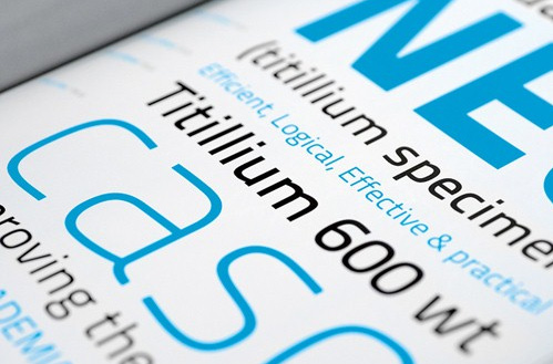
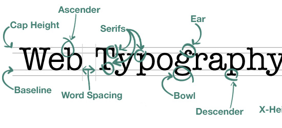
9 Tips on Typography Site

Typography for the Web site - quite an important design element, which is expressed in runet somehow not very much. This question is often raised in the English-speaking foreign design blogs, we have virtually no attention is paid to him. No, of course when you create the layout, most designers think of the site typography - fonts, design, but it is very modest and small. Because, probably, in runet can count on one hand the number of projects with a bright and creative custom typography, more than the standard dull "gray" design: (Maybe that's why Dmitry Naumov decided to share an interesting guest post about typography. Dima in combination, by the way, is author of a very useful project Converlab - "Design. Usability. Conversion." So, 9 boards typography Web site:

A. The choice of font

The choice of font depends a great deal. Type design determines the mood passes 'character', and indeed has a strong influence on perception. Choose the font that matches the style and concept of your site. For example, a "traditional" design goes a traditional serif font like Times Roman, for the "modern" design can go sans serif font - Arial or Helvetica;

Two. Font Size

Particularly important is the font size of the main body of the text. Title (subtitles) can be grotesquely large and clunky, but the main text should be comfortable, which is possible only if the optimal size. This is usually 12-16 px;

Typography

Three. The set of styles

The font should not be monotonous, gray mass is not nice to read. Develop a system of styles for headings and subheadings (H1, H2, H3, etc.), quotes the main text and the like. Use a different font sizes, options for the mark, perhaps to contrast these to use another font (especially for headlines or quotes);

4. Emphasis

Important places in the text must be allocated - bold or italic. The main thing is not to overdo it. Focus on that and he later emphasized that the dosage should be used;

Typography site

Five. Column Width

In traditional typography great attention is paid to the width of the column, for this reason that the text is divided into columns in newspapers and magazines. If the string is too long to read it is not convenient. Because you have to look too far to translate from the end of one line to the next. Short Line is also not good. The optimal length of the string is in the range 70-140 marks;

6. Leading (Leading)

Leading (Leading) - the distance between rows. If it is small, it affects the readability. Too big, too, Leading promises nothing good. In general cases, you will probably be the best spacing for 2-4 points more than the size of the font;

7. The general structure of the page

Ideally the page should be used a single grid. Thus it is possible to achieve a harmonious form of the whole site.Try to use common rules and styles (which you have come up with) on the whole site;

Eight. Color and contrast

The text should be readable, so he must be a contrast. It is better to use the classic black and white decision, it has the best possible combination of contrast, so the most convenient for reading. The remaining combinations to be tried with caution otherwise you risk to make one of the common mistakes of web design .

9. White space

White space - it is not void, but an important design element. It should not be too closely to mold elements, always leave a little "air". Thus it is possible to achieve a clean, light, nice design.

-

First of all, thanks for the post of Dime. All told briefly and in substance, in fact, develop the theme can be infinite for each item. I think part of the answers can be found on its website Converlab . Also, on my own I wanted to add that if you really decided to do something, "such things" in terms of typography site, you would be advised to view the work of the various collections on the Internet with the original decisions. This is very inspiring, but also contributes to the emergence of creative ideas.

Read More →

Six Basic Steps of Site Development

I was here recently in the comments said that some positions do not correspond to the format of the blog, which is positioned just a useful resource for web designers. If you want a competent and professional approach to the process of developing store websites, it is necessary to need good ecommerce hosting for best performance of site. On the one hand, it is really a lot of attention paid to the graphical editor, for example, photoshop, but on the other - this is also part of the work, and no small. However, today decided to publish a post that would be willing to partially satisfy the read something about creating websites. In this case a web design, I decided not to limit, and consider more broadly.

If you want a competent and professional approach to the process of developing websites, it is necessary to take into account all the details and carefully consider all stages of the project . In this case, nothing can be overlooked, even though developers are often guilty of this. As for the "stages of creation," then perhaps they can each have their own, that depends on who and how used to work. Nevertheless, there is a list of common (recommended) items that it would be desirable to perform. In any case it is useful to define for itself a clear structured plan to ensure that no detail is not overlooked.

Typically, a workflow on a project is as follows:

  • The study of the issue;
  • Design, concept development;
  • Design;
  • Create a site;
  • Launching the site;
  • Support for the site;

As a source of inspiration was used by this article . Let's look at each step in detail.

Study

"Why learn something?" - You ask - "we are enough experienced people." In fact, this is one of the most important steps. You may be an experienced developer but nothing has been understood in a "women's shoes," which will be dedicated to the site. Therefore, before proceeding to phase development of the site you must have an understanding of the subject and the subject site which will be dedicated. Not that the need to delve into all the details of this niche, explore a variety of models of women's shoes, simply estimate the basic features and nuances of the subject area.

When you're designing a site for a client, take as much time as the initial communication with the client. Need to know about the goals and objectives, timelines, target audience, the proposed budget and other matters. Get as much information. At the end of this stage you should have a clear understanding of what is required of you. This difficult task can help you such a thing as a "brief." This is something like a list of standard questions on the future of the project, where you can learn the preferences and wishes of the customer. Of course, "Brief for the development of the site" will not replace personal contact with the client, but can be used in the initial stages of cooperation - straighten it by mail, or to make a survey over the phone. In the "brief" can include various issues - from the audience of the project, the proposed budget to personal preference in design and functionality of the site.

The overall design, layout

Once you have decided on the goals and objectives, you can begin to develop a basic layout . This phase can start by visiting competitors' sites. Surely someone has done something similar to you. Therefore, the first task - to study the best examples of sites on the same (or similar subject) and note for themselves the advantages and disadvantages of each. Given the experience of competitors, you can proceed to breynshtormu in which you need to determine the overall design concept, the basic elements, colors, fonts and so on. Do not forget at the same time, of course, and the wishes of the customer.

The last stage of the design - a sketch of the framework. It can be done on paper, by using special programs and services. If you're working with a client, be sure to confirm the layout of your base before you move on. In principle, in my practice, I saw that "the basic outline of the layout" is not always approved. An exception may be considered a design of logos, where it is important to understand just which direction to go. But as for the design of sites, not all customers can understand something from scratch is usually determined by the basic site structure, layout and color blocks. Although to some extent, it can be considered a "sketch" :)

Site Design

design development siteIt's time to "build on our frame of meat." Many designers and developers are just beginning to this stage, ignoring the "study questions" and "layout". In my opinion this is not entirely wrong, rather, that the preparatory steps you will work much easier and more efficient - all the basic questions and decide for yourself the details before, but now concentrating on building design. Thus, studying the subject and having passed through the stage of creating a simplified layout, you have pre-determine the content and then do not miss anything of the kind. Design - this stage of the determination of the shape in which you clothe your content, it details the layout.

Typically, such a design is created in Photoshop or another image editing program. The finished design should virtually match the final product (the elements, colors, images, fonts), except that the text can be inserted until the staging. It should be remembered that the design development includes not only the main page, you must also develop a sub, and maybe "alternate versions" for mobile devices, or any other special purposes.

Always confirm the finished design with the customer before continuing to the next step. Then go back and redo it will be harder (more time consuming). Be sure to pay attention to this nuance of the customer - imagine yourself that you have completed all work on the coding or installing the cms, but here the client suddenly changed his mind about the design. This, of course, it happens, but it should be to minimize risk.

Created by

At this stage we need a "picture" (detailed design) to make a living site. This stage is different from the webmaster varies considerably. It all depends on how, on what basis and for what CMS (if any) you write the code.Experienced artists are usually already have a pre-made "blanks» HTML / CSS, so after "cutting" the necessary elements in Photoshop, the process may take a markup is not too much time. Do not forget in this beautiful andcorrect HTML layout .

After writing, debugging, testing in different browsers, validation and error correction, you can proceed to the next step. Incidentally, after this stage I personally also give the result of the customer for approval, if the site is developed on the cms typo3 where you want to connect (to adapt) the generated HTML in the admin. If we talk about wordpress , then there is probably better to create a template without the "pre-layout".

Launch Site

If your site is perfect, "tweaked", and all works perfectly like it, you can finally publish it. Do not forget to check out all the good (good to have on this case prestart checklist), after the upload to the hosting site via ftp, once carefully all potestiruyte. In principle, you can do immediately to create the site hosting - in this case, first, do not have to "relocation site" from the local machine, and secondly, all tested in the real in the real world (and host settings), in- Third, the customer can monitor the process performance.

Site Support

It is not in the literal sense of the word stage of development, but to resolve the issue of support and further development costs in advance - will you address this issue, or the customer will be able to do everything himself.In addition, after the date of the site, developed by a management system (CMS) should provide the client with documentation on working with her, or a little training.

Read More →

May 31, 2012

Use of Texture in Web Design

What is the easiest, right, and sometimes the only way to create the illusion of relief of a particular element (object) in web design (as well as in 2D as a whole, and of course 3D)? That's right - use a texture! Being a "material" universal, textures are widely used in web design and is the subject of endless experimentation.Patterns can be found on the websites as simple, which only emphasizes certain elements of the project, as well as more complex implementation. Inspired by the publication of this review suggest several options for the use of textures:

"Fine," the use of texture

Do you want to diversify a simple solid color or gradient background - add a "light" texture that will not be glaring and sharply contrasting, but at the same time, complicate, and ennoble the background. It will also highlight some certain sites, attracting the attention of the user.

An example of the use of textures in this way can serve as a site LogoGalas. The site uses different variations of the blue color as the background and fonts, a dark band above the background with the menu and the search for the rest of the pages lighter.

a little texture

Pay attention to the barely discernible texture in the upper part of the site (where is the logo and top navigation).An excellent example of skillful work with textures! This helps make the transition between the shades of the background more visible and "interesting".

Another example - the site of W + K Studio. This texture is used in conjunction with the effect of the gradient for the background.

texture on the background

And in this case "easy" and a very simple texture adds depth and "wealth" this very gradient background.

Texture as a "brute force"

In contrast to "thin" a delicate texture that gently adds detail, work well sometimes bright, contrasting textures, giving the basic tone and mood of the song. Most often, these textures in web design used to select the header or add a contrast between the different columns of content on the site. Must be quite accurately refers to the "heavy" texture, as they may distract the user from the content page and draw over all the attention that is not good.

A striking example of a second embodiment of the use of textures - site of Church on the Rock, where "strong" texture used widely enough.

a lot of textures in design

In fact, the entire design (especially in its upper part) Church on the Rock «involved» in the contrasting textures and their interaction: some areas of the site allocated in different textures, as you scroll down you have a conventional one-color background.

No less significant is the site design Narfstuff, where the texture of the background represents the brightest spot.On top in the header is used a lot of different elements and techniques of web design, texture, while some isolated areas of the page.

texture on the site

If you scroll down through the smooth texture of the blur goes to white - good reception of the change to a completely saturated cap "minimalist continued" at the bottom of the web page.

In general, if we talk about the texture in web design, it is very interesting and useful item, it can be achieved quite remarkable results. Personally, I love to add different kinds of textures for blogs because it helps the pattern look more succinctly, effectively, and highlights the main contents of the site. By the way, I advise you to look an article about the original generators backgrounds (Background) - find a couple of useful online services by which you can create a nice texture for the background of a web page. In general, the texture can be achieved using a very different result. Ultimately, all that defines the goal you are pursuing, but there is always a suitable texture!

PS The site Crib blogger you can find an article on how to set the background for the site in html , and many other publications on the design, layout to help novice users. 

Bought a new trendy and expensive device? Immediately advise you to buy a cover for ipad 2 , or else your plate that just will continue his life. 

broken washing machine? - It is better to book a professional repair of washing machines for those who understands that in order not to get in the near future, the new breakdown.

Read More →