Main Nav

Showing posts with label Css. Show all posts

Jun 2, 2012

20 Beautiful Contact forms for Inspiration

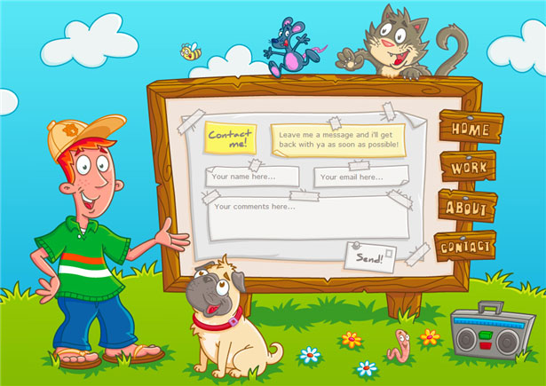
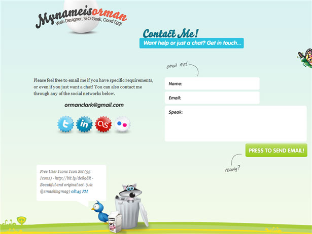
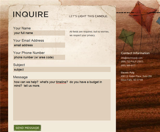
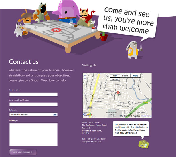
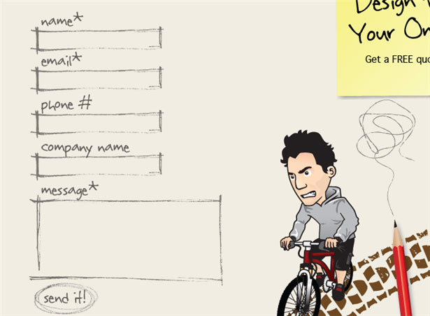
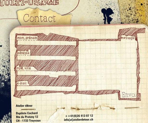
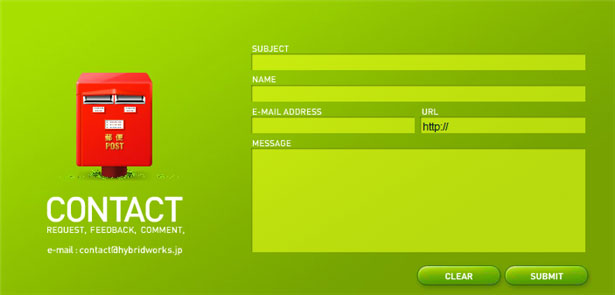
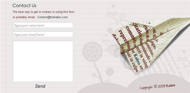
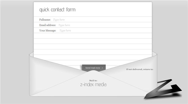
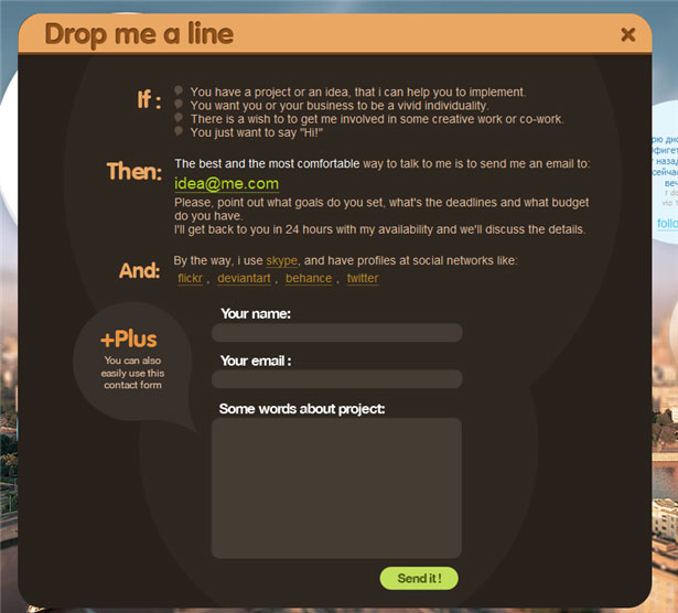
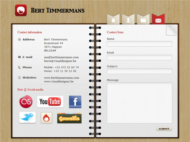
It just so happened that the design contact forms, usually highly do not break my head. Well there is some text fields - the "theme", "from whom» (e-mail), but a form of communication, what do you need? Like anything, but now is not the beginning of the 90s. For a long time no details! Every element, every detail has been actively playing on the image of the site (hence the company), attracts the attention of the reader (consumer or buyer), so now the situation is slowly changing.

Pioneers have always been design agencies, which are traditionally the first to offer something conceptual, innovative. They were beginning to catch up with the rest, there is a trend. Thus, it is now not uncommon sites where contact form is becoming a real "history" or "adventure", and that is the most interesting (or comfortable) place on the site.

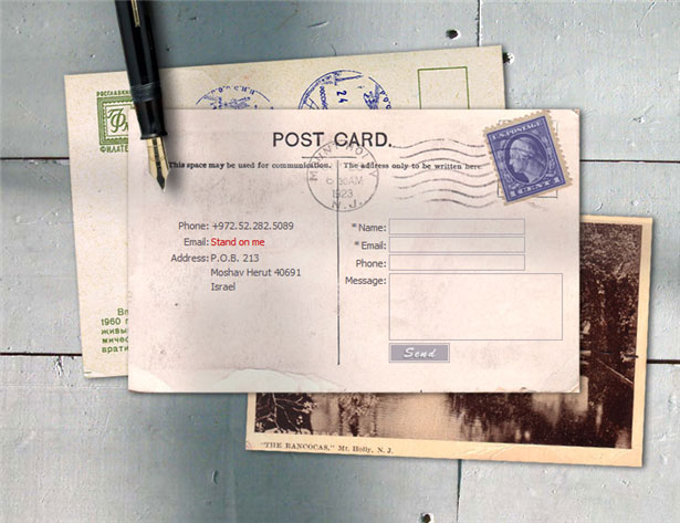
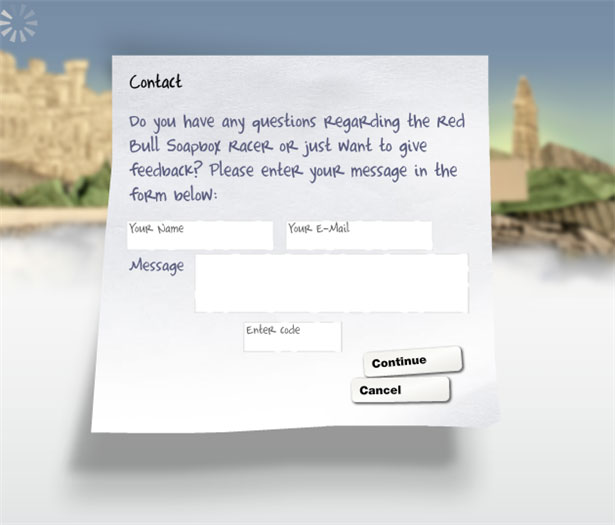
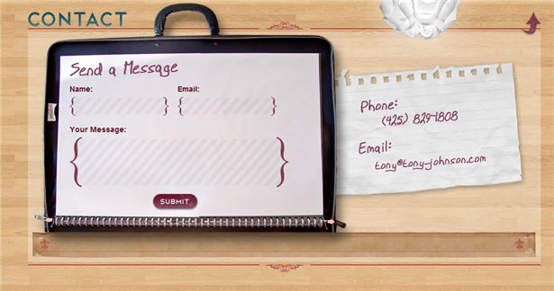
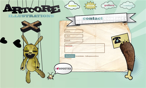
I have prepared for you a few examples with a nice contact forms for inspiration for the original selection thanks to the authors of this article :

Frankly, even I (not a web designer) have the desire to embellish or create an equally original page with the contact form. Especially liked the options, where except for the contact form is a summary of the site (the author), as well as links to social services.

Hopefully, this beautiful collection of contact forms stimulated your imagination and you were some interesting ideas about their own contact form. In RuNet there is little creative examples like (maybe I'm wrong and you correct me?), You have all chances to become one of the first!

Read More →

May 31, 2012

Fullscreen Background Image Slideshow with CSS3

CSS3 technology is becoming increasingly popular, and things that are realized with its help, all the more impressive and exciting. Today a post about one of these methods. I was there very much impressed with the output image to full screen browser. In a sample of "epic" and large-scale high-quality HD images created a very cool effect. So recently came across a small network of CSS3 tutorial that allows you to place in the background of a slideshow of pictures on the screen, and with some animation.

CSS3 background slideshow tutorial

In addition, the page displays the title picture, and also with CSS. It looks very cool! Although the need to clarify that it will work only in browsers that support CSS animation. So there you go:

Page Layout

For our slideshow will use an unordered list, where each image tag adding Span, and the DIV will be available heading.

<ul class="cb-slideshow">      <li>          <span> Image 01 </ span>          <div>              <h3> re · lax · a · tion </ h3>          </ Div>      </ Li>      <li> <! - ... -> </ li>      <li> <! - ... -> </ li>  </ Ul>

For each element of Span will be a certain fixed background image (background image) for the slideshow.

CSS styles

First you need to set the styles for the list itself - it will be a fixed position, but stretched to the whole scope. Also used: after pseudo order to locate a picture (with effect) over the image:

.cb-slideshow,  .cb-slideshow:after {      position: fixed;      width: 100%;      height: 100%;      top: 0px;      left: 0px;      z-index: 0;  }  .cb-slideshow:after {      content: '';      background: transparent url(../images/pattern.png) repeat top left;  }

The code used by the repetition of style. Cb-slideshow with image effects for images, though you might as well try to place a gradient.

Span, containing the background image will be positioned absolutely and have a height and width of 100%. Since it is within the specific text, make transparent color as we do not want it to display. Background-size property with a value of cover will make sure that the background image cover the entire area of ​​the element, which in turn stretches the full width of the visible screen. Transparency is set to 0, this will be changed even when the animation.

. CB-Slideshow li Infinite linear 36s 0s ; }                                                                                                                  

The animation for each Span will last at least 36 seconds and run an infinite number of times. But first consider how to resolve the issue with the display headline:

. CB-Slideshow li Infinite linear 36s 0s ; } . CB-Slideshow li div H3 { font-family : 'BebasNeueRegular' , 'Arial Narrow' , Arial , sans-serif ; font-size : 240px ; padding : 0 ; line-height : 200px ; }                                                                                                                                                 

The animation for the header block will last 36 seconds.

Further, the CSS styles should be defined background images for each Span and delayed animation (animation delay) so that each of the following picture and caption appeared in 6 seconds after the previous one.

.cb-slideshow li:nth-child(1) span {      background-image: url(../images/1.jpg)  }  .cb-slideshow li:nth-child(2) span {      background-image: url(../images/2.jpg);      animation-delay: 6s;  }  .cb-slideshow li:nth-child(3) span {      background-image: url(../images/3.jpg);      animation-delay: 12s;  }  .cb-slideshow li:nth-child(4) span {      background-image: url(../images/4.jpg);      animation-delay: 18s;  }  .cb-slideshow li:nth-child(5) span {      background-image: url(../images/5.jpg);      animation-delay: 24s;  }  .cb-slideshow li:nth-child(6) span {      background-image: url(../images/6.jpg);      animation-delay: 30s;  }     .cb-slideshow li:nth-child(2) div {      animation-delay: 6s;  }  .cb-slideshow li:nth-child(3) div {      animation-delay: 12s;  }  .cb-slideshow li:nth-child(4) div {      animation-delay: 18s;  }  .cb-slideshow li:nth-child(5) div {      animation-delay: 24s;  }  .cb-slideshow li:nth-child(6) div {      animation-delay: 30s;  }

Now consider the animation process in more detail. Span elements set the animation 36 seconds. During this time, the transparency will vary from 0 to 1 when the animation reaches 8%. More transparency is preserved until we reach 17%. After 25% it should again be equal to zero and remain so until the end.

Where did these numbers? - Let's deal. We want to see each image was 6 seconds, besides, after passing through the whole cycle again, should be shown the first picture. Since the commonly used 6 images, for a total take 36 seconds. Now we need to set the appropriate values ​​of time for transparency. Given the fact that the second frame (picture) animation will start in 6 seconds, we need to know what percentile of the animation should be shown for the first picture. Divide 6 by 36 and get 0.166 ... that would be 16% for our step parameter keyframe.Now, since we do not want to order our image just disappear all the time, we define an intermediate step, which is equal to half of the previous value, that is 8%. The bottom line is that the picture seemed to completely disappear gradually after 17%, respectively, and completely disappeared by 25%. (Ed. - here, of course, have a little pomozgovat and deal with all the subtleties of animation and mathematical operations. If you want to use to use the code "as is" - just place it in style or make similar calculations).

@ Keyframes imageAnimation                                                                               

Similar calculations apply to animate the title, the only thing that make the Cape a little faster so that he disappeared, so the transparency of 0 to 19%.

@ Keyframes titleAnimation {       0%  { Opacity :  0  }       8%  { Opacity :  1  }       17%  { Opacity :  1  }       19%  { Opacity :  0  }       100%  { Opacity :  0  }   }

For all web browsers that do not support animation, we only show the last image slideshow by setting the transparency of the Span to 1.

. No-cssanimations  . CB-Slideshow li span {       Opacity :  1 ;   }

Finally you can take care of the font size when viewing area smaller. We will use the media queries in order to set the font smaller for certain values ​​of the width.

@ Media screen and (max-width: 1140px) {       . CB-Slideshow li div H3 {  font-size :  140px  }   }   @ Media screen and (max-width: 600px) {       . CB-Slideshow li div H3 {  font-size :  80px  }   }

Perhaps that's it for the simplest version of a slideshow with background images on the screen. While you can add something in the process of transition between pictures.

Alternative Animation

The following sample code, along with a change in image scale also adds a little twist:

@ Keyframes imageAnimation                                                                                                                        

The title should be "go" to the right (you need to change text-align blocks in the value of right), then get out of moving to the left with the effect of extinction:

@ Keyframes titleAnimation                                                                                                                                   

That is, in principle, and all. On this page you can find the demo (examples) of CSS3 effects. Experiment with different effects and animation for the titles and pictures. It should also be noted that at present the most beautiful and gently slide it will work in browsers with support for Webkit such as Chrome and especially Safari. On the other, alas, can be significantly slowdown, but overall impressions of this picture I think everyone will be good.

Read More →

CSS3 Gradient Button

Every webmaster has heard for a long time, and someone has masterfully applied in practice, new and unique features CSS3. Not so long ago we discussed some interesting text effects , this time it will be a gradient buttons that were created without the use of graphics (pictures), that is, only by means of CSS3. Sam, I found a tutorialhere , you will also offer translation.

Gradient with CSS

So the basic qualities of the future keys (buttons):

  • Scalability (depending on the size of the font and size of the text);
  • Functionality, usability (includes state of the button - normal, hover, active)
  • Backward compatibility (even on old or not compatible browser buttons will look decent, though certainly not as intended. This can be verified at the end of publication);
  • Flexibility (these styles can be applied to other elements, not necessarily for the buttons);

What chips will be used in the process sozdnaiya buttons? The result is achieved due to the gradients, the properties box shadow, text shadow, rounded corners, the regime RGBA.

Structure of HTML

<a href="#" class="button button-blue">      <span> Button </ span>  </ A>

CSS

. Button   {       margin :  10px ;       text-Decoration :  None ;       font :  bold  1.5em  'Trebuchet MS' , Arial , Helvetica ;  / * Change the EM value to scale the button * /       display : inline- block ;       text-align :  center ;       Color :  # FFF ;         border :  1px  Solid  # 9c9c9c ;  / * Fallback style * /       border :  1px  Solid rgba ( 0 ,  0 ,  0 ,  0.3 ) ;                     text-Shadow :  0  1px  0 rgba ( 0 , 0 , 0 , 0.4 ) ;         box-shadow: 0 0 .05em rgba(0,0,0,0.4);      -moz-box-shadow: 0 0 .05em rgba(0,0,0,0.4);      -webkit-box-shadow: 0 0 .05em rgba(0,0,0,0.4);     }     . Button ,  . button span   {       -moz-border-radius :  .3 EM ;       border-radius :  .3 EM ;   }     . Button span   {       border-top :  1px  Solid  # FFF ;  / * Fallback style * /       border-top :  1px  Solid rgba ( 255 ,  255 ,  255 ,  0.5 ) ;       display :  block ;       padding :  0.5em  2.5em ;         / * The background pattern * /         background-image: -webkit-gradient(linear, 0 0, 100% 100%, color-stop(.25, rgba(0, 0, 0, 0.05)), color-stop(.25, transparent), to(transparent)),                        -webkit-gradient(linear, 0 100%, 100% 0, color-stop(.25, rgba(0, 0, 0, 0.05)), color-stop(.25, transparent), to(transparent)),                        -webkit-gradient(linear, 0 0, 100% 100%, color-stop(.75, transparent), color-stop(.75, rgba(0, 0, 0, 0.05))),                        -webkit-gradient(linear, 0 100%, 100% 0, color-stop(.75, transparent), color-stop(.75, rgba(0, 0, 0, 0.05)));      background-image: -moz-linear-gradient(45deg, rgba(0, 0, 0, 0.05) 25%, transparent 25%, transparent),                        -moz-linear-gradient(-45deg, rgba(0, 0, 0, 0.05) 25%, transparent 25%, transparent),                        -moz-linear-gradient(45deg, transparent 75%, rgba(0, 0, 0, 0.05) 75%),                        -moz-linear-gradient(-45deg, transparent 75%, rgba(0, 0, 0, 0.05) 75%);         / * Pattern settings * /         -Moz-Background- size :  3px  3px ;       -webkit-Background- size :  3px  3px ;   }     .button:hover  {      box-shadow: 0 0 .1em rgba(0,0,0,0.4);      -moz-box-shadow: 0 0 .1em rgba(0,0,0,0.4);      -webkit-box-shadow: 0 0 .1em rgba(0,0,0,0.4);  }     . Button : active   {       / * When pressed, Move IT down 1px * /       position :  relative ;       top :  1px ;   }

Blue button

. Button-blue  {      background: # 4477a1;      background:-webkit-gradient (linear, left top, left bottom, from (# 81a8cb), to (# 4477a1));      background:-moz-linear-gradient (-90deg, # 81a8cb, # 4477a1);      filter: progid: DXImageTransform.Microsoft.gradient (GradientType = 0, startColorstr = '# 81a8cb', endColorstr = '# 4477a1');  }     . Button-blue: hover  {      background: # 81a8cb;      background:-webkit-gradient (linear, left top, left bottom, from (# 4477a1), to (# 81a8cb));      background:-moz-linear-gradient (-90deg, # 4477a1, # 81a8cb);      filter: progid: DXImageTransform.Microsoft.gradient (GradientType = 0, startColorstr = '# 4477a1', endColorstr = '# 81a8cb');  }     . Button-blue: active  {      background: # 4477a1;  }

Compatibility with different browsers

  • Mozilla 3.6 and above - full compatibility, the buttons are displayed exactly as they are designed with all the details.
  • Google Chrome, Safari (Webkit) - no problems found, the overall result is not worse than Mozilla.
  • Opera 11 - unfortunately, the gradient does not appear at all, well at least that the rounded corners are interpreted as necessary.
  • Internet Explorer 08/06 - in this case the problem is, on the contrary, with rounded corners. The gradient is present.
  • Internet Explorer 9 - the situation is somewhat better than the browsers from Microsoft and past generations, but still the result is not as good as in Mozilla or Chrome.

Well, I have that's all. Now you can choose to use gradients for Photoshop , or do only with CSS. Study the possibility of CSS3, it's worth it! With HTML5 so all you can do wonders, has recently found a collection of different techniques and was very pleasantly shocked case examples.

Read More →

CSS3 Background/css3 pattern

New features CSS3 today allow you to implement what had been possible to do only with the help of a graphical editor (eg, Photoshop). Therefore, the modern web designer enough to get acquainted with new features done, we must also review the approaches and learn how to creatively use these features.

To develop these skills have always helped the analysis of practical examples. Want to find out how to create sophisticated seamless patterns? No problem! In this case you will provide invaluable assistance to the draftCSS3 Patterns Gallery .

patterns CSS3

Gallery patterns CSS3 Patterns offers you 18 examples of virtuoso use of Cascading Style Sheets. Looking at some of them hard to believe that they were created solely by means of CSS, however, the way it is. There are backgrounds in the style of carbon fiber, brick walls and a checkerboard, as well as with stars, hearts and various bars and cells. And what is most interesting - these and other images are available through CSS turned off, even with the pictures in the browser.

What can you do with this good? In its simplest form, just borrow a favorite pattern to use it in a proper project.But if you go ahead and take the time out to sort out how each pattern is created, then a lot to learn!

Gallery patterns CSS3

A small technical comment about compatibility: in general, the patterns are well displayed on the IE 10, Firefox 3.6 +, Opera 11.10, and other modern browsers, however, sometimes some details may not display correctly. On older browsers (eg, Firefox 3.6 and below) the likelihood of problems a little higher.

By the way, you can send your design to the site administrator, and if it is really interesting, it must be published.Learn new CSS features and show off your achievements!

Read More →

Full page Background Image Resize from Css3

Web technologies, as well as various trends in design, do not stand still, so every time there's some new chips and nuances for the sites. One of these trends include the use of the background (backgorund), which is stretched to full screen width and height. Something like a year ago or more I'm told how to make a great backdrop for the site through CSS - Image placed in a hat blog and smoothly "passed" in the main background color of a web page.Placement on the background of a large scalable images - this is something new and more complex work, whose solution found in this article .

Background to site

The purpose of this lesson, place the background image on the site, which would permanently shut the entire background of the browser window. What exactly needs to be done:

  • fill the whole page with one image with no spaces;
  • resize images as needed (reduced browser window)
  • maintaining the image proportions;
  • location of the image in the center of the page;
  • no scroll bars on the page;
  • cross-browser solution, suitable for different browsers;
  • implementation without any third-party technologies such as flash.

Thus, there are several suitable solutions for the background site on the entire screen.

A wonderful, simple and innovative solution using CSS3

To realize the problem we can use the background-size property in CSS3. We use the html element that is a better body. Establish a fixed and centered background, after which we will use the background-size value of cover.

html {          background: url(images/bg.jpg) no-repeat center center fixed;          -webkit-background-size: cover;          -moz-background-size: cover;          -o-background-size: cover;          background-size: cover;  }

The solution supports almost all browsers are popular in the network:

  • Firefox 3.6 + (Firefox 4 supports non-vendor prefixed version)
  • Opera 10 + (Opera 9.5 supports background-size but not the values ​​of cover)
  • Chrome Whatever +
  • IE 9 +
  • Safari 3 +

Goltzman found a solution that allows you to work in IE hack

sizingMethod = 'scale') " ;               

But attention! while there may be some problems with the links on the page. By the way, a little later Matt Litherland added that the code is, in principle, can be used but this can not be used html or body elements and the need to implement all of a div with 100% width and height.

CSS -hack # 1

Is an alternate version of Doug Neiner. In this case, use the built-in page element <img>, which can be resized in any browser. Set the value of min-height, which helps to fill the browser window vertically and put a 100% width, which fills the page horizontally. Also set min-width so that the image has never been smaller than it actually is.

Next option is used to hack @ media to test whether your browser window smaller than the image and use the percentage of properties left and margin-left align image center.

img . bg  {           / * Set rules to fill Background * /           min-height :  100% ;           min-width :  1024px ;             / * Set up proportionate Scaling * /           width :  100% ;           height :  auto ;             / * Set up Positioning * /           position :  fixed ;           top :  0 ;           left :  0 ;   }     @ Media screen and (max-width: 1024px) {/ * Specific to this Particular * Image /           img . bg  {                   left :  50% ;                   margin-left :  -512px ;    / * 50% * /           }   }

Works in all versions of high-quality browser - Safari / Opera / Firefox and Chrome. For IE, as always has its own nuances:

  • IE 9 - works;
  • IE 7/8 - often functioning properly, but centers the image is smaller than the browser window;
  • IE 6 - can be customized, but who needs this browser.

CSS -hack version 2

Another variant of the solution by using CSS styles is to place the image inside the page with a fixed position in the upper left corner, then set the min-width and min-height to 100% while maintaining aspect ratio.

<img src="images/bg.jpg" id="bg" alt="">
# Bg  {           position : fixed ;           top : 0 ;           left : 0 ;              / * Preserve aspet Ratio * /           min-width : 100% ;           min-height : 100% ;   }

However, it is not possible to center the image, which, in principle, I would like to do. Therefore, we add an external image for the DIV. It is twice as large than the size of the browser window, and then the picture will keep the aspect ratio, close all your browser window and still be in the center.

<div id="bg">          <img src="images/bg.jpg" alt="">  </ Div>
#bg {          position:fixed;          top:-50%;          left:-50%;          width:200%;          height:200%;  }  #bg img {          position:absolute;          top:0;          left:0;          right:0;          bottom:0;          margin:auto;          min-width:50%;          min-height:50%;  }

Hack works:

  • Safari / Chrome / Firefox (very early versions were not tested, but in the latter works well)
  • IE 8 +
  • Opera (any version) and with both IE both are equally buggy with an error of positioning.

The method of jQuery

This option is much easier (in terms of CSS) if we know that the aspect ratio of the image (img is used as the background) is greater than or less than the current ratio of the browser window. If less, then we can only use the width = 100%, while the width and height of the window will be equally populated. If there are - you can specify only the height = 100% to fill the entire window.

Access to all data goes through JavaScript, use the following codes:

<img src="images/bg.jpg" id="bg" alt="">
# Bg  {  position :  fixed ;  top :  0 ;  left :  0 ;  }   . bgwidth  {  width :  100% ;  }   . bgheight  {  height :  100% ;  }
$ (Window). Load (function () {                 var theWindow = $ (window),              $ Bg = $ ("# bg"),              aspectRatio = $ bg.width () / $ bg.height ();             function resizeBg () {                     if ((theWindow.width () / theWindow.height ()) <aspectRatio) {                      $ Bg                          . RemoveClass ()                          . AddClass ('bgheight');                  } Else {                      $ Bg                          . RemoveClass ()                          . AddClass ('bgwidth');                  }             }             theWindow.resize (function () {                  resizeBg ();          }). Trigger ("resize");     });

In my opinion, centering in this case is not made ​​(as I understand it), but it can be done. Supports most desktop browsers, including IE7 +. Finally the author of articles about hacks prepared a set of sample files, which are all implemented - you can download it here . In comments to the original article, also contains some information and discussion, but most of the important details in the form author added apreytov to the post and I have it also translated and displayed. Of course, to understand all this help and examples. In general, if not permanent, "jokes" from IE7 all these hacks would be ideal.

PS Bzauzery - the main tool for the user on the Internet, and the best firefox plugins to help make it as convenient, fast with new features and capabilities. 

Want to buy a book? - Not necessarily go to the store because it is now online bookstore online store allows you to do everything over the network - to select, pay and arrange delivery to your home.

Read More →

May 29, 2012

13 Free Css Editors Online

In this article you getting Free Css Editors that available online. Css Editors tools is mainly used for not only edit your css also use for HTML editor. I'm choosing Best Free Css Editors online so you can save time from them.

Hi friends, I am the author of the blog designprefix - blog with lessons for beginners and beyond, everyone will find something useful for themselves. On my blog will be able to find their inspiration , join the update, and run in for a visit, always happy.

Absolutely every web designer, webmaster or coder must constantly seek the help of a good Web page editor. With these editors, web developers create and edit HTML, CSS or JavaScript code. For a start may be suitable, such as Notepad editor or TextEdit, but with the accumulation of experience will want to use a more versatile tool for the job. So, let's talk about editors.

Notepad + +

Notepad++

Below there are a text editor that is used by programmers and web designers. The main difference between this editor - it's a good functionality and user-friendly interface. Notepad + + is able to open multiple documents simultaneously, highlight the huge number of programming languages ​​to write macros that automatically complete the text you type, and more. This text editor supports such features as lighting wizard, print mode WYSIWYG, create your own API-file and a huge number of possible functions for working with the dough. Also, the program allows you to connect a variety of plugins that can provide additional functions.

Editor PSPad

Editor PSPad

Editor PSPad is a free text editor designed to simplify the work of programmers. This editor can work with several programming languages. Also, it does not highlight is the problem code. Editor PSPad editor is successfully used with the text of plain text. Distinguishing features: a small tool availability, simple management and an incredibly powerful code editing.

Stylizer - Real-Time CSS Editing

Stylizer - Real-Time CSS Editing

Skybound Stylizer is a WYSIWYG-editor CSS styles, one of the best of its kind, working on operating systems Windows. This utility is able to significantly simplify the work of the webmaster, or rather writing and editing CSS. This editor is designed for those webmasters who are able to go beyond that of a conventional word processors for handling CSS.

TopStyle 4 for Windows

TopStyle 4 for Windows

TopStyle 4 - is the final version of the famous Windows-editor, like CSS, and HTML-code, which was created by one of the developers of HomeSite. What can an editor? TopStyle 4 is able to support Unicode and edit documents via FTP. Also, the editor includes special modifiable toolbar, and various code hints, intended for ASP, PHP, and ColdFusion. More TopStyle 4 supports bookmarks, edit CSS-code in the HTML-attributes, and much more.

Xyle scope

Xyle scope

This program has a unique analysis tool designed for all interested web standards. Through this program, you can deepen their knowledge in CSS and HTML , as well as get detailed information about this or that element with a competitor's site. Also, with the help of Xyle scope you can see their own work, so to speak, with fresh eyes.

Rapid CSS Editor

Rapid CSS Editor

This program allows to easily create and edit cascading pages are located regardless of their size. You can write code tables manually, and can be trusted with a Rapid CSS Editor. The program has a huge amount of support functions, for example, CSS validator. The program includes built-in preview, so the results of this work can be viewed in real time. In addition, Rapid CSS Editor is also a HTML-editor, which can easily work with CSS HTML editing.

Namo Webeditor

Namo

Namo Webeditor is a WYSIWYG HTML editor and is the brainchild of Namo Iteractive. This editor is able to support CSS, HTML, ASP, PHP, and JavaScript technologies. In addition to visual editing program can work with the code by page. If the local server (SSI, Apache), a built-in prog masters are able to create on the computer slozhnostruktuiruemye sites based on MySQL database and using the technology of server-side languages.

EngInSite CSS Editor

EngInSite CSS Editor

This program is designed to handle the styles of CSS. It contains multiple options to view and edit styles, and test them for compatibility with W3 standards. In addition, EngInSite CSS Editor is involved in mapping the entire work in different browsers. This tool is able to check the syntax, contains an internal help system and several other very useful for webmasters lotions.

Arduo Css Editor

Arduo Css Editor

Arduo Css Editor - CSS Editor is a free. It is simple to use and has a pleasant interface, which contributes to the creation of style sheets without manually writing code. This program allows you to view HTML on the dynamics of the impact of a particular style of change. That is, the main feature of this editor is intuitively simple and very user-friendly interface that allows you to save significant amount of time spent at work.

Simple CSS - A Free CSS Authoring Tool

Simple CSS - A Free CSS Authoring Tool

Simple CSS-editor of styles, the main feature is its price - it's free. This program allows the webmaster to work with multiple projects. Just like other similar tools, Simple CSS has a preview function, which can show how it will look the final result. The program is easy to use and has enough features.

PS Thanks for the guest post, you can see that free software lacks full, and many editors are quite functional - meaning no software to buy. I personally use Notepad + + because it also allows you to conveniently enough CSS to edit HTML and PHP files.

Read More →

May 20, 2012

3D background effects with CSS


Optical illusions can be exciting. In particular, when still move to the subject area of ​​web design. There are rather few solutions, and so two different samples appear to be particularly beautiful.

The effect, which you use here is called parallax. Both demos come with detailed explanation and, therefore, so everyone can develop the background and implementation.

You can Get full demo or tutorial of 3D background css effects on below link

Read More →

Typogridphy, Grid Layout CSS Framework


Typogridphy is a framework - yes, again one thing - to create a grid layout, typography, intended primarily for pages.

Basically, I like to start from scratch and like tinkering, but I get along without time pressure and have no time pressure - the advantage when it operates as a hobby.

Why me but Typogridphy like, with this solution, I have the key facts for a CSS layout together, the code lean and fast, I shortened the code on my must-have data. Then you start again, as always, and you feel at home in the code.
Read More →

May 15, 2012

My First Post on My New Site


First of all i want to introduce me. my self Bhagwati & i'm a ui designer & jQuery, Wordpress, Magento, joomla developer means you can say that i'm all rounder in my field. About my blog
www.designprefix.com is dedicated to web designer & developers who want regular updated with new technologies that change every day. www.designprefix.com serve you best of best new collection of tutorial, workout on new technologies sucha as Css3, Html5, jQuery mobile some of wordpress or other type of cms related problems. You can also find out our freebies such as icon set, wordpress themes, wordpress plugin, photoshop psd files, illustrator source file & many more get connect with us for daily updates. or if you need any type of help then contact me via contact form
Read More →