Main Nav

Jun 2, 2012

New Custom Free Wordpress Themes

Surf on the internet in search for a new wordpress themes blog, I got a rather interesting collection of designs.Periodically, one has to look patterns, but these I have not seen - demonstrates a creative approach to displaying content, another shocking variegated color, and the third is ideal for design blog. Which of the following options corresponds to a particular description - guess yourself.

Design Pile

wordpress themes

Download / / demo / / Source

What can we say about this topic wordpress - it is made ​​in a rather nice color, has a non-standard design all kinds of details - the menu of the blog posts, a pleasant and functional footer below. On top of the main displays elected post, but the transition is not a complete text of the article will see a small text about the author. This trend is directly west of blogs after each publication to place these messages. It also supports tree-like comments. If I understand correctly, the archive has three bright colors.

Neutica

custom wordpress themes

Download / / demo / / Source

A very specific theme wordpress, which is a bit shocking color solution. However, I just had some association - first, western union, and secondly, the "yellow pages" - is a tremendous reference information. Actually, you can play a little bit on this and create a project in these destinations, attracting visual attention - is also a useful thing might just need a little muted yellow background. As for the topic, it uses popular font Helvetica Neue, supports widgets, and has a lot of columns to insert information. The efficiency was tested in all popular browsers, make-up - completely valid.

Urban

original wordpress theme

Download / / demo / / Source

Perhaps the most unconventional themes wordpress, which I have ever seen. This will not find even in Wparchive - Archive Premium WordPress themes . Developer Paul Bennett used the idea of displaying posts on the main page according to the timeline (this is best seen in the demo than in the picture in the article). You can scroll through this same line thereby selecting positions for a certain period. As a publication used as a simple text and insert a photo or video. Video is imported from the service Youtube. In addition, the pattern is a search that works and displays the results in real time as you type a search query! No less original is the footer where you can find the latest published and visited your blog posts, a list of pages. In short, the author apparently has realized all the things about for so long dreamed of because the theme wordpress is truly original, unconventional and urban.

And now attention! Continuation of this post and another 3 cool wordpress theme I will publish in its new blog,Inside WordPress . There's also templates you'll find the useful information on working with the system, which come in handy for both novice and advanced users. Only interesting, relevant and useful articles. subscribe to RSS and add a blog site - you will not regret it!

Read More →

Beautiful Free Gothic Fonts

Long time no blog publishing, where you can download something. It is time to correct this tradition, the more that I have found the right material. It's about fonts, but rather a gothic font. There is something in them, "such things" - an ancient and mystical, and in a good and competent use can be achieved simply stunning effects. All these fonts are original and nonstandard priori - if you look at the examples below, you can verify this.

So that's one of a selection of English-language blogs found 15 Gothic fonts for designers. It has been collected from various sites devoted to fonts, such as fonts archive dafont and others. Actually, walked through all the files and added an archive that you may make it easier to download.

Archive Gothic fonts

Gothic fonts

Download ( mirror ) / / Source

Some of the Gothic fonts, perhaps, you already know, some very original and we can say that the new (at least for the first time I see them :) The source indicated the site where the original article was published. There will also find links to archives of the font. I can, in principle, tell what the name of Gothic fonts were included in the archive are:

  • Berliner
  • Blackletter ExtraBold
  • Bridgnorth
  • Cuxhaven Times
  • Dark 11
  • Deutsch Gothic
  • Diploma
  • Endor Alt
  • Manuscript
  • Morpheus
  • Morris Roman
  • Old London
  • Satanick
  • Van Helsing
  • Versal Gothic

A total of 15 Gothic fonts. Quite a decent selection, as for me, the site of the mystical themes - the most it.

Read More →

How to Create Favicon (ico file)

Site without favicon (favicon), as a ship without a flag. Favicon - an integral part of the brand site, its image and identity. By the way, look for the issuance of any search engine (such as Yandex). You will definitely find a number of titles found pages and documents favicon. That is, favicon, it is also a factor which increases click through your site in search results. Therefore, no favicon anywhere!

How to make a favicon? The process can be divided into two stages:

  1. Making favicon or the presence of already finished;
  2. Install it on site.

The first task, as has been indicated, there may be several approaches. If you for some reason you do not want to make favicon yourself, you are too lazy, do not have time or do not know how, and to try and experiment there is no desire, you can find it at one of the sites, libraries, finished favicon. The main disadvantage of this option - hardly your icon will be original. Rather, it is already used in dozens, if not hundreds or thousands of sites.Therefore, in this case, the relevant question: "Do I need a favicon at all?". To me, this element must be unique, even if it is as simple as "3 penny". Therefore, from this version is better favicon refused and made his own hands.Let's stop this process in detail.

Start making favicon can be in a photo editor or by using special service. In the first case does not necessarily seek the help of desktop applications (eg, Photoshop), you can use the free online raster graphics editor . All you need - to create a 16x16 paper and anything on this "canvas" to portray. Fill the background, try to draw something "pencil" or to put any symbol or letter. In the screenshot example of a "masterpiece" that I began to paint using the service  Pixlr :

Pixlr create favion

The result can be saved in the format ". Gif" or ". Png".

For me as a tool to use graphics editor - the organic option, but it is not only because there are special services that can help you draw a favicon. An example would be the site Favicon.cc, which allows you to create an icon in pixels:

Service favicon.cc

This is just one example, in fact there are so many sites - services to create favicon online - free of charge, with the same functionality and for every taste.

Whichever option you would choose, create favicon is not very complex and interesting. Install the same problem does not deliver. Once you've finished, save the icon on your computer, it can be converted into a format ". Ico", or use the files ". Gif" or ". Png". The principal difference will not be just about any option, if desired in the future it will be possible to animate. It remains the last - pour favicon in the "root" of the site (named favicon) and add the code in the head section:

<link rel="shortcut icon" href="put_k_ikonke/favicon.ico" />

(If you have a favicon format other than ". Ico", you must specify the desired type of file)

In this process of creating and installing favicon, can be considered complete. If you need any additional information on the icon, it is possible to look out my article 2 a year ago in another blog - all about favicon.ico icons - most of the data they are still relevant.

Read More →

Online Free Vector Graphics Editor

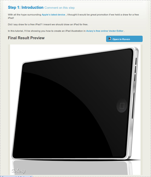
Do you know how to draw a vector line Apple iPad? No? Most likely you do not even know that there is such a powerful on-line vector graphics editor of Aviary's -Raven ! Online applications are constantly evolving, because today they can achieve a good result. Before moving on to the review of this application, I would like to see that developers mougt Aviary boasts not only the product. On this site you can find a collection of useful online services for designers and graphics, which I once wrote in one of his blogs. In addition to online vector graphics editor can find the usual graphic editor, tools for creating effects, working with palettes, and screenshots.

But back to our Raven and Apple iPad - not to be unfounded, the tablet will give an example, drawn with the help of Raven:

draw the Apple iPad

In fact, even today this illustration - not an easy task for an untrained person, even if his hand is CorelDraw or Adobe Illustrator, to say nothing of a web application? But, as you see at the moment it is quite doable task.Moreover, the site Aviary, a simple tutorial, you will learn how to even. But let us still closer look at the editor!

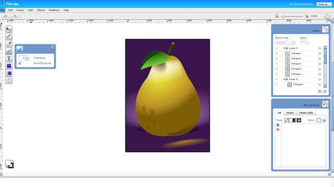
Interfeyc Raven is not as complicated as those mentioned above, CorelDraw or Adobe Illustrator, so the application can be considered even as a testing ground for the study of vector graphics:

online vector editor

Of course, the functional to full vector graphics editor application that far. But do not forget that this is a online service which, by the way supports even things like layers and blend modes (Blend mode).

Complete engine "curves." Working with curves, fills, strokes, gradients and objects is realized at a fairly advanced level (of course, not as in CorelDraw or Illustrator, but still);

Supports layers. It supports layers, groups, layers, layer masks;

"Import" from the popular social services. Import from Flickr, Picasa and Facebook;

The training system through the tutorials. While they certainly are not enough, but to all appearances their number will keep growing.

In short, Raven - a very neat and functional online editor of vector graphics. If you do it, I advise you to look necessarily. Finally I bring to your attention a little video about how to create a small vector image using Raven:


In principle, any online applications are not yet able to completely replace the desktop solution, but due to their mobility can compete with them in certain situations.

Read More →

Fractal Free Brushes for Photoshop

You know what a fractal? Before interest, I had a vague idea. In general, represented, but ask me to explain - hardly could be. It turned out a fractal is a geometric figure is self-similar (each smaller part of such an overall figure). Definition is not very clear, therefore, it is better to see once than hear a hundred times. Today I have in store for you some great sets of fractal brushes, which will be useful in the household:

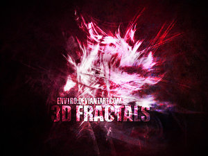
3D Fractals

Fractal Photoshop Brush

Download ( mirror ) ~ 7,7 Mb / Source

In a set of 3D Fractals are 12, including a large (diameter up to 1950 pixels), brushes for photoshop.

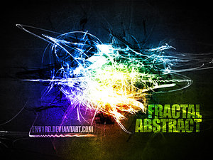
Abstract Fractal

fractal photoshop

Download ( mirror ) ~ 7,8 Mb / Source

In a set of Abstract Fractal, is the same 12 brushes. Compatibility - Photoshop 7 and above. As can be seen even on the preview image, the brush can add a very cool effects in the overall appearance of your web project.

02 Fractal Brushes

photoshop brushes

Download ( mirror ) ~ 6,6 Mb / Source

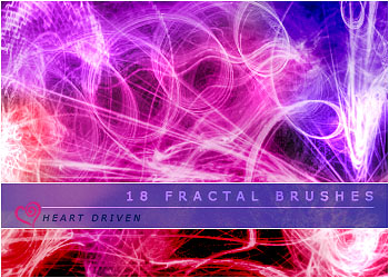
The set includes 18 brushes created for Photoshop CS2 and higher. Resolution ranges from 800 - 1100 pixels.

In addition to "open" fractals presented above, there is a "closed", "concentric" (this is not common terminalogiya, this is how I call them). Brushes (and sets) with fractal shapes as there are, here are two excellent examples:

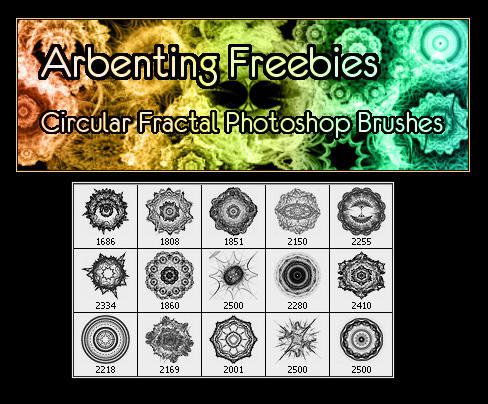
Circular Fractal Pack 1

Photoshop brush set

Download ( mirror ) ~ 27,5 Mb / Source

This set includes 15 fractal brushes for Photoshop at high resolution. Download and try to put into practice, judging from the preview should get something interesting. Of course, a separate small brush apply, but in conjunction with other design elements you can get a pretty picture.

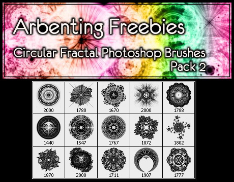
Circular Fractal Pack 2

Fractal Brushes

Download ( mirror ) ~ 20,5 Mb / Source

Continuation of Circular Fractal Pack. Like its predecessor contains 15 brushes.

Fractal Brush must be in the arsenal of any designer. Because only by mere fractal brushes you can create a great abstract bekgraund. In a word - Mast keV! In addition, data sets of brushes can add the original light effects on the site that looks quite nice. "Weigh" of course, a lot of files, but it's definitely worth it.

Read More →

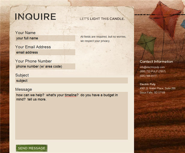
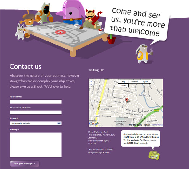
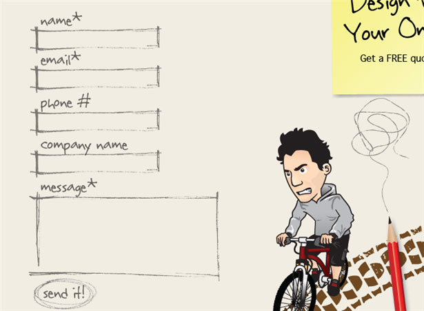
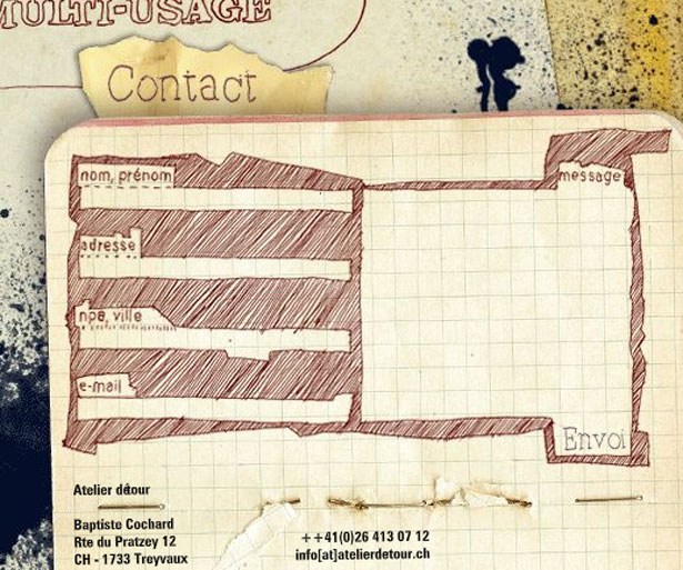
20 Beautiful Contact forms for Inspiration

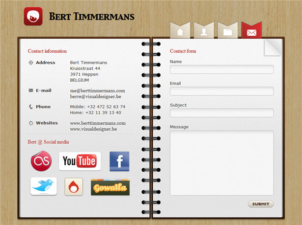
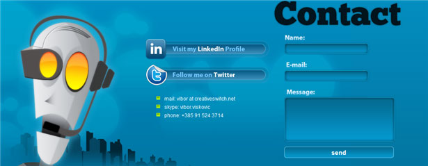
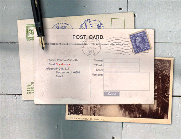
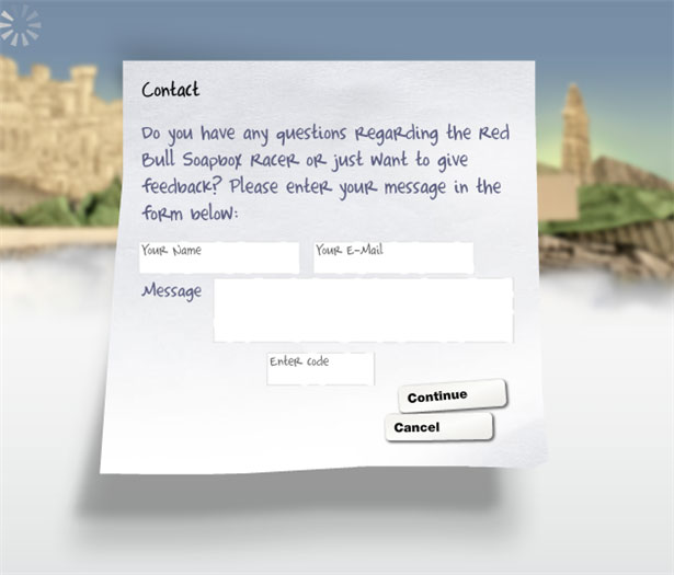
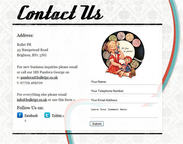
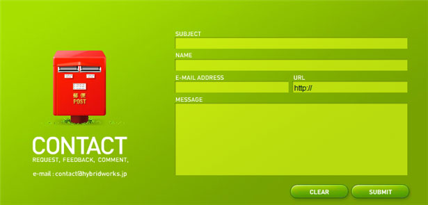
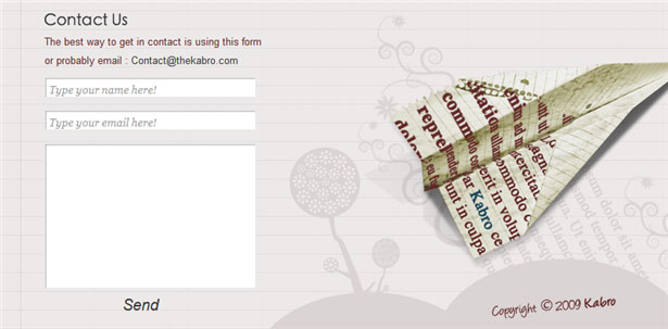
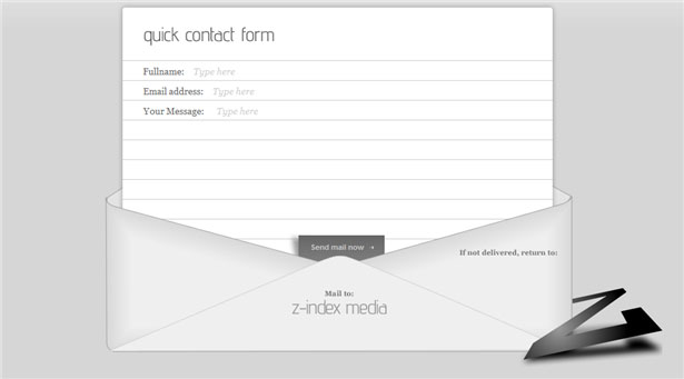
It just so happened that the design contact forms, usually highly do not break my head. Well there is some text fields - the "theme", "from whom» (e-mail), but a form of communication, what do you need? Like anything, but now is not the beginning of the 90s. For a long time no details! Every element, every detail has been actively playing on the image of the site (hence the company), attracts the attention of the reader (consumer or buyer), so now the situation is slowly changing.

Pioneers have always been design agencies, which are traditionally the first to offer something conceptual, innovative. They were beginning to catch up with the rest, there is a trend. Thus, it is now not uncommon sites where contact form is becoming a real "history" or "adventure", and that is the most interesting (or comfortable) place on the site.

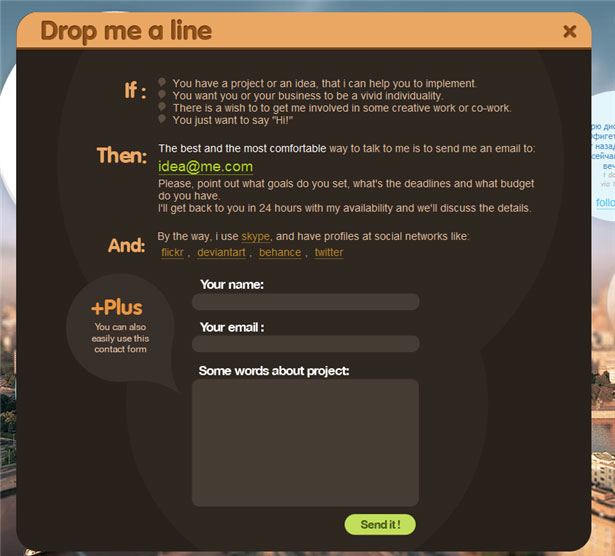
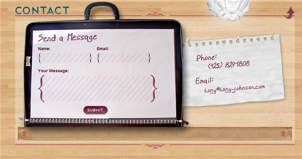
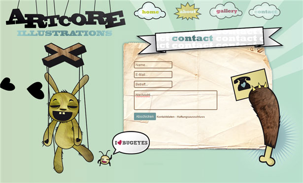
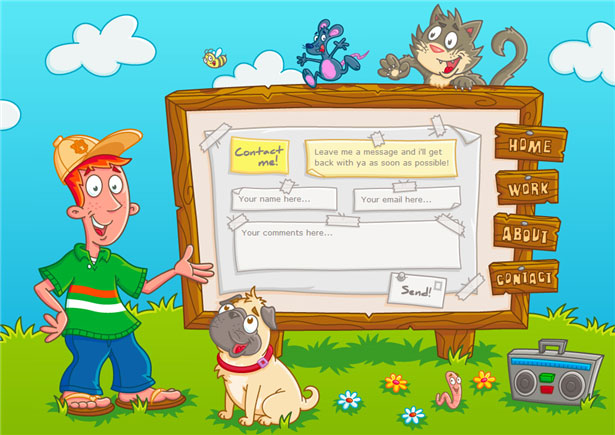
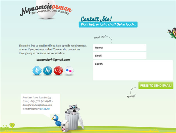
I have prepared for you a few examples with a nice contact forms for inspiration for the original selection thanks to the authors of this article :

Frankly, even I (not a web designer) have the desire to embellish or create an equally original page with the contact form. Especially liked the options, where except for the contact form is a summary of the site (the author), as well as links to social services.

Hopefully, this beautiful collection of contact forms stimulated your imagination and you were some interesting ideas about their own contact form. In RuNet there is little creative examples like (maybe I'm wrong and you correct me?), You have all chances to become one of the first!
Read More →

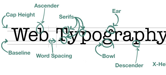
9 Tips on Typography Site

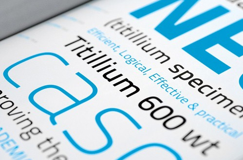
Typography for the Web site - quite an important design element, which is expressed in runet somehow not very much. This question is often raised in the English-speaking foreign design blogs, we have virtually no attention is paid to him. No, of course when you create the layout, most designers think of the site typography - fonts, design, but it is very modest and small. Because, probably, in runet can count on one hand the number of projects with a bright and creative custom typography, more than the standard dull "gray" design: (Maybe that's why Dmitry Naumov decided to share an interesting guest post about typography. Dima in combination, by the way, is author of a very useful project Converlab - "Design. Usability. Conversion." So, 9 boards typography Web site:

A. The choice of font

The choice of font depends a great deal. Type design determines the mood passes 'character', and indeed has a strong influence on perception. Choose the font that matches the style and concept of your site. For example, a "traditional" design goes a traditional serif font like Times Roman, for the "modern" design can go sans serif font - Arial or Helvetica;

Two. Font Size

Particularly important is the font size of the main body of the text. Title (subtitles) can be grotesquely large and clunky, but the main text should be comfortable, which is possible only if the optimal size. This is usually 12-16 px;

Typography

Three. The set of styles

The font should not be monotonous, gray mass is not nice to read. Develop a system of styles for headings and subheadings (H1, H2, H3, etc.), quotes the main text and the like. Use a different font sizes, options for the mark, perhaps to contrast these to use another font (especially for headlines or quotes);

4. Emphasis

Important places in the text must be allocated - bold or italic. The main thing is not to overdo it. Focus on that and he later emphasized that the dosage should be used;

Typography site

Five. Column Width

In traditional typography great attention is paid to the width of the column, for this reason that the text is divided into columns in newspapers and magazines. If the string is too long to read it is not convenient. Because you have to look too far to translate from the end of one line to the next. Short Line is also not good. The optimal length of the string is in the range 70-140 marks;

6. Leading (Leading)

Leading (Leading) - the distance between rows. If it is small, it affects the readability. Too big, too, Leading promises nothing good. In general cases, you will probably be the best spacing for 2-4 points more than the size of the font;

7. The general structure of the page

Ideally the page should be used a single grid. Thus it is possible to achieve a harmonious form of the whole site.Try to use common rules and styles (which you have come up with) on the whole site;

Eight. Color and contrast

The text should be readable, so he must be a contrast. It is better to use the classic black and white decision, it has the best possible combination of contrast, so the most convenient for reading. The remaining combinations to be tried with caution otherwise you risk to make one of the common mistakes of web design .

9. White space

White space - it is not void, but an important design element. It should not be too closely to mold elements, always leave a little "air". Thus it is possible to achieve a clean, light, nice design.

-

First of all, thanks for the post of Dime. All told briefly and in substance, in fact, develop the theme can be infinite for each item. I think part of the answers can be found on its website Converlab . Also, on my own I wanted to add that if you really decided to do something, "such things" in terms of typography site, you would be advised to view the work of the various collections on the Internet with the original decisions. This is very inspiring, but also contributes to the emergence of creative ideas.

Read More →

Free Pattern and Texture Resources for Website

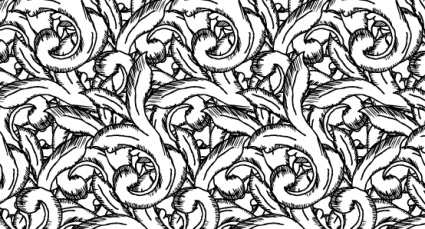
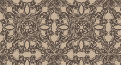
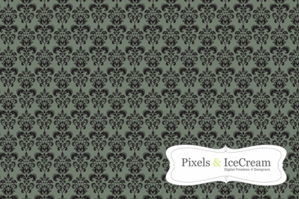
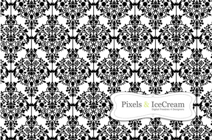
Seamless textures and patterns are sometimes the best fit for the role of the background image for the site.Pompous classic designs are needed, perhaps not so often, but if required by design concept, will be an excellent choice. There are some topics of sites where such a classical background will add sophistication and style to emphasize the overall design. There must, of course, be able to use any texture in the right place at the right time, they are not always able to settle down.

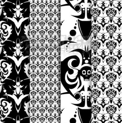
So you do not dig and search for such classic patterns and textures when they need you, I've decided now prepared a small selection. In general, the classic of course, is not quite correct to call. This definition is too rough, because of patterns presented below, there are barrochnye, and antique and gothic. Despite the fact that they are different styles, I decided that it is possible to combine them into one group. By the way, for simplicity and convenience, I combined all the texture of the post in an archive that can be downloaded here ( mirror ) ~ 2,4 Mb.

Thus, the classical patterns and textures for a site:

Hand-Drawn Scrolls

texture for the site

Hand-Drawn Scrolls

Antique Engraved

Patterns and Textures

Antique Engraved

Charcoal Demask

classical patterns

Charcoal Demask

Sample Damask

Classic designs for the site

Sample Damask

Grim Lady Patterns

texture for the site

Grim Lady Patterns

(in the set are 4 different patterns)

The application of these patterns I think the big work for you not to be. Some of the patterns is represented in the archive as a "fusion" in the. Png pattern, and the "source code" (usually a vector eps), so you can even make changes or alter the file (if you can have the skills and desire) . Use these classic textures and patterns can be for personal, private and commercial projects.

Read More →

50 Free Hand Drawn Icons set (Social Media)

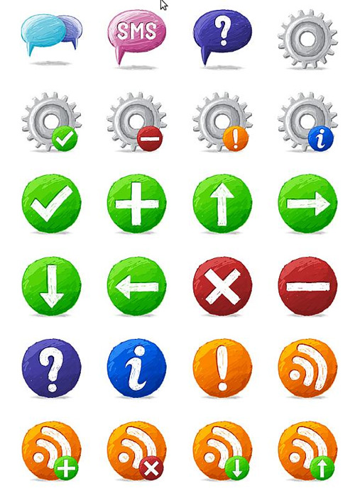
In design, there are various techniques to create images for websites, including icons. The application of each of them is due to the overall styling of the project - whether it's high-tech styling, or "antique". In the design of Mania can find examples of different styles, today we'll discuss the icons painted by hand. They are perfect for certain types of projects, some altogether indispensable. In any case, in some cases they will be more preferable than the overexposed all the icons in the "candy" or "veb2nolnom" style. In this regard, I offer you a nice set of five hand-drawn icons. I think that is something you probably will like:

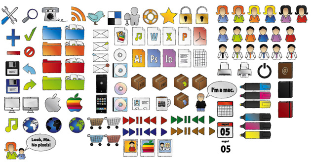
Artistica Icon Set

hand-painted icons for the site

Download ( mirror ) ~ 7 Mb / / Source

Artistica Icon Set - a great set, consisting of 60 different hand-drawn icons that are designed studio Rabotilnica.Icons very different directions, sizes from 24x24 up to 256x256 pixels, they are very carefully designed and executed just the highest quality. There are icons formats PNG, Ico, and for Mac (2 can be found on the website designers). By the way, for commercial use of cartoon icons will have to pay for personal purposes such as no limits.

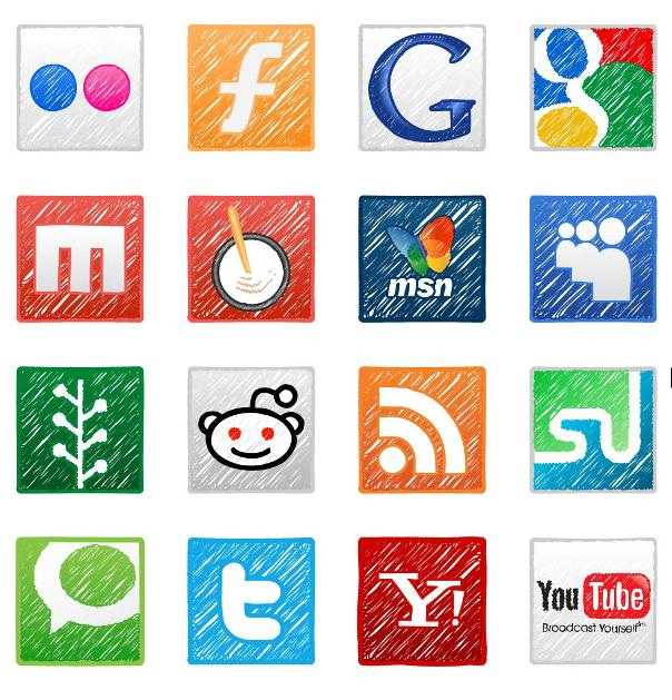
Sketch'd up!
hand-painted icons

Download ( mirror ) ~ 6 Mb / / Source

Sketch'd up! - Another one giant set, which includes social icons, info-icon, icons, wallpapers and much more. The format of icons - vector EPS so you have to prepare the final files themselves. The set presents 99 icons.

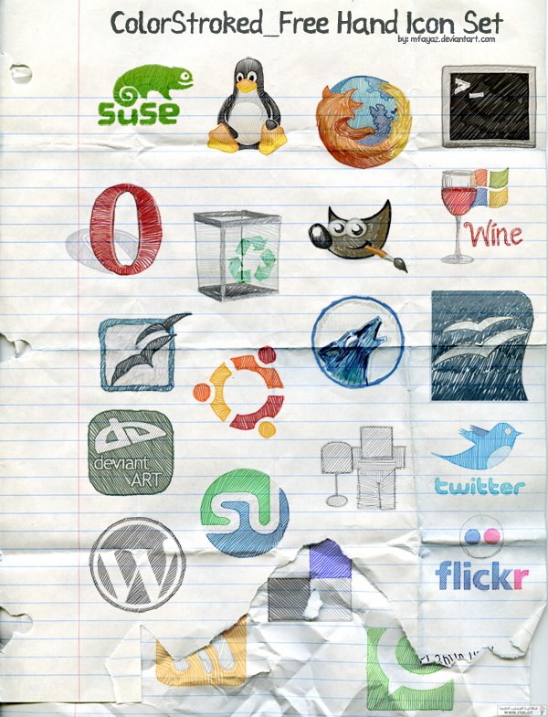
ColorStroked Freehand Icon Set

download the drawing icons

Download ( mirror ) ~ 1 Mb / / Source

ColorStroked Freehand Icon Set - contains 29 animated icons in format PNG. Resolution of 150x150 pixel icons.Social icons, so the focus is primarily on the bloggers / webmasters. Performance is very nice, something like the shaded icons.

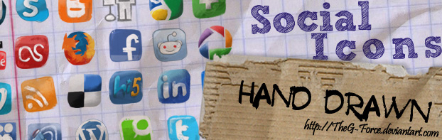
Social Icons Hand Drawn

hand-drawn icons

Download ( mirror ) ~ 900 kb / / Source

Social Icons Hand Drawn - a set that contains 18 icons, hand-drawn, for the popular social services (Twitter, Facebook, Digg, etc.), as well as the previous set, may well be suitable for your blog. In a set of typical dimensions are different from 24x24 up to 64x64 pixels.

Handy

painted icons

Download ( mirror ) = b, 4 Mb / / Source

Handy - qualities of icons in high resolution (256x256 pixels), perfectly suited for blogs because they contain mostly social icons, like Facebook, Digg and more. The kit includes a vector sources, so you may want to modify something to your liking.

I hope these sets of hand-drawn icons, you will definitely come in handy! A couple of icons can be a very fit seamlessly into their websites and blogs.

Read More →