Main Nav

Jun 2, 2012

Brushes for Adobe Illustrator (oil and watercolor)

Brushes for vector graphics editors are not as popular as the appropriate brushes for bitmap graphics editors. This is not because they are useless, just Adobe Photoshop installed in every second, and vector graphics editor is basically just the professionals. But, for those who have an idea of ​​what Adobe Illustrator and what it eats, they need nothing less than a brush for Photoshop. Because with a good brush can literally work wonders.

Today I decided to make a selection of brushes for Illustrator, simulating real brush - watercolor, oil, ink (this is not a brush but still) and so on. Such materials are useful for different works in the artistic style and look all the brushes for Illustrator is very high quality, variety of them large enough so that all, I think, sets handy. Download the brush, as always, is free.

Multi-Colored Paint Brushes

Brushes for Adobe Illustrator

Download ( mirror ) ~ 44Mb / / Source

Multi-Colored Paint Brushes - a collection that includes 57 multi-colored tassels. A very interesting set. On the source page of the site will also find a small manual on how these (and other) brushes for Illustrator can be connected.

Watercolor Brushes

Download the brush watercolor

Download ( mirror ) ~ 2.6 Mb / / Source

Watercolor Brushes Set contains more than 100 watercolor brushes, which were created by using different techniques and can be used to solve many problems. We can say universal brush.

Paint Brushes

download free hand

Download ( mirror ), ~ 22 Mb / / Source

Paint Brushes - 15 high quality brushes simulate various strokes of this brush. The archive options for Illustrator CS and Illustrator CS3. The set was very useful and versatile.

Delicious Watercolor Brushes

brushes for Adobe Illustrator

Download ( mirror ), ~ 15 Mb / / Source

Delicious Watercolor Brushes - a great package, which includes 106 of watercolor brushes. The total file size - 14.6 mb. Compatibility - Illustrator CS and above. Ideal for creating illustrations in the style as if they were really painted by hand, for example, children's pictures.

Ink and Watercolor Brushes

Download Illustrator Brushes

Download ( mirror ) / / Source

Ink and Watercolor Brushes - you will find a set of 13 brushes. In the source there are two versions - one for Illustrator CS, the other for Illustrator CS3 (the link for download is version CS3). If you are using a later version of the editor, the latter must be compatible.

Water Color Blob Brushes (for Photoshop and Illustrator)

Free Illustrator Brushes

Download ( mirror ), ~ 22 Mb / / Source

Water Color Blob Brushes - these collections are interesting in that there are two versions - for "Photoshop" and "illustrator". The set includes 17 brushes. If you need these brushes for Photoshop, installation guide you will find the link source, and I, meanwhile, just in case, I will tell (and most knowledgeable people remind you) how to install these brushes in Illustrator.

It's very simple to the directory where you installed Adobe Illustrator folder, find the Presets, Brushes folder in it which will extract and one set (or sets) that you downloaded. After restarting, Adobe Illustrator, the set will appear in the Brush Libraries. Use your health!

Read More →

Retro Style in Web Design

According to the American writer John Steinbeck, most people live ninety percent in the past seven in the present and the future is only three percentage points. Well, it counts Nobel laureate for literature is too difficult to verify, however, dispute the fact that the appeal of the events of the past is not necessary. If a painful sense of the value of passing time and the appeal of antiques you are familiar, perhaps, retro style in web design will be your skates.We can only think, will satisfy the concept of a retro-audience share. Who will be delighted with the content, masterly powdered antique? People who nostalgically peering into the symbolism of a bygone era, with its fashion, people, machines and other stories, covered with a dusty coating otgorevshih passions.

In clothing, automotive and interior design for a retro-style confident enough to tie the timing of the 20s to the 80s of last century. Writing a clear time characteristics of retro-style in web design is not easy, because in everyday life can be considered the last day, in a rapidly changing IT-sphere can be safely called day before yesterday afternoon. And the fact that thirty years of the artist still finds it relevant and modern, youth has long been written off for scrap. Take, for example, the results are disappointing for producers rent the movie "Alien": Bandit romantic swashbuckling 90 not stir the soul teenager, as retro - it is each his own.

But the more interesting and more difficult to challenge for a designer who decided to work out the style of the site is in a retro-style. Only the knowledge of the nature and characteristics of retro-style, coupled with a considerable sense of proportion, will not slip into a banal kitsch.

Most of the time intervals that can safely operate a designer decides to use the retro style, tied to the fashion of the 20th century.

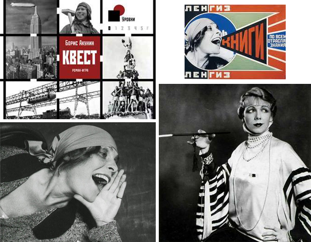
Want to recreate a visitor feel aggressive chic 20-30s - help him remember the muse of Vladimir Mayakovsky Lilya Brik, good will and Ellochka-cannibal from "The Twelve Chairs." These were troubled years of sudden and massive women's emancipation: women wearing pantsuits, shortened skirts and smoked long cigarettes. All of these mesh stockings, knit hats and bowler hats a la Charlie Chaplin, bare arms and shoulders in a fur boa during the NEP, notably stirred the blood of man in the street. Take the olive, black and purple color as a base, add the drive of jazz improvisation, story and cinematography airplanes - and you can easily catch the essence of retro-20's and 30's!
Retro 20s

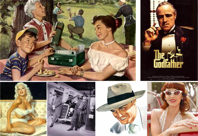
If you no longer taste restraint and modest elegance L - look back in the postwar 40s - 50s . In place of ostentatious vulgarity and pretentiousness new look came a style invented by Christian Dior. Style sensual, decadent, recklessly romantic, stylized "krinolinovy» XIX century. It airs raised chins of women in dresses of silk, satin, crepe de chine. This is a thin waist, neckline exciting and gloves to the elbow, wide-brimmed hats and patent leather straps that boost to the limits of femininity polupristoynogo pin-up. Review "The Notebook" Nick Cassavetes and "The Godfather" by Francis F. Coppola, include Glenn Miller Orchestra recording and quickly grasp the tablet. Have you caught the mood.
Retro 50s

Would you like to bet sexuality and sensuality - Browse through magazines 60s and 70s . While the tone was set seductive film star Brigitte Bardot, Marilyn Monroe, Sophia Loren. The color palette matches the mood - it is the dominant red, pink, blue in the range of flowers, polka dots, the cell. Car rides chic "Bentley" on a dizzying seditious motives of Elvis. The Beatles "they" VIA "Gem" - the "us." Denim 70's, platform shoes, disco dancing to the music and the sea of synthetics in clothing: nylon, nylon, krimplen wild colors. ease, brightness, ease - that's how it will be possible to describe the site in a retro-style 60 - 70 years.
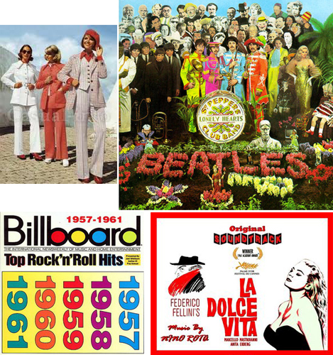
Retro 70's

It may be an unusual experience in the style of Soviet culture of the 80s of XX century - a time when the ideology of the ruling party kultprosvetovskaya staggered under the chaotic but powerful blows protest basement subculture. Emerged from the underground Soviet Russian rock and punk rock mixed with dance tunes broken disco 80's became the leitmotif of Surgery. This period is not so deeply redesigned web designers, so the decision to use the style of the '80s can bring great success.
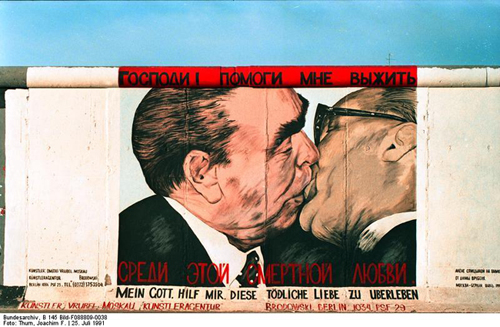
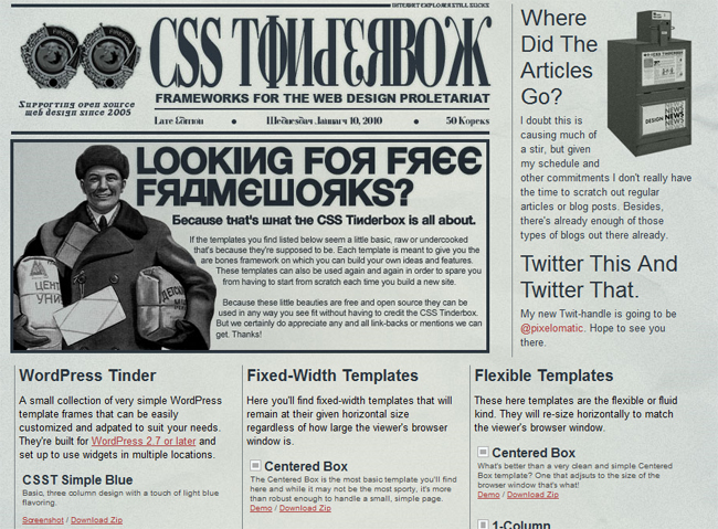
Retro 80's restructuring

retro pattern

To sum up. Retro-style actually quite stable and marketable trend in web design, with its charm and unique color palette. What would you choose: tragic nepmanskie 20th, 50th caramel, floral 60's, disco 70's, or nomenclatural retro 80's, building on the past, adding to their feelings and are actively using rich graphic editors, you able to create a small masterpiece.

In addition, color palettes can be retro-inspired style in a small collection of retro designs (for a particularly interesting instance you can go through a reference on the original sites and see how everything is done).
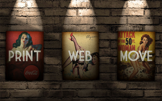
Retro Site Design

retro design of the Internet

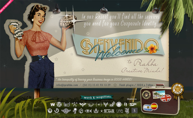
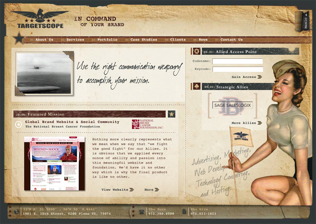
Dallas Advertising Agency - a very original navigation, music in the background and a military general, a retro style.
design of retro

Retro Style

Retro style

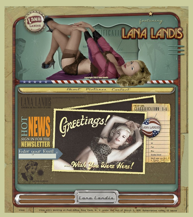
Lana Landis - on the implementation of flash, always check out the photos :) beautiful vintage photos + wonderful music
Retro Design

retro-style in design

retro flash site

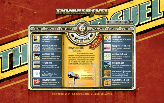
ThunderFuel - as far as I understood the company is engaged in everything from design, to animation and games.After reviewing their site in flash retro style, I'd have ordered something cool idea and implementation.

Retro Style Web Design

vintage poster

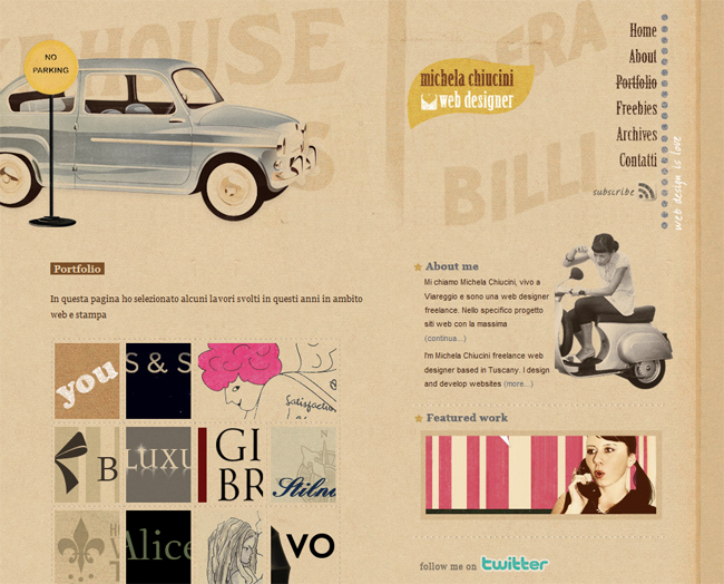
Site-portfolio Michela Chiucini web designer - by the way, it is her past work, we see that it is clearly not indifferent to the retro style
web design, retro style

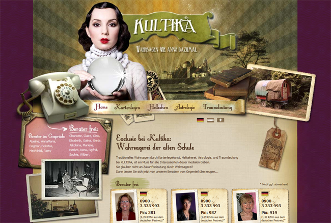
Kultika - I do not understand the purpose and subject matter of this site, but the implementation just beyond all praises!
Retro Design

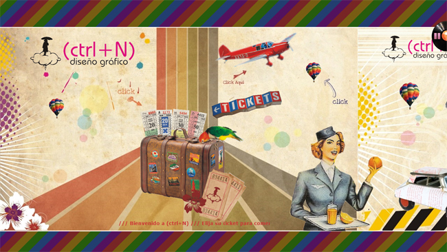
Diseño Grafico - cool retro-style poster for the Web developer studio or freelancer, he seems to be stretched in a line and when you click the picture moves to the right.
design of retro style

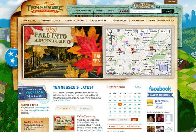
Tennessee Vacation - for all lovers of the State of Tennessee, and leave in those parts, very cool implementation of a retro-style, where attention is given to almost every detail, one of the best sites in a similar style that I've seen

Here's a collection of web design in a retro style has turned out. In my opinion, very good work here presented, although, of course, retro sites exist on the order of magnitude. And that means that I need to Find and publish as early as next time.

Read More →

How to make a website easy. Usability by Steve Krug

Looking the other night in my mail and found it an interesting letter from the publishing house "Peter." If someone had told me something similar institute in distant years, when does the reading of some books on computer topics, would never have believed it. Now, given my profession blogging and authorship of the project design Mania, they offered me a little bit, and collaborate together to tell blog readers about an interesting book. The practice, in principle, quite typical in the blogosphere, so of course I gladly accepted. For the theme of the project is best suited Steve Krug book " How to make a website easy. Usability by Steve Krug on a method . " And if the web design for me is more a hobby than work, the creation of the site and the question of its effectiveness - the theme is much more intimate.

Steve KrugTo begin with a few words about the author. Steve Krug (Steve Krug) - usability specialist, bestselling author in the same yuzabilti "Do not make me think." He works in his own consulting company, has a great many years of experience in the design of interfaces and overgrown with usability testing.Boasts some of the most renowned for its customers such as Apple, AOL, the IMF, Bloomber.com, etc. Most of the time Steve Krug is engaged in conducting seminars, well, just consulting.
Honestly, before the book came in the mail "by the method of Usability by Steve Krug" only known to me was the usability experts , Jakob Nielsen .Now, we can say, I expanded my (and yours, I hope) because the horizons of what Steve has to tell the public. After the first book, "Do not Make Me Think" Krug has become a very popular specialist, began to actively organize seminars, advise, and then at one point, he says, in a weak moment signed a new contract with a publisher.

For example, the question of whether this world need another book on usability testing? You can read the following.

I did not invent the wheel. Usability testing has come into our world long ago, and many famous people, the most influential of them - Jakob Nielsen, more than twenty years of preaching the idea of ​​"affordable usability testing."

There are several wonderful books, which explains in detail how to test usability. I strongly recommend that you read at least one of them, when you happen to do testing. His favorite book on this theme, I have listed in Chapter 15.

However, this book differs from existing in at least two aspects.

It is not comprehensive. I guess you did not become usability and will not be a matter of life and that this word is not even in your job description. If so, you will not necessarily know all the nuances and spend a lot of time on their comprehension. This book, like the previous ("Do not Make Me Think"), I tried to make a sufficiently thin (200 pages), so that it can be read, for example, in the plane.

This book is written not to make you an expert on severe or usability testing. It is necessary for you to know which end to approach the testing itself. Some of you, of course, this theme will entice enough to need to know about it as much as possible. For these and I wrote a chapter 15. But in general, to be tested and get this huge impact, not to know anything more written on these pages.

This book is not only about how to find usability problems . Unlike many other publications, this also explains how to fix identified problems.

I can confirm all these words are 100%, though I am very involved (or rather did not do) usability, but from the first page was simply a human interest. And given how quickly read the book to find out all the details of this process somewhere along the road to transport or a rainy autumn evening - simple. In addition, such a reading also draws from the other side, that all this is really an invaluable experience, "knowledgeable" person.

And it is interesting that the question, " And your tips are only suitable for web-sites "you can find the answer.

In writing this book, I focused on testing sites, because these days most need this, and because it is possible to make the book a thin and simple. But exactly the same methods and principles can and should be used in testing and improving the whole, than are men. Network and local applications - is the most obvious sites for testing, but no one bothers with the same methods to estimate the ballots, cell phones, presentation, laid out in PowerPoint, Digital fotikom instructions and forms that you fill out when it comes to the doctor. I would suggest to you, wherever I have written "your website" to believe that it says "your product".

Actually it would be logical to continue to publish the contents of the book "Usability of the method by Steve Krug."

The discovery of usability problems

  • Chapter 1. Elephants, it can not see 20. What is an independent usability testing, why it always works and why it is so rarely performed.
  • Chapter 2. And now I saw cut my [excellent] assistant in half. In what looks like an independent testing
  • Chapter 3. One morning in the month - we do not ask for more. The plan, which you can easily follow the
  • Chapter 4. When and what to test. Why are the most difficult has to do first
  • Chapter 5. Do not hammer nails with a microscope. Who to test and how to find these people
  • Chapter 6. Take them to task. The choice of targets for testing and scripting
  • Chapter 7. A few boring checklists. Why they should be used, even if you (like me) hate them
  • Chapter 8. Telepathy without tension. Testing
  • Chapter 9. This is somewhat similar to the sport. How to captivate all the match and what to bring to their attention

Resolving problems with usability

  • Chapter 10. "Debriefing". Compare experience and decide what to eliminate the shortcomings
  • Chapter 11. Less is better. Why fix problems should carry as little as possible actions
  • Chapter 12. The Usual Suspects. Some of the problems that you will surely find, and thinking about their elimination
  • Chapter 13. Life has become better, life has become happier? The Art of pleasant manners

Just go!

  • Chapter 14. Teleportation without tension. Remote testing: fast, cheap and slightly uncontrolled
  • Chapter 15. Only for advanced users. A list of recommended literature
  • Chapter 16. Good luck, friends. A few parting words. An example of the script and the agreement on record

In general, usability testing can be very simple and informal employment. You just need to find time for it and read the book :) Steve Krug said as he held seminars that they say, first of all the assorted audience of a site for an example, and then decided to introduce an original method. He allowed himself participants usability testing - how it was raboaet :) That is the site is taken as an example and volunteer to perform some common tasks for which this is the site and set up.

Test results are almost always the same:

Talk a good time testing and eventually breaks a storm of applause for his bravery.

"Owners" of the site, all 15 minutes furiously writes, what problems must be solved, and asks whether it is possible to obtain a record of what was happening to show your team and your boss.

Others come to mind, "Heh-heh. Is that all? So I could. "

Upon completion of testing, I ask: "How do you think is worthwhile way to spend 15 minutes? - And all under the nod.

So if you somehow are building high-quality and user-friendly site, you can safely buy and read the book " How to make a website easy. Usability by Steve Krug by the method of "online publisher Peter. In the same way, find a small piece, but rather one chapter from the book.

Read More →

Power on the Redesign of the Examples

Sooner or later even the most successful design to date. Sometimes you can get a slight redesign, and sometimes require radical renewal, referred to as rebranding. Very often these processes began to appear with the acquisition of the popularity of so-called design style Web 2.0 , which simply did provoke a serious company for updates and follow current trends.

From the standpoint of the integrity of the brand's radically new design is not always acceptable, in at least a step risky, because that way you can lose face. But even those who are at risk was up to "moderate" is not a revolutionary redesign. Let's look at examples of how to solve this problem (and solved) the designers of famous sites. As inspiration, has been used , this English-language paper , reflections are copyrighted. First published on the old design, then a new one.

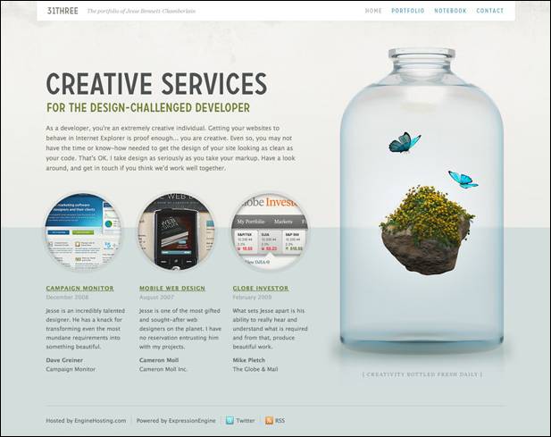
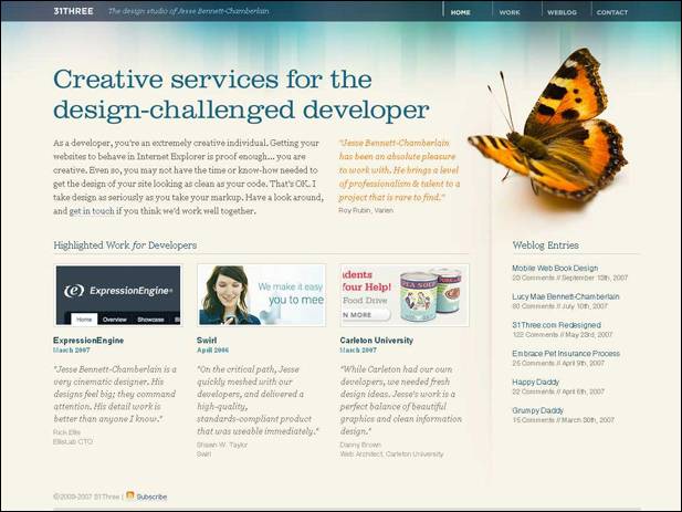
31Three

old design 31Three

new design 31Three

During the redesign was otherwise decided 31Three space (it was more) and changed a few colors, why design has become more "pure" and "air." Perceive the information has become much easier once it is clear that the page has the greatest value. Definitely a successful redesign, or should I say effective - catches.

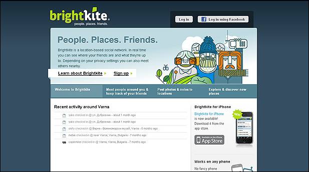
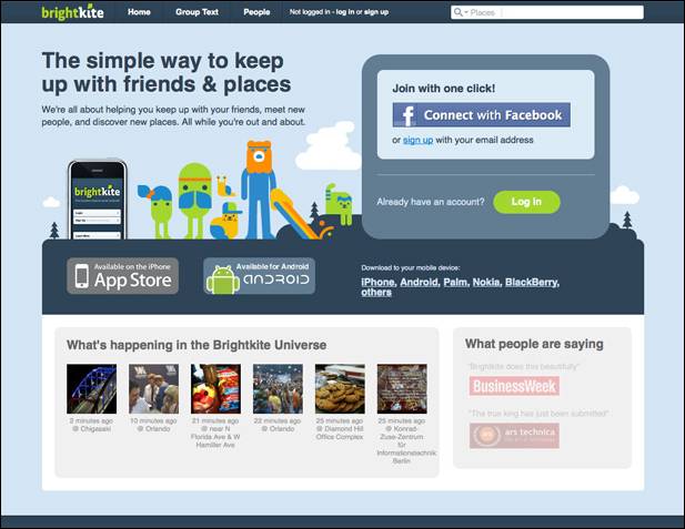
Brightkite

old design Brightkite

new design Brightkite

Brightkite has undergone major changes. The new design got rid of the heavy dark-blue substrate to replace the cap had come a lightweight upper panel. Visually zaokruglennye angles acute and successfully replaced by "splitting" last version, the big headlines emphasize the key parts of the project. In general, the new design creates the impression of a comfortable and well made. The previous version looked less than professional and integrity. The redesign was a success.

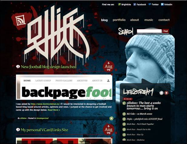
Ollie

old design Ollie

new design Ollie

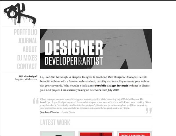
In my opinion, the site is only won by Ollie redesign. The old one was too dark, dirty and a bit chaotic (this applies to both elements, as well as flowers and other things). The new design is in sharp contrast to the fact that it was, it is close to minimalistchnomu - a little strict, but neat. The only "a quote from the past" - a logo, which, however, fit quite harmoniously. Although my impression of a matter of taste, some people may notice that the old design could be more creative and stylish - it is quite possible, and sometimes because of the redesign is the author's desire to change something, sometimes dramatically. I think this is the case.

N.Design Studio

old design N.Design Studio

new design N.Design Studio

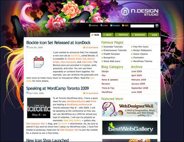
The project site N.Design Studio was always very bright, expressive and powerful in terms of design (which they say "showmanship"). Despite all the advantages of the old design become boring.

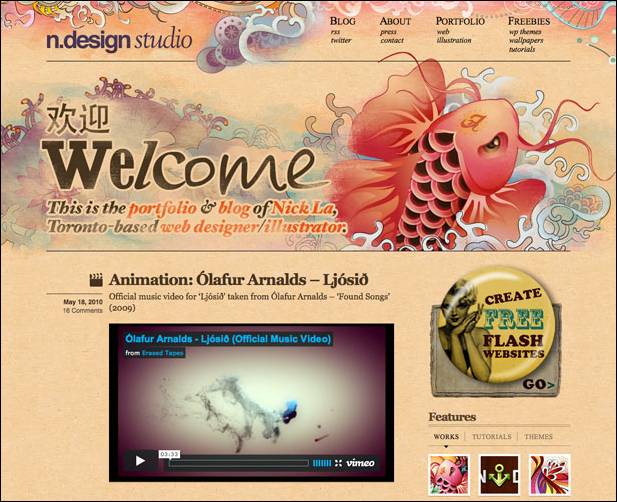
The new version of the design is small enough in common with the previous one. However, done very cleverly, keeping the continuity of the least of it. The new design may be surprised (those who are accustomed to the old), but leaves the impression of an extremely favorable.

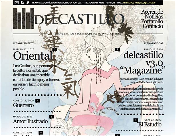
DelCastillo

old design DelCastillo

new design DelCastillo

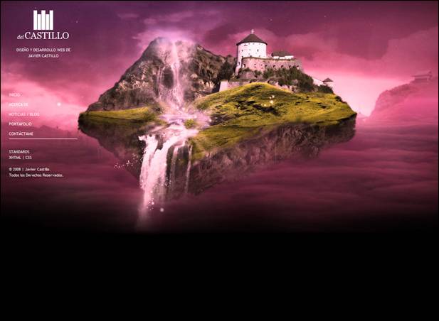
Designers working on DelCastillo decided on a bold step. The original version of the site showed a quiet traditional design and layout, the new version - a bold, "the log" layout, typography and vivid emotion. Such a redesign may be called for something extreme, but nevertheless, most successful rather than vice versa. In recent typography in web design is more and more weight, probably, the authors decided to comply with the new fashion trends.

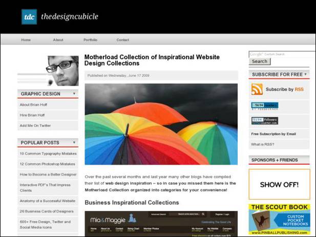
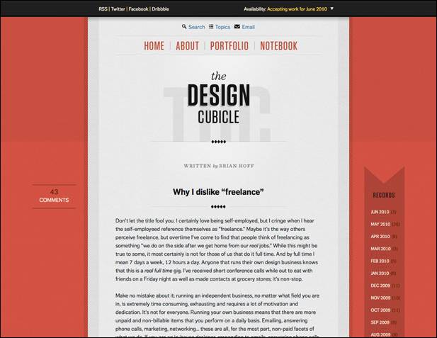
Design Cubicle

old design Design Cubicle

new design Design Cubicle

The first thing that catches your eye in the new design Design Cubicle - considerably fewer elements. The second - the design is almost centered. The new design "easier", more convenient, while brighter (even if you do not confuse the bright umbrellas in the screenshot with the old design - it is an illustration of the post, not a design element). The desire for minimalism and concentrating attention solely on the contents - is also very popular for modern web design.

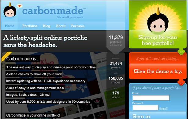
Carbonmade

old design Carbonmade

new design Carbonmade

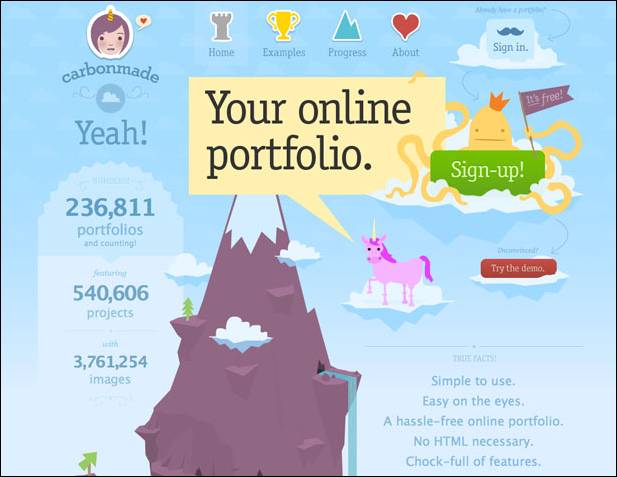
The new version of the design Carbonmade also very different from the previous one. The old version was obviously too heavy (which was the fault of mourning, a vast gray area under the cap). The new design is based on the idea of graphic (in the center of the mountain, rich in illustration), it is more clear, positive and creative. Visually looking at the page of the site, personally I remember such a thing as infographics , which is often used in the design for the presentation of information.

I often want to do for his redesign of the blog, sometimes almost dramatically change everything. Unfortunately, this is not a quick and easy process, so until that time is not enough, perhaps in the future, I still come to that.

Read More →

Create a portfolio with the help of online service Portfolios

Online-Services , a designer , an overview of services , useful websites , portfolios .

For working on the "free bread" designer, animator, photographer, or any way that does not define a good chance to get an order (or job) as having an attractive portfolio. Previously, portfolios were largely on paper or shown with the help of his computer, the trend of today (especially if you are looking for a job on the internet) - on-line portfolio.You'll notice that almost every site contains a freelance exchanges the ability to upload and showcase their work, but what if you want to create their personal online portfolio, which is independent of any internet projects.

Create your own online portfolio in several ways. The most difficult and time-consuming way - buy a domain and create his own website on it. The easiest - use the service to create a portfolio Portfolios ! In the first case, of course, you will have almost limitless options for customizing the functionality and appearance, but, unfortunately, without any special knowledge of development of sites here will not do (or the cash outlay). Option number 2 - a very interesting solution, which propose to examine in more detail.

Online Portfolio

So, Portfolios - an online service through which a person's creative specialties (painter, designer, makeup artist, illustrator, flasher, etc.) can easily create a free and fully customizable portfolio site.

In the Portfolios you can (just a few possibilities):

  • Choose a variety of design layouts and customize them;
  • Upload images and high resolution without compression (you can load multiple images at once);
  • Post videos and Flash (for use with the popular video service YouTube and Vimeo Video Hosting just point the downloaded video link);
  • Connect your own domain;
  • Use your own logo;
  • To study the statistics of attendance;
  • Maintain your own blog on the Portfolios;
  • Communicate with other members of Portfolios;
  • Add a comment, discuss and evaluate the other portfolios.

In fact Portfolios combines the two mediums. The first - a personal portfolio management mechanism online, where you can perform all configuration, installation, download pictures and files. The second - the site itself portfolio, which saw customers. To better understand what are the portfolio in Portfolios, worth looking at some examples:

online portfolio

And, of course, the same video with a demonstration of all the features of the service Portfolios.


Portfolios not only provides an opportunity for everyone to create their own professional looking portfolio (of course, the content on your conscience.) This is one of its kind social networking site for professionals and even a blog-hosting service. The most important thing - the service, of course, can bring huge benefits to freelancers. So the people of creative professions are obliged, to get to the Portfolios Portfolio!

Read More →

Vector icons for Halloween (Halloween)

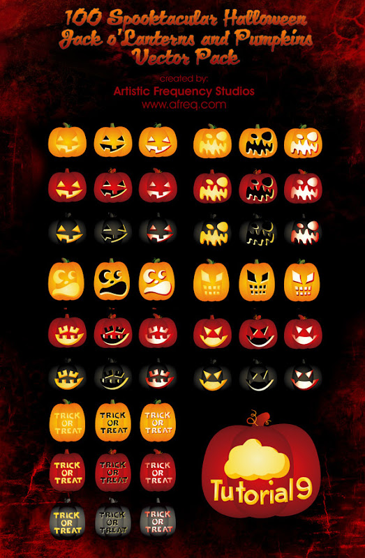
Yes, I know that the holiday of Halloween (Halloween) has already passed, but I just could not help but share with you a remarkable discovery in the style of the subject. A kind of Tina Artistic Frequency Studios a surprise readers of one of the English-language blogs in the design of the vector form of a stunning collection of different pumpkins (Pumpkins) to celebrate Halloween. These icons can be used for both personal and commercial projects, an archive file format - eps, design - vector.

icon Halloween (Halloween)

Download ( mirror ) ~ 9,18 Mb / / Source

I hope you enjoy. Even if you use this year will not work, then these will come in handy for Halloween the next day all the saints. By the way, we should note that I'm not the first time, appeal to the holiday theme - for example, in the pages of the blog has published a post on a similar theme - beautiful icons in the style of Halloween , where you can download three different sets of icons. In addition, for those who want to delve into the history and details of the holiday, you can read the post about Halloween in the Tod's Blog.

Read More →

Vector Icons Kitchen and Food

Purely by chance stumbled on an interesting and attractive set of vector icons related to food, cooking, eating and everything like that. Turning to the website source dezignus.com found 3 more similar topics archive of icons, which as a result formed the basis of a new post.

Vector icons Kitchen

kitchen vector icons

Download ( mirror ) ~ 3,3 Mb / / Source

The set contains 25 icons of various kitchen utensils, created this easy, fun, cartoon style. Here you will find pots, pans, stove, cups, knives, microwave and much more. Nice soft colors, round shapes and everything will look very nice. Format eps, you can download and use for personal needs.

Food Icons

vector icons Pictures Food

Download ( mirror ) ~ 4,7 Mb / / Source

The following vector icons archive dedicated to different food, looks very colorful, bright and appetizing. Here you can find a variety of fruits, vegetables, cakes, pies, sweets and pastries, ice cream, beverages, etc. There are some kitchen items - cups, kettle, microwave and other kitchen utensils. Format eps, food icons can be downloaded for free and use for personal needs.

Vector icons kitchen equipment

Pictures Equipment vector icons

Download ( mirror ) ~ 1,1 Mb / / Source

Simple vector icons of kitchen equipment and even an apartment - washing machine and dishwasher, refrigerator, oven, microwave, air conditioning and TV. The format of icons - eps.

Icons can be used on different thematic projects and blogs dedicated to culinary art. Similar sites, in principle, enough - once was a time when the web designer created these blogs to their girlfriends / wives :) So all three sets of vector icons would be great to complete these projects.

Read More →

Abstract Wallpapers

On the Internet there are many different themes for your desktop wallpaper - nature, animals, someone puts posters from movies, games. But sooner or later the time when many themed pictures bored, I want something that does not attract special attention, and it was pretty interesting background. In this case, come to the rescue of abstract wallpapers: ) Of course, one could argue that they also want to change over time. Abstract Wallpaper suitable for people who are not particularly attach importance to the image on the desktop, and for those who want to establish myself something of such things.

Not sure what abstract wallpaper can cause some specific emotions as it does a favorite or just a beautiful machine, girl, pretty scenery and the beach can be good to recall the last vacation, etc. Though, probably, in the abstract wallpaper people also find something. I think you might have guessed that today offer to download a small selection of wallpapers for your desktop.

Wallpaper abstraction, abstract wallpapers

Download ( mirror ) ~ 14,5 Mb

Today is no reference to the source, since I did this set on their own. The only thing that helped me in this wonderful site Wallpaper Abyss , where you'll find over 23 thousand different images, including abstract 3d wallpaper. Although, in principle, sites with different wallpaper is now very much, does not necessarily look for them on the specified project by me. By the way, you can find wallpapers (wallpapers) by using Google Image Search .

So, in my build you will find 25 abstract wallpapers on your desktop with a variety of negative pressure - there is a 1280x1024 and 1600x1200. I tried to choose the most beautiful and in good quality - in general, those who would put on your desktop. Actually one of the pictures on my desktop and showing off :)

Read More →

May 31, 2012

Fullscreen Background Image Slideshow with CSS3

CSS3 technology is becoming increasingly popular, and things that are realized with its help, all the more impressive and exciting. Today a post about one of these methods. I was there very much impressed with the output image to full screen browser. In a sample of "epic" and large-scale high-quality HD images created a very cool effect. So recently came across a small network of CSS3 tutorial that allows you to place in the background of a slideshow of pictures on the screen, and with some animation.

CSS3 background slideshow tutorial

In addition, the page displays the title picture, and also with CSS. It looks very cool! Although the need to clarify that it will work only in browsers that support CSS animation. So there you go:

Page Layout

For our slideshow will use an unordered list, where each image tag adding Span, and the DIV will be available heading.

<ul class="cb-slideshow">      <li>          <span> Image 01 </ span>          <div>              <h3> re · lax · a · tion </ h3>          </ Div>      </ Li>      <li> <! - ... -> </ li>      <li> <! - ... -> </ li>  </ Ul>

For each element of Span will be a certain fixed background image (background image) for the slideshow.

CSS styles

First you need to set the styles for the list itself - it will be a fixed position, but stretched to the whole scope. Also used: after pseudo order to locate a picture (with effect) over the image:

.cb-slideshow,  .cb-slideshow:after {      position: fixed;      width: 100%;      height: 100%;      top: 0px;      left: 0px;      z-index: 0;  }  .cb-slideshow:after {      content: '';      background: transparent url(../images/pattern.png) repeat top left;  }

The code used by the repetition of style. Cb-slideshow with image effects for images, though you might as well try to place a gradient.

Span, containing the background image will be positioned absolutely and have a height and width of 100%. Since it is within the specific text, make transparent color as we do not want it to display. Background-size property with a value of cover will make sure that the background image cover the entire area of ​​the element, which in turn stretches the full width of the visible screen. Transparency is set to 0, this will be changed even when the animation.

. CB-Slideshow li Infinite linear 36s 0s ; }                                                                                                                  

The animation for each Span will last at least 36 seconds and run an infinite number of times. But first consider how to resolve the issue with the display headline:

. CB-Slideshow li Infinite linear 36s 0s ; } . CB-Slideshow li div H3 { font-family : 'BebasNeueRegular' , 'Arial Narrow' , Arial , sans-serif ; font-size : 240px ; padding : 0 ; line-height : 200px ; }                                                                                                                                                 

The animation for the header block will last 36 seconds.

Further, the CSS styles should be defined background images for each Span and delayed animation (animation delay) so that each of the following picture and caption appeared in 6 seconds after the previous one.

.cb-slideshow li:nth-child(1) span {      background-image: url(../images/1.jpg)  }  .cb-slideshow li:nth-child(2) span {      background-image: url(../images/2.jpg);      animation-delay: 6s;  }  .cb-slideshow li:nth-child(3) span {      background-image: url(../images/3.jpg);      animation-delay: 12s;  }  .cb-slideshow li:nth-child(4) span {      background-image: url(../images/4.jpg);      animation-delay: 18s;  }  .cb-slideshow li:nth-child(5) span {      background-image: url(../images/5.jpg);      animation-delay: 24s;  }  .cb-slideshow li:nth-child(6) span {      background-image: url(../images/6.jpg);      animation-delay: 30s;  }     .cb-slideshow li:nth-child(2) div {      animation-delay: 6s;  }  .cb-slideshow li:nth-child(3) div {      animation-delay: 12s;  }  .cb-slideshow li:nth-child(4) div {      animation-delay: 18s;  }  .cb-slideshow li:nth-child(5) div {      animation-delay: 24s;  }  .cb-slideshow li:nth-child(6) div {      animation-delay: 30s;  }

Now consider the animation process in more detail. Span elements set the animation 36 seconds. During this time, the transparency will vary from 0 to 1 when the animation reaches 8%. More transparency is preserved until we reach 17%. After 25% it should again be equal to zero and remain so until the end.

Where did these numbers? - Let's deal. We want to see each image was 6 seconds, besides, after passing through the whole cycle again, should be shown the first picture. Since the commonly used 6 images, for a total take 36 seconds. Now we need to set the appropriate values ​​of time for transparency. Given the fact that the second frame (picture) animation will start in 6 seconds, we need to know what percentile of the animation should be shown for the first picture. Divide 6 by 36 and get 0.166 ... that would be 16% for our step parameter keyframe.Now, since we do not want to order our image just disappear all the time, we define an intermediate step, which is equal to half of the previous value, that is 8%. The bottom line is that the picture seemed to completely disappear gradually after 17%, respectively, and completely disappeared by 25%. (Ed. - here, of course, have a little pomozgovat and deal with all the subtleties of animation and mathematical operations. If you want to use to use the code "as is" - just place it in style or make similar calculations).

@ Keyframes imageAnimation                                                                               

Similar calculations apply to animate the title, the only thing that make the Cape a little faster so that he disappeared, so the transparency of 0 to 19%.

@ Keyframes titleAnimation {       0%  { Opacity :  0  }       8%  { Opacity :  1  }       17%  { Opacity :  1  }       19%  { Opacity :  0  }       100%  { Opacity :  0  }   }

For all web browsers that do not support animation, we only show the last image slideshow by setting the transparency of the Span to 1.

. No-cssanimations  . CB-Slideshow li span {       Opacity :  1 ;   }

Finally you can take care of the font size when viewing area smaller. We will use the media queries in order to set the font smaller for certain values ​​of the width.

@ Media screen and (max-width: 1140px) {       . CB-Slideshow li div H3 {  font-size :  140px  }   }   @ Media screen and (max-width: 600px) {       . CB-Slideshow li div H3 {  font-size :  80px  }   }

Perhaps that's it for the simplest version of a slideshow with background images on the screen. While you can add something in the process of transition between pictures.

Alternative Animation

The following sample code, along with a change in image scale also adds a little twist:

@ Keyframes imageAnimation                                                                                                                        

The title should be "go" to the right (you need to change text-align blocks in the value of right), then get out of moving to the left with the effect of extinction:

@ Keyframes titleAnimation                                                                                                                                   

That is, in principle, and all. On this page you can find the demo (examples) of CSS3 effects. Experiment with different effects and animation for the titles and pictures. It should also be noted that at present the most beautiful and gently slide it will work in browsers with support for Webkit such as Chrome and especially Safari. On the other, alas, can be significantly slowdown, but overall impressions of this picture I think everyone will be good.

Read More →