Main Nav

May 31, 2012

CSS3 Gradient Button

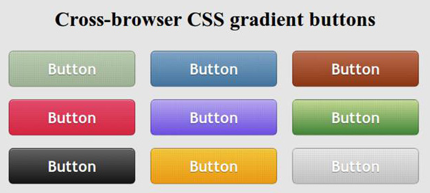
Every webmaster has heard for a long time, and someone has masterfully applied in practice, new and unique features CSS3. Not so long ago we discussed some interesting text effects , this time it will be a gradient buttons that were created without the use of graphics (pictures), that is, only by means of CSS3. Sam, I found a tutorialhere , you will also offer translation.
Gradient with CSS

So the basic qualities of the future keys (buttons):

  • Scalability (depending on the size of the font and size of the text);
  • Functionality, usability (includes state of the button - normal, hover, active)
  • Backward compatibility (even on old or not compatible browser buttons will look decent, though certainly not as intended. This can be verified at the end of publication);
  • Flexibility (these styles can be applied to other elements, not necessarily for the buttons);

What chips will be used in the process sozdnaiya buttons? The result is achieved due to the gradients, the properties box shadow, text shadow, rounded corners, the regime RGBA.

Structure of HTML

<a href="#" class="button button-blue">      <span> Button </ span>  </ A>

CSS

. Button   {       margin :  10px ;       text-Decoration :  None ;       font :  bold  1.5em  'Trebuchet MS' , Arial , Helvetica ;  / * Change the EM value to scale the button * /       display : inline- block ;       text-align :  center ;       Color :  # FFF ;         border :  1px  Solid  # 9c9c9c ;  / * Fallback style * /       border :  1px  Solid rgba ( 0 ,  0 ,  0 ,  0.3 ) ;                     text-Shadow :  0  1px  0 rgba ( 0 , 0 , 0 , 0.4 ) ;         box-shadow: 0 0 .05em rgba(0,0,0,0.4);      -moz-box-shadow: 0 0 .05em rgba(0,0,0,0.4);      -webkit-box-shadow: 0 0 .05em rgba(0,0,0,0.4);     }     . Button ,  . button span   {       -moz-border-radius :  .3 EM ;       border-radius :  .3 EM ;   }     . Button span   {       border-top :  1px  Solid  # FFF ;  / * Fallback style * /       border-top :  1px  Solid rgba ( 255 ,  255 ,  255 ,  0.5 ) ;       display :  block ;       padding :  0.5em  2.5em ;         / * The background pattern * /         background-image: -webkit-gradient(linear, 0 0, 100% 100%, color-stop(.25, rgba(0, 0, 0, 0.05)), color-stop(.25, transparent), to(transparent)),                        -webkit-gradient(linear, 0 100%, 100% 0, color-stop(.25, rgba(0, 0, 0, 0.05)), color-stop(.25, transparent), to(transparent)),                        -webkit-gradient(linear, 0 0, 100% 100%, color-stop(.75, transparent), color-stop(.75, rgba(0, 0, 0, 0.05))),                        -webkit-gradient(linear, 0 100%, 100% 0, color-stop(.75, transparent), color-stop(.75, rgba(0, 0, 0, 0.05)));      background-image: -moz-linear-gradient(45deg, rgba(0, 0, 0, 0.05) 25%, transparent 25%, transparent),                        -moz-linear-gradient(-45deg, rgba(0, 0, 0, 0.05) 25%, transparent 25%, transparent),                        -moz-linear-gradient(45deg, transparent 75%, rgba(0, 0, 0, 0.05) 75%),                        -moz-linear-gradient(-45deg, transparent 75%, rgba(0, 0, 0, 0.05) 75%);         / * Pattern settings * /         -Moz-Background- size :  3px  3px ;       -webkit-Background- size :  3px  3px ;   }     .button:hover  {      box-shadow: 0 0 .1em rgba(0,0,0,0.4);      -moz-box-shadow: 0 0 .1em rgba(0,0,0,0.4);      -webkit-box-shadow: 0 0 .1em rgba(0,0,0,0.4);  }     . Button : active   {       / * When pressed, Move IT down 1px * /       position :  relative ;       top :  1px ;   }

Blue button

. Button-blue  {      background: # 4477a1;      background:-webkit-gradient (linear, left top, left bottom, from (# 81a8cb), to (# 4477a1));      background:-moz-linear-gradient (-90deg, # 81a8cb, # 4477a1);      filter: progid: DXImageTransform.Microsoft.gradient (GradientType = 0, startColorstr = '# 81a8cb', endColorstr = '# 4477a1');  }     . Button-blue: hover  {      background: # 81a8cb;      background:-webkit-gradient (linear, left top, left bottom, from (# 4477a1), to (# 81a8cb));      background:-moz-linear-gradient (-90deg, # 4477a1, # 81a8cb);      filter: progid: DXImageTransform.Microsoft.gradient (GradientType = 0, startColorstr = '# 4477a1', endColorstr = '# 81a8cb');  }     . Button-blue: active  {      background: # 4477a1;  }

Compatibility with different browsers

  • Mozilla 3.6 and above - full compatibility, the buttons are displayed exactly as they are designed with all the details.
  • Google Chrome, Safari (Webkit) - no problems found, the overall result is not worse than Mozilla.
  • Opera 11 - unfortunately, the gradient does not appear at all, well at least that the rounded corners are interpreted as necessary.
  • Internet Explorer 08/06 - in this case the problem is, on the contrary, with rounded corners. The gradient is present.
  • Internet Explorer 9 - the situation is somewhat better than the browsers from Microsoft and past generations, but still the result is not as good as in Mozilla or Chrome.

Well, I have that's all. Now you can choose to use gradients for Photoshop , or do only with CSS. Study the possibility of CSS3, it's worth it! With HTML5 so all you can do wonders, has recently found a collection of different techniques and was very pleasantly shocked case examples.

Read More →

CSS3 Background/css3 pattern

New features CSS3 today allow you to implement what had been possible to do only with the help of a graphical editor (eg, Photoshop). Therefore, the modern web designer enough to get acquainted with new features done, we must also review the approaches and learn how to creatively use these features.

To develop these skills have always helped the analysis of practical examples. Want to find out how to create sophisticated seamless patterns? No problem! In this case you will provide invaluable assistance to the draftCSS3 Patterns Gallery .

patterns CSS3

Gallery patterns CSS3 Patterns offers you 18 examples of virtuoso use of Cascading Style Sheets. Looking at some of them hard to believe that they were created solely by means of CSS, however, the way it is. There are backgrounds in the style of carbon fiber, brick walls and a checkerboard, as well as with stars, hearts and various bars and cells. And what is most interesting - these and other images are available through CSS turned off, even with the pictures in the browser.

What can you do with this good? In its simplest form, just borrow a favorite pattern to use it in a proper project.But if you go ahead and take the time out to sort out how each pattern is created, then a lot to learn!

Gallery patterns CSS3

A small technical comment about compatibility: in general, the patterns are well displayed on the IE 10, Firefox 3.6 +, Opera 11.10, and other modern browsers, however, sometimes some details may not display correctly. On older browsers (eg, Firefox 3.6 and below) the likelihood of problems a little higher.

By the way, you can send your design to the site administrator, and if it is really interesting, it must be published.Learn new CSS features and show off your achievements!

Read More →

Learning HTML5 Library specialist

It was a story about how you can make the site more convenient and simple for users. The book was called by the method of Usability by Steve Krug , and was kindly provided by the publishing house "Peter." But this is not the end of our cooperation, in "Peter" seriously interested in improving my technical skills by offering to read something else. I immediately liked the book for HTML5.Technology, we can say revolutionary to some extent, and which is relevant in our time, and I, to my shame, not very familiar with it. And let not a coder, but the work of constantly having to edit someone else's templates, whether the introduction of personal ideas or fix the mistakes of others.

Thus, the book - Learn HTML5. Library Specialist - 272 page paperback about the new Web standard markup documents HTML5. The publication is a translation of the English-language books (successful abroad) by Lawson, B., Sharpe, R., professional programmers that use HTML5 for a long time and know all its intricacies. Fortunately, here you will find detailed specifications and dry language to hundreds of pages, most of the books take very specific examples of working with HTML5. In them the authors are trying not only to show how to use some elements, but also give a detailed explanation of each. We can say that the "Library Specialist" is ideal for web designers or users of the HTML or XHTML, which would quickly learn as a new HTML5.

It begins with the story of what appeared HTML5. It turns out it might not be as many experts have decided that the future layout of web pages for XML. As a result, there were new specifications XHTML, but "full transition" has not taken place. And at the same time a group of like-minded people, where they were independent developers, representatives of Mozilla, Microsoft, Apple and many other well-known companies have focused on the creation of HTML5.Interestingly, a large enough role in the development process itself played a browser, they could (in part) to dictate terms. In any case, if it was a new language, but these or other browsers would not support it, the benefits of this were not enough. Hopefully HTML5 will be the most unique and versatile tool for all (or at least most) of the Internet browsers.

Actually, reading the book, I felt a great interest and even some inspiration about HTML5. Language practically all the main aspects and technological features of the modern Internet. After all, it is strange that during the video and audio content, geo-location applications, complex web projects, many still use the old HTML4 to XHTML, with some improvements. I remember when I was reading a book at the Institute for HTML4 - it was in terms of how this may be, 200 pages, but in the end of useful information from it could make an order of magnitude smaller. There is, in principle, and there was a big deal - tables, formatting, forms, two or three dozen tags, which are assessed at 90% of Internet pages. HTML5 in this plan went much further and it's great!


The book "Learning HTML5. Specialist Library "consists of 10 chapters, covering certain features of the language HTML5.

  1. The basic structure - that which has undergone a change basic structure of web pages, the structural elements of the header, nav, footer, article. A study was conducted of millions of web sites for the definition of what constitutes a modern web, it is not surprising that many of the classes of the elements recur. Now, instead of "inefficient" DIV you can use the notation nav, which allows the browser to understand exactly where the navigation bar, etc.
  2. Text - text formatting has undergone further changes.
  3. Forms - were the new attributes, and types of input data.
  4. Video and audio - a section on working with video content, players, etc.
  5. Canvas - an element allowing to draw in 2D directly in the browser. In basic form it is certainly not impressive and more like an old Paint, but based on it can do cool and more sophisticated applications.
  6. Data storage - Working with web store and SQL databases.
  7. Independent work - the mobile Internet is now virtually everywhere and all, but not always the quality of communication allows you to work with applications online, stand-alone operation - the solution to all problems.
  8. Drag and drop - an overview of the drag and drop.
  9. Geolocation - as I understand it, is not part of specifications HTML5, but discussed in the book as one of the important and interesting technologies.
  10. Messages background calculations and sockets .

In each chapter you will find the necessary minimum of information in order to understand the essence of certain innovations HTML5. Again, the text reads easily and contains lots of code examples with detailed explanation. The book is ideal for learning from scratch, and as a small allowance, which can be continuously from time to time to seek an explanation - it is unlikely you will soon need all the 10 chapters. Order the book "Learning HTML5.Library specialist. "Online can online publishers, Peter, in the same piece of one of the chapters in order to get acquainted with the contents of the product. For web designers uniquely useful thing, even before the introduction of HTML5 in runet will be more than one year.

Read More →

Free Web ui elements kit set (psd)

In principle, for the pros is nothing easier than a hand-sketched schematic layout of the site. The process becomes a little trickier when it comes to the design of user interface elements (and their parts). There is not enough without imagination, experience and inspiration. If you do not know something to start (or you already have an idea, but you want to save time by using templates) you can come to the aid of special sets of elements of UI.They come usually in PSD, so that everyone who can work in Photoshop is not difficult to alter their own way.

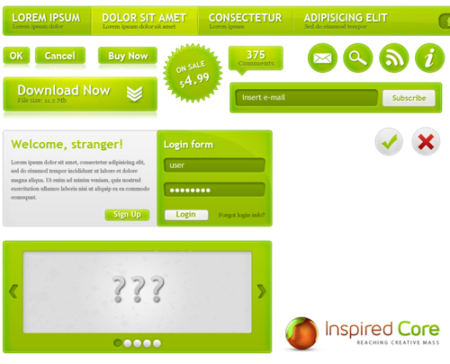
Green WebUI Kit

PSD source interface

Download - 3MB

Set the interface Green WebUI Kit - includes almost all the elements that may require - the top menu navigation buttons (OK, Cancel, Buy Now, Download Now), a sticker "sale", a form for login "blank" slider and the elements of subscriptions - RSS, E-mail and more. All the elements are high quality, modern design. Each element has its own layer file (PSD), so working with them very convenient. In principle, this can quickly sketch out the design of such a blog - a slider, a subscription is already there.

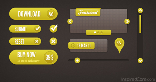
Yellow User interface elements

Yellow Interface

Download - 7Mb

Yellow User Interface Elements - set contains 11 elements of the interface in their yellow number buttons (Download, Submit, Buy Now, Search), sections (Featured and date), scroll bars and progress. All layers in the PSD file conveniently grouped so you can easily make adjustments to one or another element of the UI. Color also can be easily changed to one that requires you (in a set of Green WebUI, of course, too).

Unfortunately, Yellow UI Elements includes fewer items than the Green WebUI Kit, so do not rule out that some of the items you have borrowed from other collections or dorisovyvat yourself.

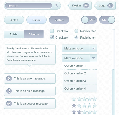
Soft UI Kit

stylish interface

Download - 200 KB

A nice light set of interface elements for your web development. Can be applied to create any site, and Web-based applications. Among all PSD sources are the most frequent elements for the web - buttons, search, drop-down list, checkboxes, and radioboksy, text, tips, etc., there are even a star to vote. Anyone who knows how to work in Photoshop, do not be difficult to correct this PSD to fit your needs. In general, set the quantity and quality is very good.

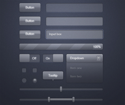
Transparent Glass UI

Interface PSD for Photoshop

Download - 1 MB

As you can see from the title set (Transparent Glass UI) and a preview of its distinguishing feature is the transparent elements. First, it looks quite impressive and well fit into the modern design, and secondly, fit almost any background color. PSD set contains all the typical elements of a Web interface - drop-down lists, radio buttons, buttons, forms, sliders and input fields.

I think of the presented sets of UI widgets for Photoshop will find something for yourself. The first and last sets are especially good. I wish you successful experiments and a beautiful interface!

Read More →

Free Font Embedding Recognition Service

So, you look at your favorite resources and find it on the site that uses a font that you like. Do you also want a font (and the sooner the better!) ... And what should be done to find out the name of this font? Sound familiar? Yes, we all have been in similar situations.

The easiest option - just write the webmaster of this site and ask the name of the font, but also where it can be taken. The answer may not come immediately, in addition, not all webmasters are responsible for such letters. So I decided to compile a list of free online resources to accelerate the process of identifying a font.

A. What The Font

Service What The Font created one of the largest font (myfonts.com, - shareable). This resource is number 1 on your list of identifiers of fonts. Just download the picture with the font that you want to identify the server WTF (do a screenshot and carve the word with the pleasant characters - shareable) or insert a link to the image of the font in a special line. The system will show you the results in the different versions of fonts.

What The Font

If the system does not recognize the font, you will be asked to go to the Font Forum , where you can post the picture with the font and wait for a response from the experts about what this might be a font. I've used both, and this is usually solved most of my questions regarding fonts

Identifont

This service is called Identifont uses a different approach to identifying and finds your fonts by asking some questions about it. This resource can be useful for you if you do not have the font image that you are looking for. In truth, I myself have never been able to find a font through this service, but maybe I'm the exception!

Search Font Identifont

The developers of the service argue that it is "the largest independent resource for fonts on the Internet that contains information about fonts from 534 publishers and 143 vendors."

Message Boards: Typophile

Typophile - this may be the greatest and largest community of experts on the fonts. Your question you can ask, posted a picture with the font on their forum. If this resource does not help you, the majority of sites on fonts (typically, sites with free fonts) is a forum where you can post the question and a picture with the font you are looking for.

Typophile community fonts

Bowfin Printworks

Website Bowfint Printworks offers a wealth of information and a variety of online tools to identify the font, asking questions about the form of font glyph. This resource on the scheme works similar to Identifont, but it seems to work faster, because All data is entered on the same page, while Identifont makes you go through many pages, which may seem tedious. The site includes a guide to font Script, Bauhaus-style, Sans Serif, and Serif, and Lined.

Site Bowfint Printwork

The site owner is also willing to answer any questions relating to the identification of the font, by e-mail.

TypeNavigator

TypeNavigator created by developers Fontshop. It uses the same operating principles as Bowfint, ie asks questions about the shape of each letter.

Service TypeNavigator

It should sweep that at the time of publication of the article there were some problems with downloading services, but the developers promised to fix the problem soon.

Flickr Typeface Identification

The popular photohosting Flickr group is typeid (Flickr Typeface Identification), dedicated to the identification of fonts, and a group of Fonts in Use , which laid out the fonts used in the different pictures (logos, labels, posters, etc. - shareable). These services may be useful for quick reference about the fonts.

Group Flickr Typeface Identification

PS Group typeid much more active, and there you can get a faster answer to your question

Lists fonts

Sometimes the best way to find a font is a font viewing lists, which contain the most commonly used fonts. Here are some popular resources with lists of fonts. You can use them to quickly obtain information about fonts.

list of fonts Modern Life Blog

Modern Life Blog

The Logos of Web 2.0

The Logos of Web 2.0

Just Creative Design font list

Just Creative Design

Smashing Magazine

Smashing Magazine

list of fonts Urban Fonts

Urban Fonts

PS On behalf of myself and the readers of Design Mania would like to thank the project for this perennial selection of really useful in the service. Original article can be found at Deport Webdesign . Sometimes it is from the font in the design of the site depends on many things. The most commonly used, of course, standard operating time, but with the development of the Internet, HTML5, services, font designers are gradually paying attention to other design features of texts.

Read More →

Best Free Open Source Fonts for Designers

 I found recently on the Internet an interesting article about fonts - The top 10 Open source Web Fonts , where the author presented a very cool collection of totally free fonts that you can use for their sites. But the essence of the notes not only that, a couple of times in the text is repeated a certain revolution @ font-face. And it really is, what are the fonts in the Web `s about 5 years ago and now does not compare. First, it used to be nice to find a cool and with a free font (not a license to use does not count) for the site. But today the situation is changing for the better - a unique (up to a certain extent) and free (licensed open source) the font is no longer a rarity. Moreover, for many expensive fonts can be found excellent, and most importantly free replacement that is not how it is inferior to analog.

Secondly, I remember very surprised that the Web `s are very stringent restrictions on the font used on the site - a couple of standard and all. Time is now same the application of of original of elements, of non-standard, vivid, of creative is considered to be now very good, a tone of. Typography in the internet has become more unchained, interesting and freewoman. Is not it a revolution? The article below will find 10 good fonts that can be a decoration on your site.

The Fell Types

Fonts The Fell Types from the author of Igino Marini (Igino Marini) look simply more tremendous. If you believe the description, they are based on the actual original fonts from manuscripts of the 17th century. The author has studied the structure, gathered together all the work and made ​​a full font that will rescue you when you need to beat some "classic" theme in the design of the site.

font The Fell Types

Open Baskerville

OpenBaskerville - a font based on the original Baskerville (more precisely on the font Fry's Baskerville). It features versatility, and this has earned popularity. Open Baskerville - a great alternative to the original. The font has a dual license - Open Font License and the GNU GPL version 3.

the font Open Baskerville

Josefin Sans

JosefinSans - elegant and refined ideal font for headings. Based on known font Kabel, Memphis, Futura and other fonts of the "European School". The designer - Santiago Orozco. This set has a lot of different styles and options to use, making it very flexible to work with.

Josefin Sans font

Open Sans

OpenSans - another font from the collection of Google Web Fonts. Designed by Steve Matteson (Steve Matteson).Differs by the fact that contains a full a set of of 897 of symbols (in the including of Cyrillic); therefore, is very flexible in the application of and his must have a in his collection every self-respecting designer! It also has many options of styles with different weight.

the font Open Sans

Gravitas

Gravitas - massive and heavy font refers to the era of industrial revolution in Britain. Perfect for posters and promotional titles. The letters are well worked out, it looks great.

font Gravitas

Jura

Jura - slightly futuristic euro-font (meaning in the tradition of European design.) Based on the well-known classic font Eurostile, but at the same time has its own character.

font Jura

League Gothic

LeagueGothic - essentially an open source-version of the legendary font Alternate Gothic № 1, developed by ATF (American Type Founders) in 1903, but contains original elements. Fans of Gothic font download required!

League Gothic font

Orbitron

Orbitron - a font that is ideal not only for the "space of interfaces." This stylish font can be found many other applications, the benefit of the "complete", there are four "weight» - light, medium, bold and black.

Orbitron font

Chunk

Chunk - imitation of wood-carving. The font is very rich and heavy, so it can be safely used, for example, the headlines.

Font Chunk

Ostrich Sans

OstrichSans - very nice and modern sans serif font. Characterized by a wide diapazom Inscription - Ultra light, Normal, Bold, Black, Rounded (medium), and even Dashed (thin) - intermittent "to the point."

the font Ostrich Sans

By the way, many other interesting fonts can be found on the Google Web Fonts, one has only to look good! The project started a year ago, and now it is full of interesting fonts that can be quickly and easily connect to your site.This is one of the elements of the "revolution", which was mentioned earlier in this article.

Read More →

Tips for creating one page websites

For this article I express thanks to them! Subject of one-page sites have not been reviewed, so it will be interesting! 

One-page Web sites have become fashionable and popular - there is no doubt about it. But they do not suit everyone and every organization. Single-site are of interest because they are popular, and if they are made correctly, your website can become successful. But first, make sure that your project is suitable.

A good candidate for a single-site has a large number and volume of content. You only have one page, to get his message across, and only a limited number of tricks, and animations that you can throw before the user loses interest in the site. In addition, most single-page Web sites have non-standard markup. Trying to fit a large amount of content so that it does not look like a disorderly heap of information is problematic.

The potential scope of the single-site are different, but some of the most popular candidates for the use of such sites is the personal portfolio of sites and companies that provide a small amount of products or services. If you have a suitable site, make sure that the chosen strategy is effective for your business and activities. There are certain principles that you must follow to create any website, but the items listed below are especially critical for single-page Web sites.

A. Keep the focus of attention of visitors

Make the audience for everything as simple as possible. If you are considering odnostranichnik as an option for the site, it is likely that you do not have a large amount of content for posting on the site. This is great. We sometimes tend to put on the site of a large number of unnecessary information. One-page sites do not require too much information, because their sole purpose - to hit right on target. If you are a designer who creates portfolio site, submit your best work, and even do not suffer the thought of placing mediocre projects or your side of the business associated with the sale of T-shirts.

Clean your site of all superfluous and only use the information that matters. Despite the fact that this is a good strategy for each site, multiple sites, most can afford a certain amount of extra information, since the user always knows where to find the information they need. in the case of one-page site you have, figuratively speaking, just one shot, if the user does not find the right information out there, you will lose it.

single-site

We have no question that this site sells

odnostraninyh secret sites

This portfolio goes straight to the point. And a wonderful, lovely minimalist design too.

2. Create a visual hierarchy of the site

One-sites have the task not only set the focus of attention of the visitor, but also to present your product or service. If any single-site made an impression on you, then they may have one sole purpose: to present the design of the agency or to draw attention to the upcoming event.

Excellent design and focusable visual hierarchy may help to characterize the purpose of your site. you as a designer, you have the power to direct the visitor look wherever you want it passed. For people naturally notice the large objects in the first place, and small - in the latter. Important objects should not be placed in the bottom of the page and be fine.

Introductory paragraphs, typed in large print, have become so popular in the designer's portfolio site just because they hit right on target and attract those looking for designers. The last thing you would like to see on the website designer - this is what school he attended. But you need to know its specialization, and which design projects he does.

Again, you have only a few invaluable opportunity to convey your message to the visitor. So try to use them correctly. If you realize that you have too much content, so that you can convey your message through a one page, then create a multi-site.

a simple one-page site

Despite the fact that even in this screenshot we see a number of different points of focus visitors' attention, we can say a lot about what is more important.

hierarchy for the site

We can say, what does this company, but the visual hierarchy could be better.

3. clear navigation

Some one-page sites are static pages that redirect visitors to external resources. For example, the musicians on your page can put a navigation option "Video", which will take you to their page on YouTube. There is absolutely nothing wrong, and so is even easier (especially in terms of encoding). The only thing that the visitor needs to know - is that he will be redirected to an external page.

If your one-page site was created to sell a product, a link to "Buy" the buyer sends a payment to an external platform without warning, you may lose some of its customers.

Your goal - to do everything as simple as possible. Redirect the user to external websites without prior notification may cause the user confusion. He might think that the link does not work, or that the link is incorrect. Try to use special icons (a lot of free options available on the Internet), or headers, so the user knows where he will be redirected.

clear navigation Site

Here we see something that you should not do. Link at the top sends you to an external site without warning. This is really confusing.

single-site

Design and code of this site is very unusual. However, all links to external pages are marked with green circles and signed appropriately.

4. Experiment with the design

Now we got to the fun part: the use of a single-page Web site to show yourself and your skills. You do not want your web site was boring or was similar to other web sites - so be bold, experiment. Put the design on a new level - think outside the box. The unusual design draws attention to your product and make it memorable.

One-sites become synonymous with great design, because the work with a large "canvas" opens up great opportunities for you. You can not use the same background everywhere, you can change it for different sections.Often, single-visit sites like browsing magazines or well composed presentation. Use these opportunities.

Create a stunning design: Use large pictures, which fill the entire browser window, or a chic illustrated background.This not only gives you an advantage over other web sites - as a result your site may fall into one of the reviews of web design.

single-site

From this design is breathtaking. He recalled a poster or billboard. And the rest of the site design does not make you disappointed.

one page websites

Cleanliness of the design (and code) is just amazing. It makes you stop and look.

5. Experiment with the code

If you want to show not only their skills in design, but also the skills to write code, the one-page sites allow you to do it. Experience in the development of the code in this case is critical, so pay attention to detail. The code can lift your site to the next level.

Here are a few things that should be addressed: the color and behavior options (especially in selection mode), the look and feel of forms (forms podognka a site design using AJAX and JavaScript); sending data and error messages (here we use the forms and AJAX script), and the location of a table of content (including content on the behavior of the browser window). All this must conform to design and work in concert with the design.

single-site

A wonderful and simple sample code for a single-page site.

single-site

I, of course, biased because I love it when content is loaded into the same box, but the attention to detail in the code here is just incredible, and it can be seen everywhere.

6. Animation

In addition to that mentioned above (care of the details when writing code), you can use code to create an animation on the page. And try not to be boring. Add to your page a sense of life and movement, make her look as if it moves along with the visitor. Add funny animations and transitions of interest to your site really stand out among others.

Languages ​​jQuery and AJAX became standard for animation on the site. No matter what you do: force the content to appear on different sides, or create a background as a slide show - keep the audience involvement in the process of viewing the site.

Animation Online

The background of this site is made in the form of animation. It is difficult to understand what this site, but it looks very neat.

animation of a single-site

Transitions on this web site are made great. I love it!

PS Thanks again to the company perennial for the English translation of this article. It is an original can be found here - 6 Tips to create better one-Page websites . What can be said as a summary. Certainly one-page sites - cool stuff, which has its very serious advantages: such a project can come as no surprise to hold the user to select and highlight it profitable to your site among the hundreds of other ordinary and unremarkable. Therefore the greatest benefit of such odnostranichnikov will be in the field of activity, where the effect of the product is almost the most important task - as an example, we can easily result in portfolio websites of designers and any other creative people. In focus is a bit like flash sites - the concept is similar, but other embodiments.

On the other hand it must be remembered that a small amount of content on the site of the project reduces the chances for promotion in search engines and drive traffic there. So, of course, most major corporate websites of companies should not be in the form odnostranichnikov, except maybe a mini web site (in addition to the subdomain, for example) or creating a project for a fashion company that is moving in other ways - TV channel, radio station, etc. n

Read More →

Where and how can the designer make money online

At the present time is not so easy to find a suitable and well-paid job, even knowing, versed man. Crisis and inhibits any other nonsense, some unemployment in the area of ​​design is inherent in many cities away from the capital, which is not on the internet. After all, the Internet, with some good skills, you can always make money no matter where you live .. If you have studied and know how to use image editors (photoshop, illustrator, etc.) then you have every chance to gain a foothold in the market of web design and earn good money at the same time.

After analyzing all the possible ways to income, you can stay on the following three are:

  • manufacturing sites, banners, icons for sale;
  • to go into the studio web-design, or arrange for its;
  • work for themselves.

All these ways of earning differ radically from each other and require different levels of knowledge in the field of work. Remains unchanged but the desire for self-learning and to achieve their goals. Thus, we proceed to detailed consideration of each of the ways to earn.

A. Create a site design , banners, icons, painting for sale. This way of getting money is the easiest and does not require much knowledge of the intricacies of professional web-designer. But far from being the most profitable. To do this will be useful only good knowledge of Photoshop and Flash. However, demand for this type of service is quite low, and all niches are already occupied by people who are doing it for years. So do not expect you to tumble down to the crowd of potential employers.

Alternatively, you can combine design and html coding layouts for websites. But for this skill, "drawing" is not enough. You will need to master at least partially html, css, javascript, and possibly some other programming languages ​​that will be required to create a full website layout. Many web-designers and arrive. This form of earnings paid more, and the chance that you will find a job later. But, of course, you can not do without a portfolio, because large orders often accrue to the people tested. So, you may have some time to work "idle".

Two. to get a job in web-studio, or to organize their own. It's not as simple as it seems at first glance. Typically, these studios have strict requirements: Higher education, experience, knowledge of a perfect image editors, and this is just basic. Even if you find a job, not a fact, it will take you. If you still have a job, try to perform all tasks on time and with maximum efficiency, as your place is claimed by many.

The second option is to open his own studio web-design. To do this you need freelancers who will be looking for customers and create layouts. Naturally, all they need to pay. In addition, you need to make your own website, which should look presentable, because that person is your studio. The method is even more difficult the first - as the head of the activity is not so simple. It would seem that complicated - find freelancers on similar sites found orders, agreed on all the nuances and gave the work its employees. In theory it is, of course, everything went smoothly, but in fact there is a lot of little things and details - inexperienced freelancers, bad customers, delays in operation, etc. If you do not have any knowledge, with the creation of the studio is best avoided.

3. If for the time you spent looking for work in the studio, or on a well-paid for in orders, did not find anything worthwhile, it will be your lifeline to the work itself. In order to start earning good money on the internet you will need to create a website. All you can do with their hands: icons, icons, layouts, banners, reklamki, fonts, all of this is placed freely available on its website, because people are constantly looking for such material for their sites, but pay for them do not want.

And you in turn will be able to cash in on the people themselves, rather than on their attendance. You can install klikandery, affiliate, advertising on Google or Yandex, if lucky, and somebody else's ads or banner. In addition, the sale of options has not been canceled, but to engage in such earnings, it is necessary to pump your website. TIC 10 is quite enough to get your site accepted in exchange links. And this is the most difficult TIC, then they will grow faster if you actively promote your site, and therefore, together with TITsem will grow and your earnings.

This is, perhaps, all so that you have food for thought. Aspire, Achieve, Earn!

PS What I can add on the basis of personal experience. The methods mentioned in principle correct, but it seemed to me a little bit chaotic. So before you do something right from the start to sit down and think - 1) what you have skills and knowledge, 2) what exactly would you like to do - because the "studio" and the Internet is already earning a little bit far from things classic design. If no special knowledge, then, of course, learning the basics of forward - this image editors , and layout (which is useful).

If you can not find a job web designer at the firm (either remotely or permanently), then do not worry, the different positions and proposals can also be found on the stock exchanges and specialized forums, freelancing, starting and finishing orders less full site design. At the same urge to have a website - where not only publish some icons, fonts, and upload their work. Anyway you can in the process of personal site to hone specific skills, and apply the design and layout - will be the first major project in your portfolio that you can live to see and appreciate. Good luck to you!

PPS If you need to choose an unusual gift that is useful or interesting, it presents bought in Empik.ua you definitely fit is very good shop, where there is almost everything. 

When you do not know that it is better to choose this or that person can always be found in the Book Shop and buy a good book, whether it be classical or modern writer. 

Transportation of goods - sometimes a difficult task, but it is doable, high-quality transportation can do for you Ukrmitservis company, for the goods can not survive.

Read More →

Use of Texture in Web Design

What is the easiest, right, and sometimes the only way to create the illusion of relief of a particular element (object) in web design (as well as in 2D as a whole, and of course 3D)? That's right - use a texture! Being a "material" universal, textures are widely used in web design and is the subject of endless experimentation.Patterns can be found on the websites as simple, which only emphasizes certain elements of the project, as well as more complex implementation. Inspired by the publication of this review suggest several options for the use of textures:

"Fine," the use of texture

Do you want to diversify a simple solid color or gradient background - add a "light" texture that will not be glaring and sharply contrasting, but at the same time, complicate, and ennoble the background. It will also highlight some certain sites, attracting the attention of the user.

An example of the use of textures in this way can serve as a site LogoGalas. The site uses different variations of the blue color as the background and fonts, a dark band above the background with the menu and the search for the rest of the pages lighter.

a little texture

Pay attention to the barely discernible texture in the upper part of the site (where is the logo and top navigation).An excellent example of skillful work with textures! This helps make the transition between the shades of the background more visible and "interesting".

Another example - the site of W + K Studio. This texture is used in conjunction with the effect of the gradient for the background.

texture on the background

And in this case "easy" and a very simple texture adds depth and "wealth" this very gradient background.

Texture as a "brute force"

In contrast to "thin" a delicate texture that gently adds detail, work well sometimes bright, contrasting textures, giving the basic tone and mood of the song. Most often, these textures in web design used to select the header or add a contrast between the different columns of content on the site. Must be quite accurately refers to the "heavy" texture, as they may distract the user from the content page and draw over all the attention that is not good.

A striking example of a second embodiment of the use of textures - site of Church on the Rock, where "strong" texture used widely enough.

a lot of textures in design

In fact, the entire design (especially in its upper part) Church on the Rock «involved» in the contrasting textures and their interaction: some areas of the site allocated in different textures, as you scroll down you have a conventional one-color background.

No less significant is the site design Narfstuff, where the texture of the background represents the brightest spot.On top in the header is used a lot of different elements and techniques of web design, texture, while some isolated areas of the page.

texture on the site

If you scroll down through the smooth texture of the blur goes to white - good reception of the change to a completely saturated cap "minimalist continued" at the bottom of the web page.

In general, if we talk about the texture in web design, it is very interesting and useful item, it can be achieved quite remarkable results. Personally, I love to add different kinds of textures for blogs because it helps the pattern look more succinctly, effectively, and highlights the main contents of the site. By the way, I advise you to look an article about the original generators backgrounds (Background) - find a couple of useful online services by which you can create a nice texture for the background of a web page. In general, the texture can be achieved using a very different result. Ultimately, all that defines the goal you are pursuing, but there is always a suitable texture!

PS The site Crib blogger you can find an article on how to set the background for the site in html , and many other publications on the design, layout to help novice users. 

Bought a new trendy and expensive device? Immediately advise you to buy a cover for ipad 2 , or else your plate that just will continue his life. 

broken washing machine? - It is better to book a professional repair of washing machines for those who understands that in order not to get in the near future, the new breakdown.

Read More →